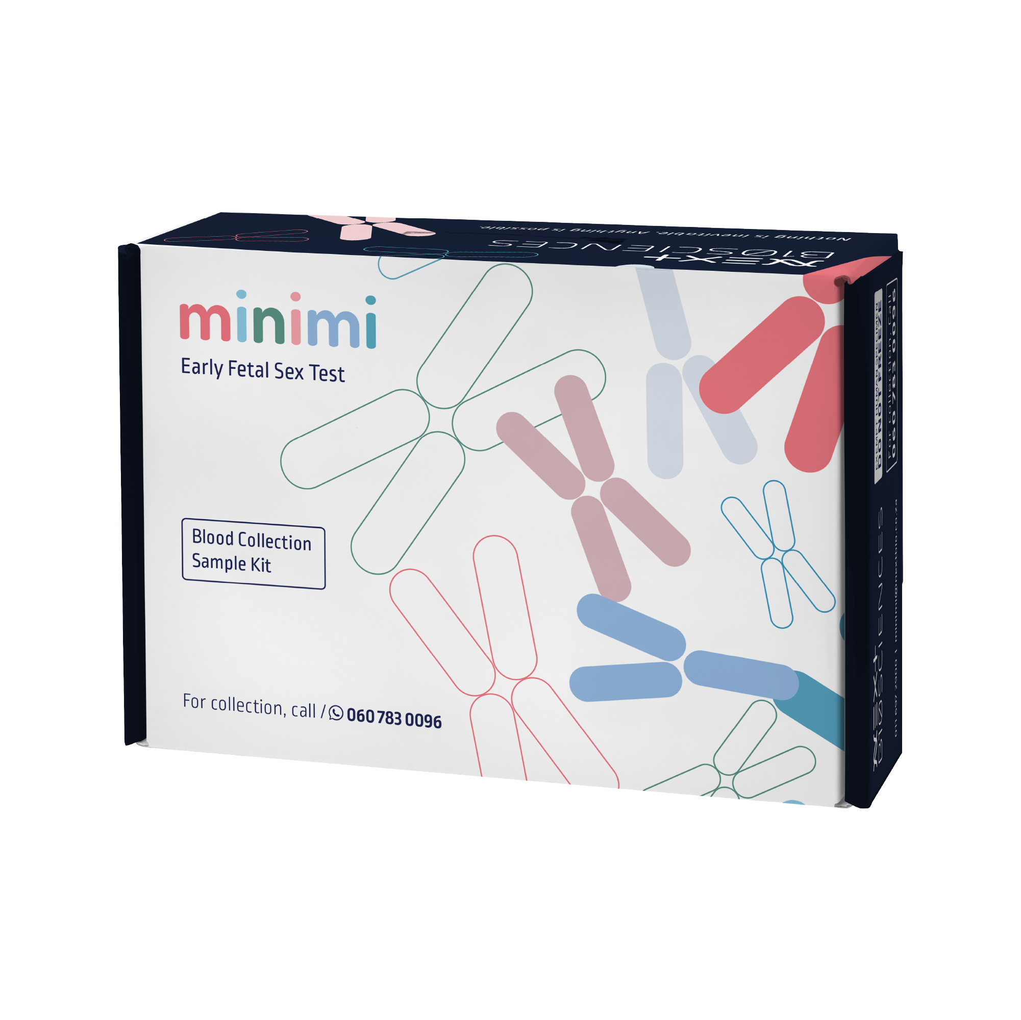
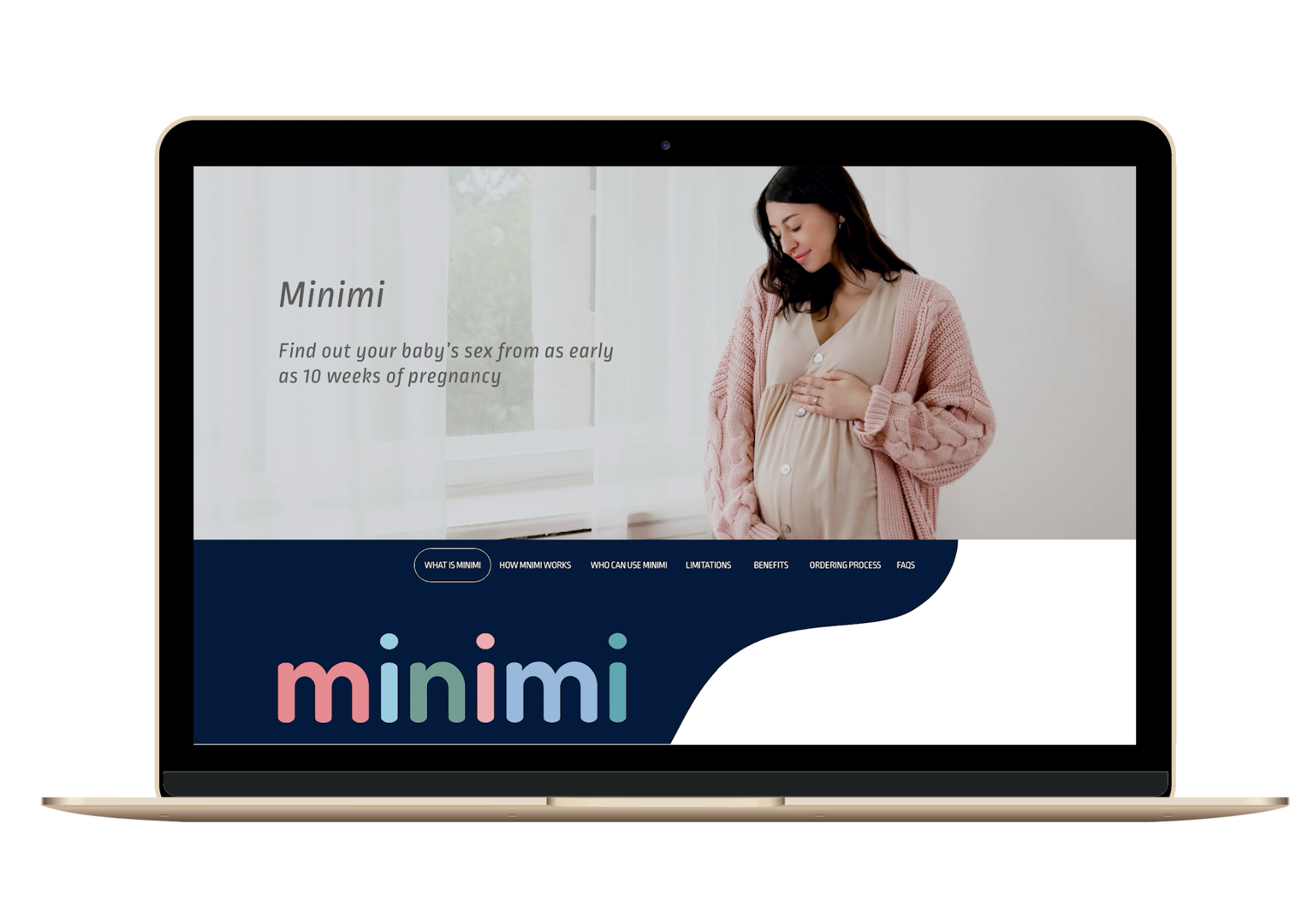


MiniMi Early Fetal Sex Test
Prize(s):
WINNER 2026 Print & Digital / Logo, Trademark and Symbol Design | Multimedia Design / Brand Identity
Company Name:Next Biosciences
Lead Designer(s) Name(s):Kerry Hodgkinson
Client Name:Next Biosciences
Project Location:Johannesburg
Design Status:Commercialized
Website: View
Video URL:View
Project Description:
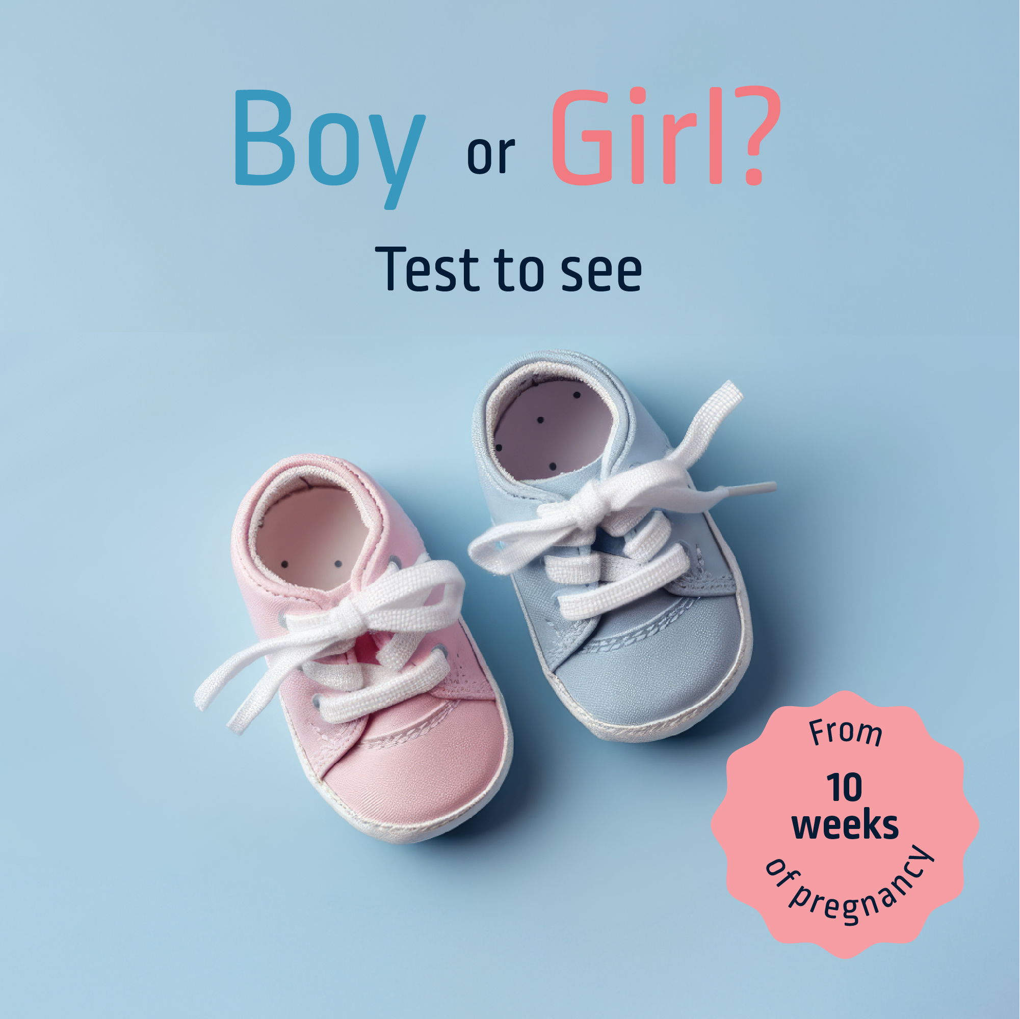
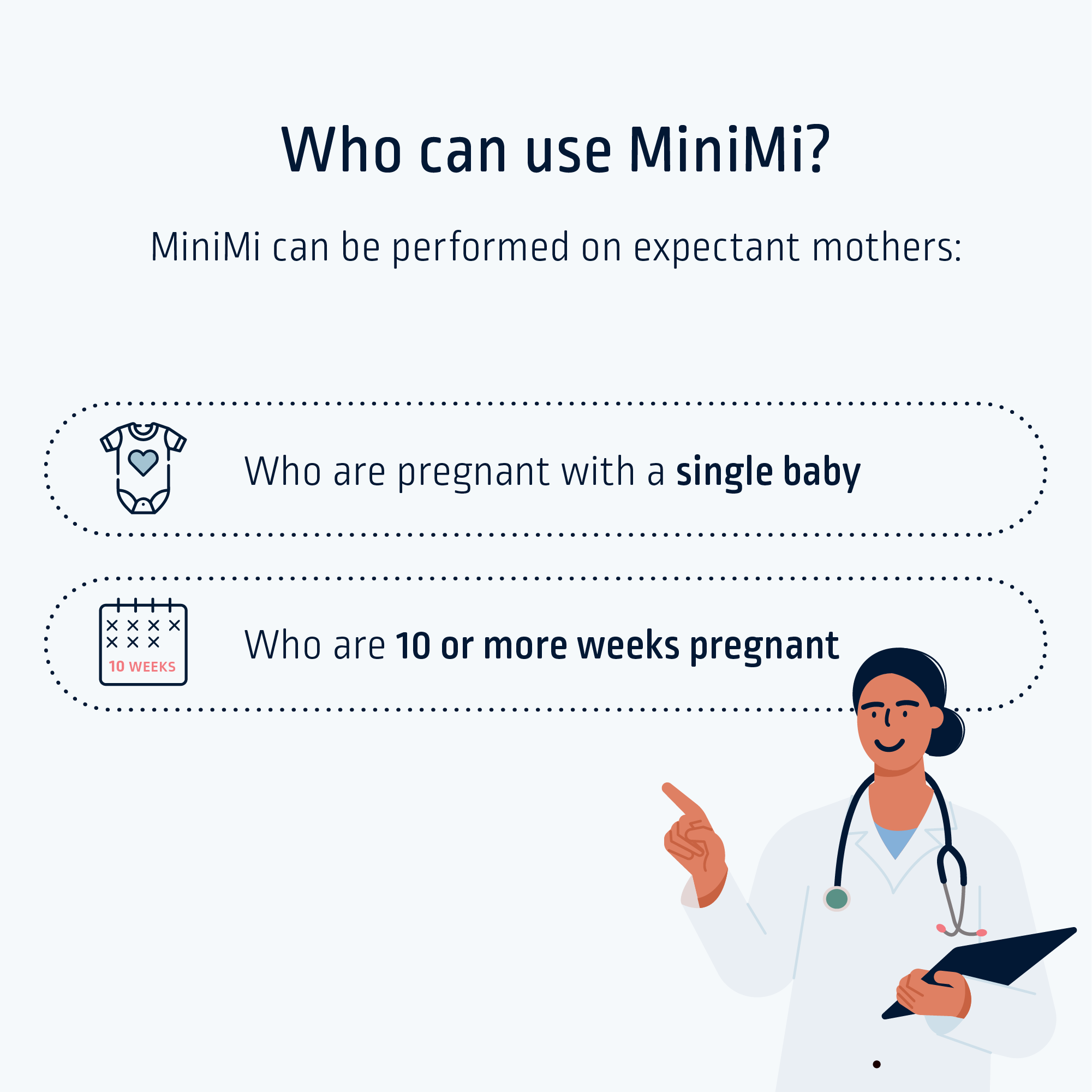
Product: scientifically validated, laboratory-based early fetal sex test designed to help expectant parents discover their baby’s gender from as early as 10 weeks of pregnancy. The test is offered through authorised blood draw facilities & is part of our portfolio of advanced reproductive & genetic testing services. Objective: create a brand that combines science & emotion — presented through a playful & trustworthy identity. Goal: to position the test as safe, easy & accurate, while differentiating it from a 3D scan or at-home testing alternatives. Key design challenge: to present it in a way that feels personal, modern & emotionally connected. Unlike typical medical brands that may be sterile & scientific, we wanted an identity that inspires excitement & connection, without compromising credibility or medical integrity. Design: had to function seamlessly across digital, print & in-field marketing channels — packaging, marketing collateral, social media, & website — ensuring clarity & relevance for healthcare professional and expecting parents.
Product: scientifically validated, laboratory-based early fetal sex test designed to help expectant parents discover their baby’s gender from as early as 10 weeks of pregnancy. The test is offered through authorised blood draw facilities & is part of our portfolio of advanced reproductive & genetic testing services. Objective: create a brand that combines science & emotion — presented through a playful & trustworthy identity. Goal: to position the test as safe, easy & accurate, while differentiating it from a 3D scan or at-home testing alternatives. Key design challenge: to present it in a way that feels personal, modern & emotionally connected. Unlike typical medical brands that may be sterile & scientific, we wanted an identity that inspires excitement & connection, without compromising credibility or medical integrity. Design: had to function seamlessly across digital, print & in-field marketing channels — packaging, marketing collateral, social media, & website — ensuring clarity & relevance for healthcare professional and expecting parents.
Project Innovation / Specification:
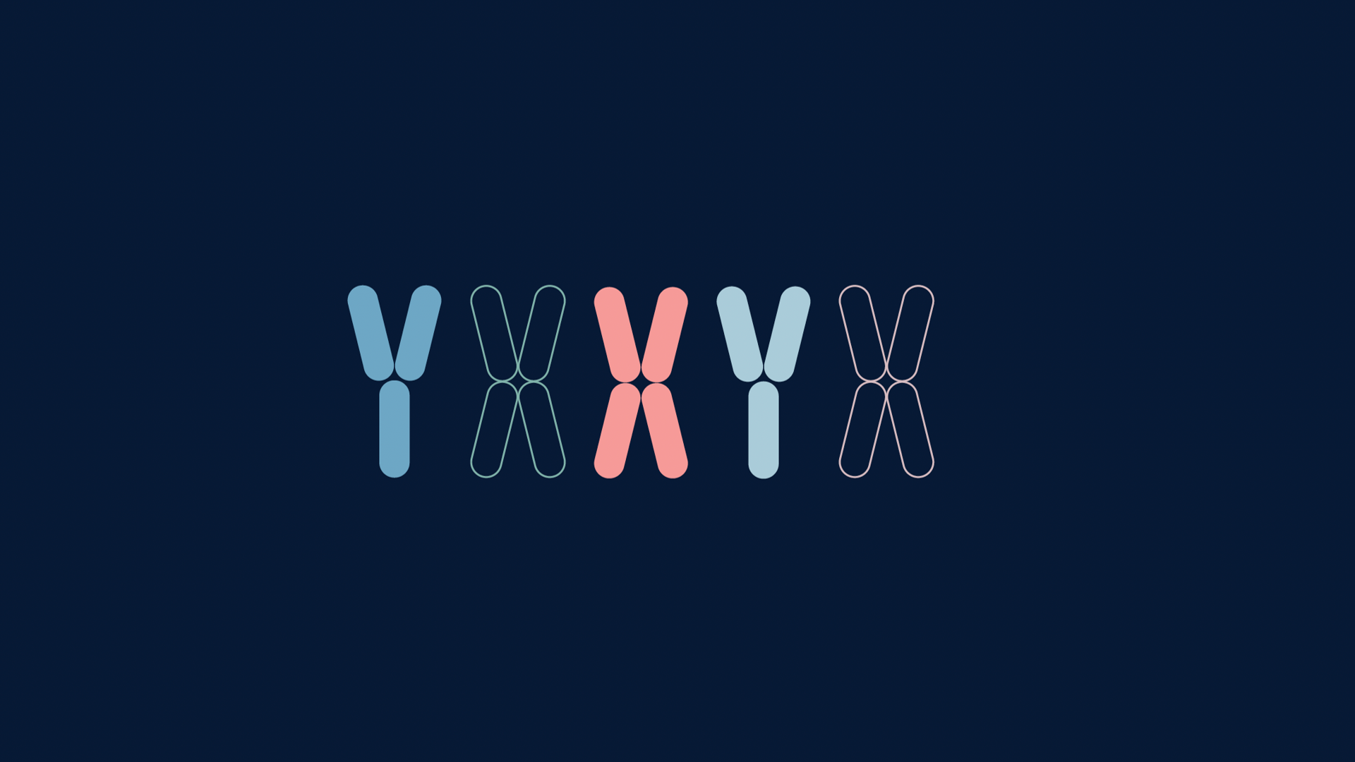
This test was the first if its kind in South Africa. The project's innovation lies in translation scientific accuracy into human-centered communication, balancing empathy & credibility through design. Introduces calm, evidence-based visual & verbal language through the use of a thoughtful playful logo, colour palette, typography and visuals. Sex chromosomes used as part of brand identity. Design & messaging were co-developed with the company's scientific, medical & compliance teams, ensuring accuracy in medical claims & adherence to regulatory frameworks. Research included user testing with focus groups to ensure comprehension & emotional resonance. All touchpoints—website, in-store collateral, packaging & all digital content—were designed as part of one continuous experience building on the idea of connection between baby & parent, emotion & science. Partnering with a leading retail outlet gave further credibility to the brand. Name: Inspired by the idea of a baby being a smaller version of their parents, symbolising the intimate bond & shared genetic connection between them in a playful yet meaningful way.
This test was the first if its kind in South Africa. The project's innovation lies in translation scientific accuracy into human-centered communication, balancing empathy & credibility through design. Introduces calm, evidence-based visual & verbal language through the use of a thoughtful playful logo, colour palette, typography and visuals. Sex chromosomes used as part of brand identity. Design & messaging were co-developed with the company's scientific, medical & compliance teams, ensuring accuracy in medical claims & adherence to regulatory frameworks. Research included user testing with focus groups to ensure comprehension & emotional resonance. All touchpoints—website, in-store collateral, packaging & all digital content—were designed as part of one continuous experience building on the idea of connection between baby & parent, emotion & science. Partnering with a leading retail outlet gave further credibility to the brand. Name: Inspired by the idea of a baby being a smaller version of their parents, symbolising the intimate bond & shared genetic connection between them in a playful yet meaningful way.
Project Sustainability Approach:
Guided by environmental-, social- and ethical considerations, we integrated responsible material usage (recyclable where possible), digital optimisation, and long-term design relevance. Our communication channels prioritise digital interaction wherever possible, incl educational material, instructions, marketing collateral, booking and lab portals, and client journey. Updates can be made instantly without waste.
Guided by environmental-, social- and ethical considerations, we integrated responsible material usage (recyclable where possible), digital optimisation, and long-term design relevance. Our communication channels prioritise digital interaction wherever possible, incl educational material, instructions, marketing collateral, booking and lab portals, and client journey. Updates can be made instantly without waste.
Local and Regional Impacts of the Project:
Designed & produced in South Africa, the product reflects the growing strength of local innovation in healthcare communication & design. It advances medical literacy, empowering parents to make informed reproductive choices & promotes trusts in local biotech services. Diversity was central to design consideration; all elements were tested for neutrality & comprehension. The brand's offering enables an easy white labelled option that can be rolled out to other markets, allowing cultural adaption & compliance to local health regulations.
Designed & produced in South Africa, the product reflects the growing strength of local innovation in healthcare communication & design. It advances medical literacy, empowering parents to make informed reproductive choices & promotes trusts in local biotech services. Diversity was central to design consideration; all elements were tested for neutrality & comprehension. The brand's offering enables an easy white labelled option that can be rolled out to other markets, allowing cultural adaption & compliance to local health regulations.