The Beer We Call Home
Prize(s):
WINNER 2026 Print & Digital / Poster and Flyer | Honorable Mention 2026 Multimedia Design / Online Advertising Design
Company Name:The Quollective Africa
Lead Designer(s) Name(s):Kennedy Thiong'o
Design Team / Other designer(s):John Gaitho, Andrew Nyaga
Other Contributor(s):Rhona Namanya, Leila Terry Shikuku
Client Name:Serengeti Breweries Limited
Photo Credit:Hendri Lombard
Project Location:Dar es Salaam, Tanzania
Design Status:Commercialized
Website: View
Video URL:View
Project Description:
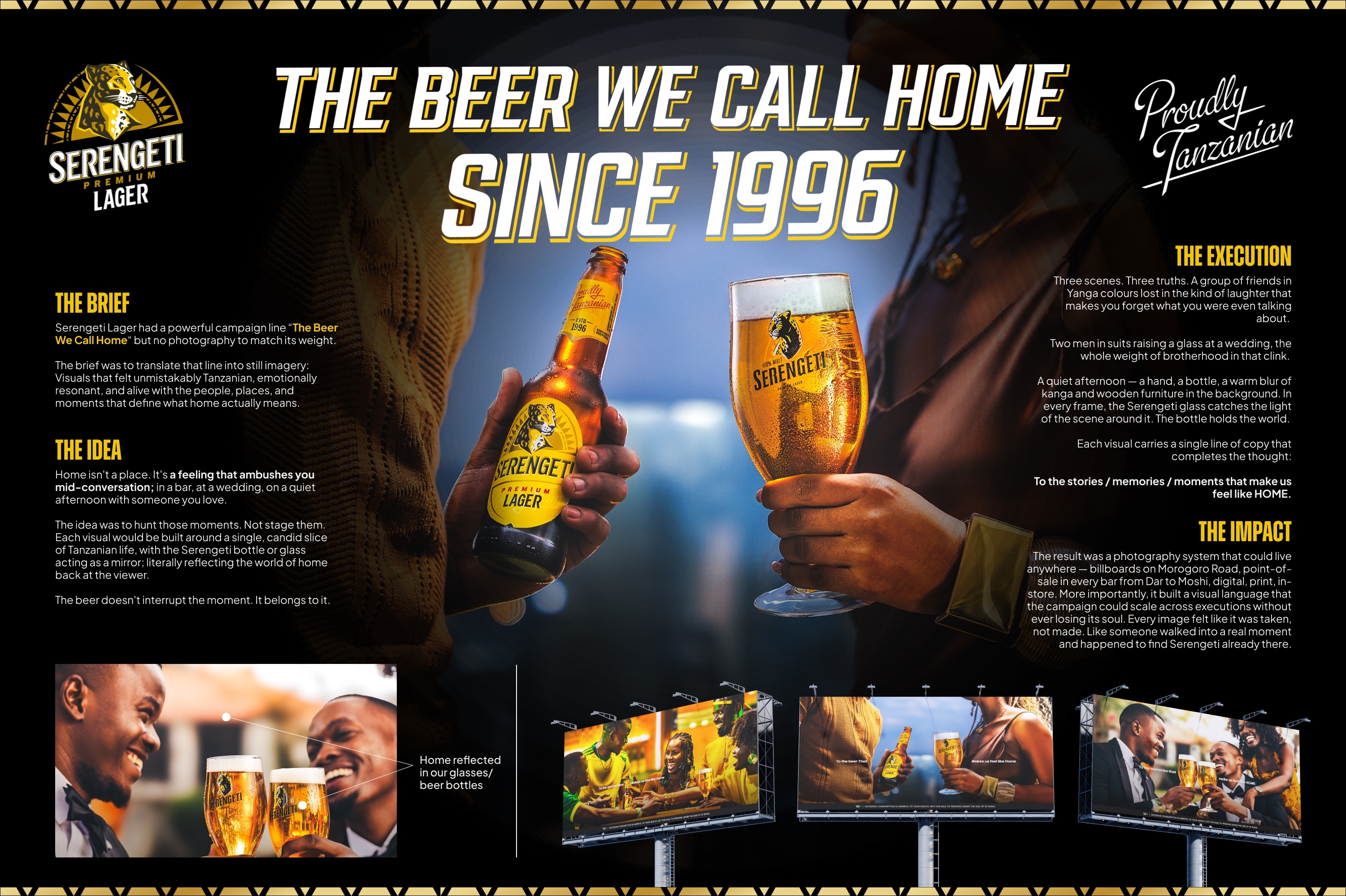
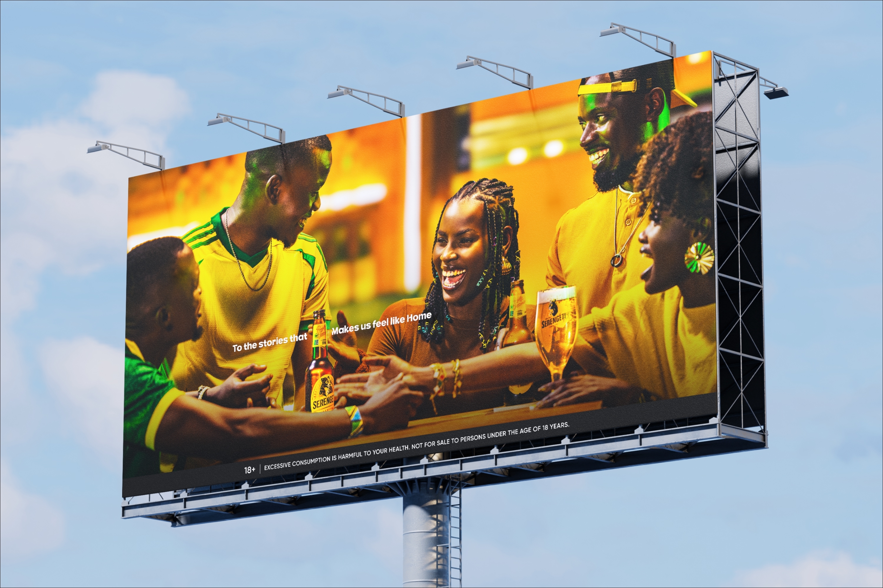
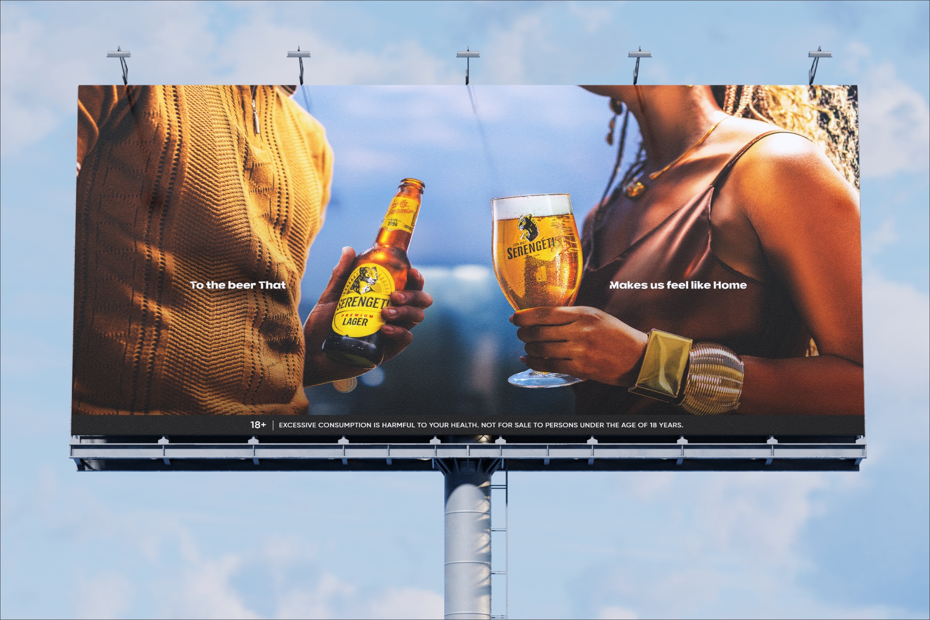
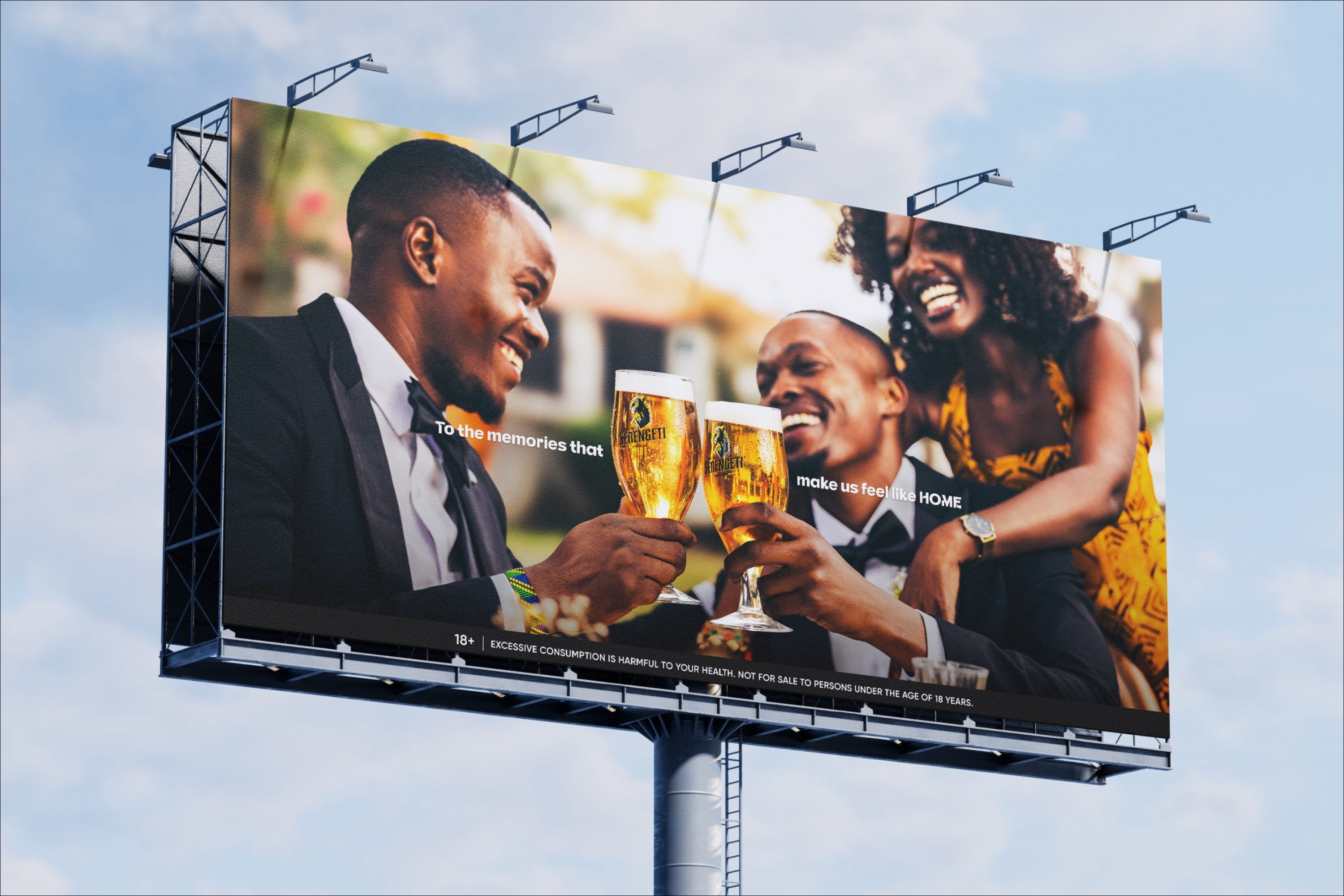
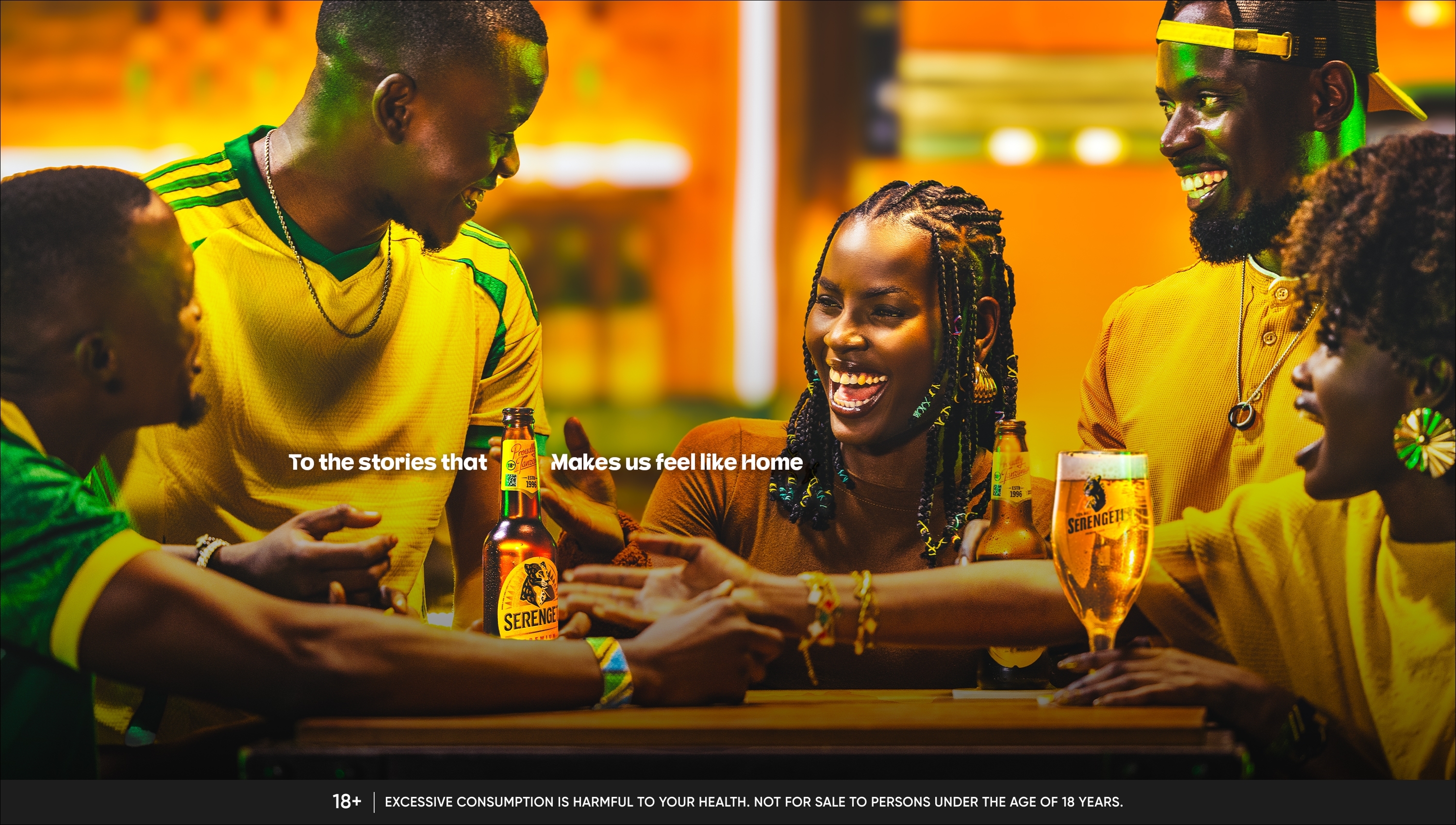
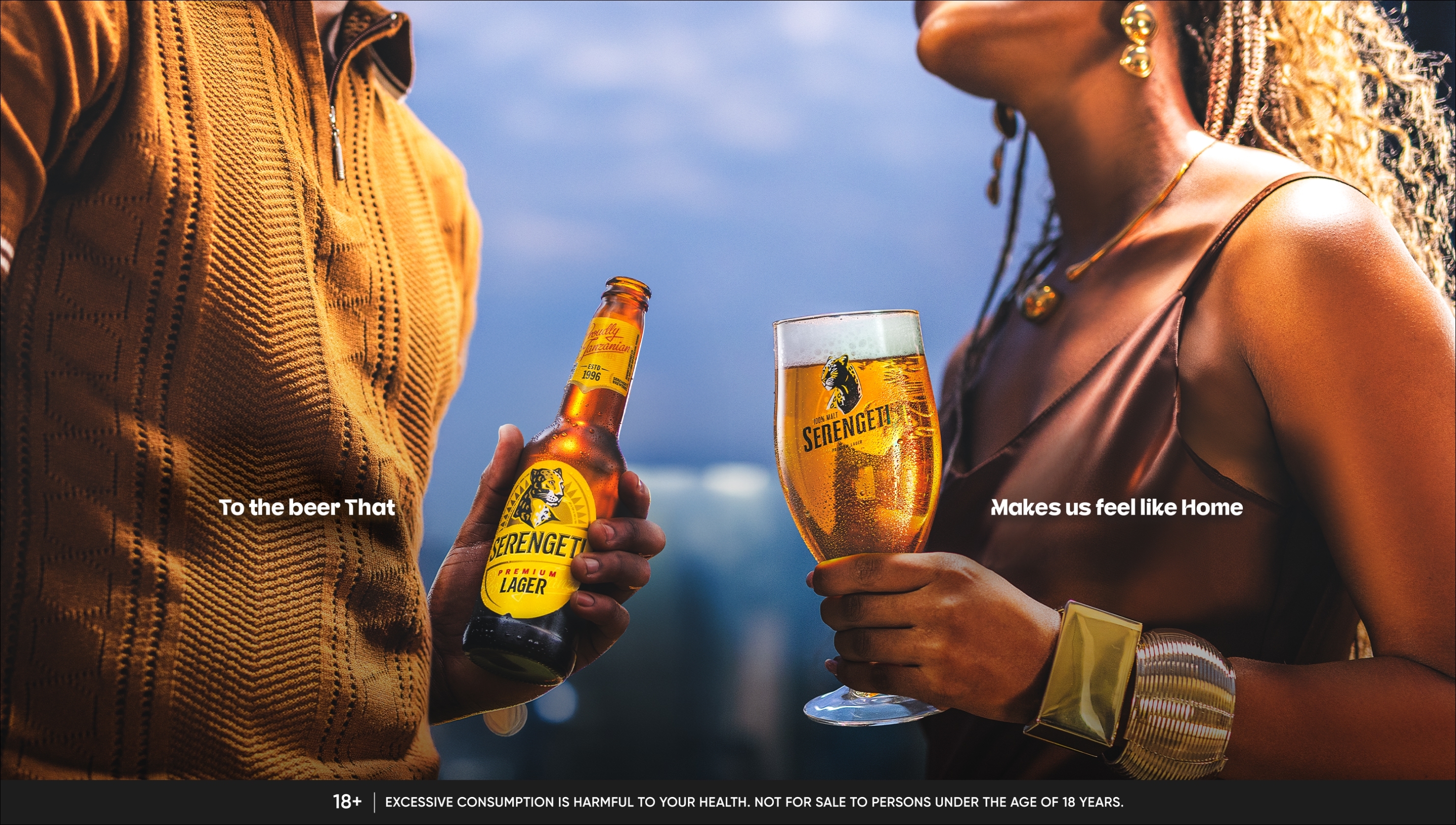
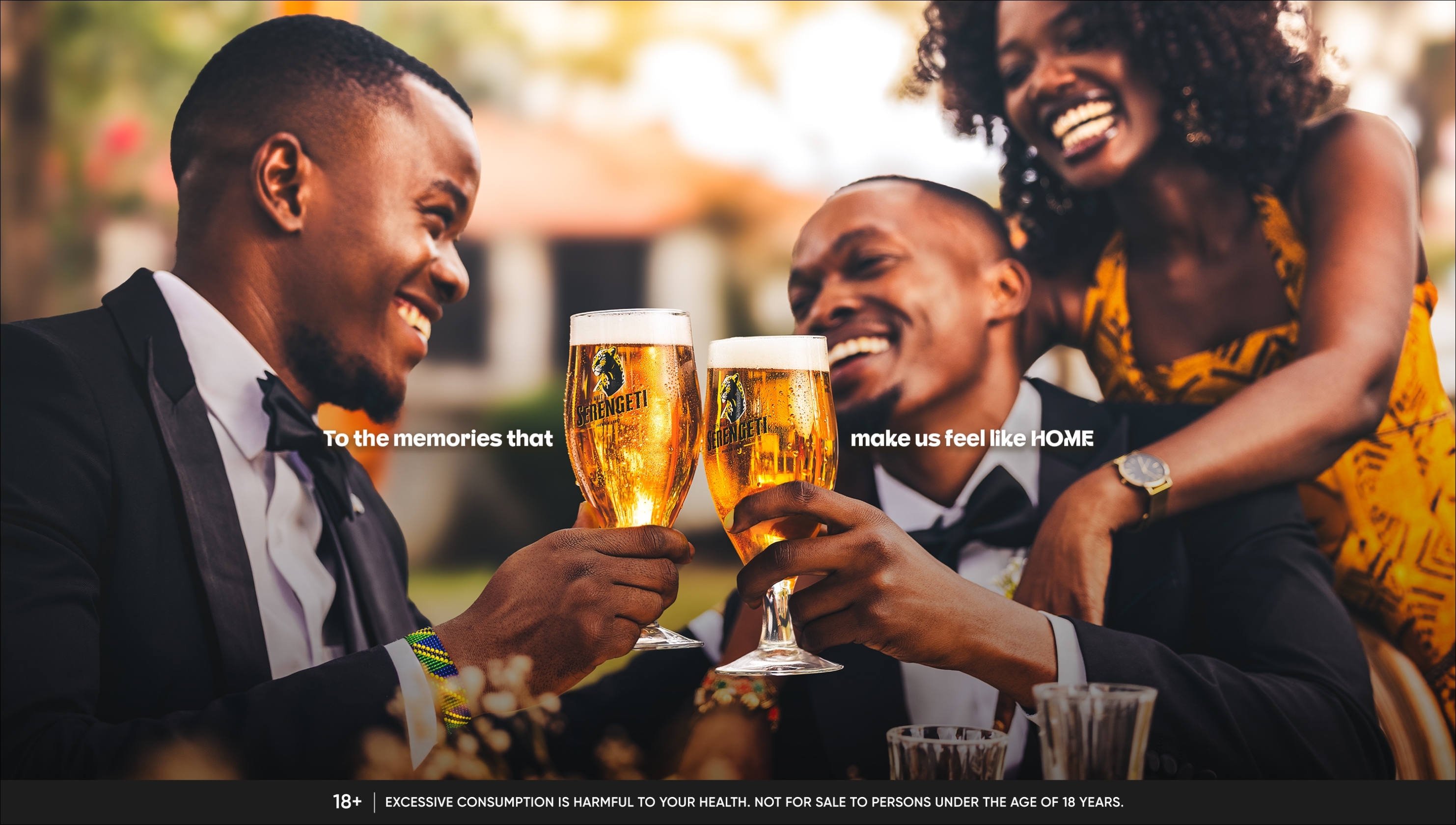
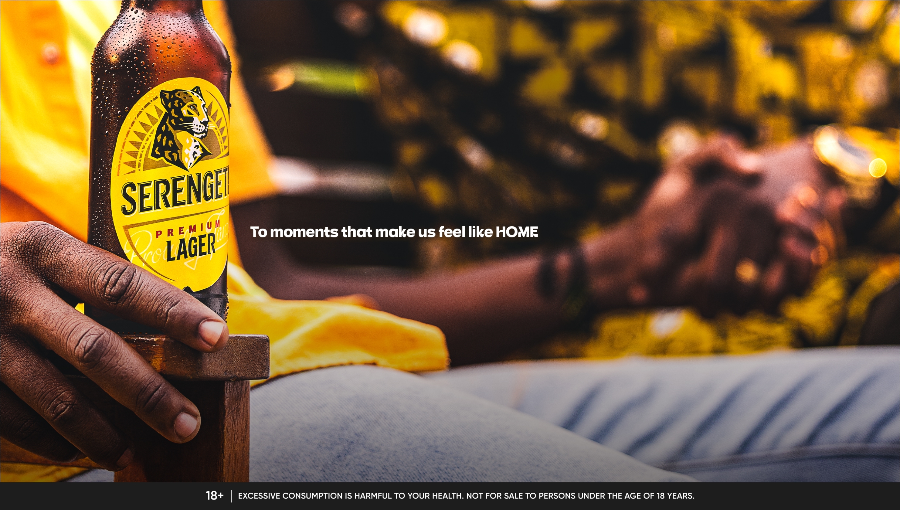
We had a campaign line with real weight: The Beer We Call Home. But without photography to match it, the line was just words. The brief was to build key visuals that felt unmistakably Tanzanian. Not images that sold a product, but images that held up a mirror to the people who drink it. Each frame had to feel found, not made. The idea was built around a single craft device: the beer glass as a literal mirror. In every image, the glass catches the light of the scene and reflects home back at the viewer. The beer doesn't interrupt the moment. It holds it. Yanga supporters lost in laughter. Two men in suits at a wedding, the weight of brotherhood in a single clink. A quiet afternoon: a hand, a bottle, warm light over kanga and wooden furniture. Natural light throughout. Shallow depth of field. Real Tanzanian people in real moments. The camera found the scene. Our Beer was already in it. Each visual carries one line of copy: To the stories / memories / moments that make us feel like HOME. The result is a photography system rooted in Tanzanian culture, built to scale from OOH billboards to point-of-sale, and strong enough to carry the brand idea.
We had a campaign line with real weight: The Beer We Call Home. But without photography to match it, the line was just words. The brief was to build key visuals that felt unmistakably Tanzanian. Not images that sold a product, but images that held up a mirror to the people who drink it. Each frame had to feel found, not made. The idea was built around a single craft device: the beer glass as a literal mirror. In every image, the glass catches the light of the scene and reflects home back at the viewer. The beer doesn't interrupt the moment. It holds it. Yanga supporters lost in laughter. Two men in suits at a wedding, the weight of brotherhood in a single clink. A quiet afternoon: a hand, a bottle, warm light over kanga and wooden furniture. Natural light throughout. Shallow depth of field. Real Tanzanian people in real moments. The camera found the scene. Our Beer was already in it. Each visual carries one line of copy: To the stories / memories / moments that make us feel like HOME. The result is a photography system rooted in Tanzanian culture, built to scale from OOH billboards to point-of-sale, and strong enough to carry the brand idea.
Project Innovation / Specification:
The innovation is a single, precise craft decision: using the beer glass as a reflective surface that becomes a window into the world around it. Most beverage advertising treats the product as a centrepiece. Here, the glass is a mirror. It catches the people, the light, the colour, and the warmth of the scene and reflects home back through the liquid. The product earns its place in the frame not by dominating it, but by organising its light. Every composition followed this principle. Natural light only. Shallow depth of field. The glass in critical focus while the Tanzanian world behind it softens into texture. The viewer's eye lands on Serengeti before it understands why. Typography was deliberately restrained: one line, one weight, one size, anchored to the frame. The copy finishes what the image starts. It does not explain what the viewer can already see. The result is a repeatable visual system. The same device, the same light logic, the same typographic restraint can generate new executions indefinitely without losing consistency. It does not depend on a specific photographer or setting. It depends on finding a real Tanzanian moment and placing our beer inside it.
The innovation is a single, precise craft decision: using the beer glass as a reflective surface that becomes a window into the world around it. Most beverage advertising treats the product as a centrepiece. Here, the glass is a mirror. It catches the people, the light, the colour, and the warmth of the scene and reflects home back through the liquid. The product earns its place in the frame not by dominating it, but by organising its light. Every composition followed this principle. Natural light only. Shallow depth of field. The glass in critical focus while the Tanzanian world behind it softens into texture. The viewer's eye lands on Serengeti before it understands why. Typography was deliberately restrained: one line, one weight, one size, anchored to the frame. The copy finishes what the image starts. It does not explain what the viewer can already see. The result is a repeatable visual system. The same device, the same light logic, the same typographic restraint can generate new executions indefinitely without losing consistency. It does not depend on a specific photographer or setting. It depends on finding a real Tanzanian moment and placing our beer inside it.
Project Sustainability Approach:
This visual system was built for longevity, not obsolescence. The design decisions made here, the reflective device, the natural light approach, the typographic restraint, create a framework that can generate new executions across years and seasons without requiring a complete redesign. Most campaign photography has a finite life. It is created for a specific moment, deploys, and is retired. This system was designed differently. The visual logic is repeatable by principle, not by formula. Any photographer working within the same brief and craft device can produce images that belong to the same family. This reduces the resource cost of future campaign production. New images can be created within the same system rather than rebuilding a design language from scratch each cycle. Beyond production sustainability, the work is culturally sustainable. It draws entirely from Tanzanian light, faces, fabric, and texture. It does not import a visual language from outside or impose an aesthetic the audience does not recognise as their own. These images will not age the way manufactured advertising ages. They were made to look taken, not made.
This visual system was built for longevity, not obsolescence. The design decisions made here, the reflective device, the natural light approach, the typographic restraint, create a framework that can generate new executions across years and seasons without requiring a complete redesign. Most campaign photography has a finite life. It is created for a specific moment, deploys, and is retired. This system was designed differently. The visual logic is repeatable by principle, not by formula. Any photographer working within the same brief and craft device can produce images that belong to the same family. This reduces the resource cost of future campaign production. New images can be created within the same system rather than rebuilding a design language from scratch each cycle. Beyond production sustainability, the work is culturally sustainable. It draws entirely from Tanzanian light, faces, fabric, and texture. It does not import a visual language from outside or impose an aesthetic the audience does not recognise as their own. These images will not age the way manufactured advertising ages. They were made to look taken, not made.
Local and Regional Impacts of the Project:
This work represents a shift in how consumer photography is made for the East African market. Rather than importing a visual aesthetic from outside the continent, the system is built entirely from Tanzanian raw material: its light, its people, its culture. The work gives a proudly Tanzanian brand a visual language that is equally proud. Our Premium beer has been part of Tanzanian life since 1996. These images show what that actually looks like. The broader signal to the region: locally rooted craft can carry the same weight as international production. African moments do not need to be filtered through an outside lens to be beautiful, credible, or award-worthy. The campaign activated across Tanzania, from Dar es Salaam to Moshi, anchoring OOH, point-of-sale, digital, and print.
This work represents a shift in how consumer photography is made for the East African market. Rather than importing a visual aesthetic from outside the continent, the system is built entirely from Tanzanian raw material: its light, its people, its culture. The work gives a proudly Tanzanian brand a visual language that is equally proud. Our Premium beer has been part of Tanzanian life since 1996. These images show what that actually looks like. The broader signal to the region: locally rooted craft can carry the same weight as international production. African moments do not need to be filtered through an outside lens to be beautiful, credible, or award-worthy. The campaign activated across Tanzania, from Dar es Salaam to Moshi, anchoring OOH, point-of-sale, digital, and print.