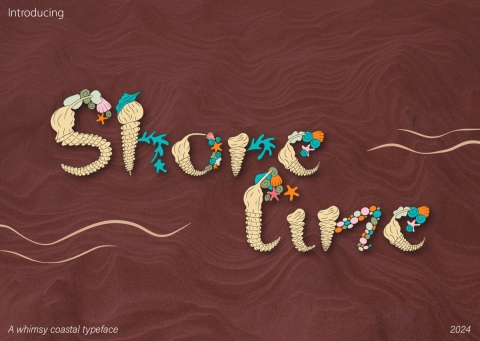
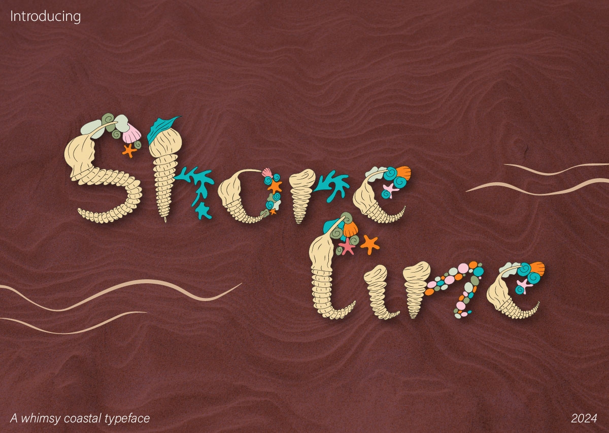
Shoreline Typeface
Prize(s):
WINNER 2026 Print & Digital / Other Graphics
School / University Name:Vega School at Emeris
Lead Designer(s) Name(s):Waseela Khan
Professor Name(s):Vian Roos
Design Status:Concept
Project Description:
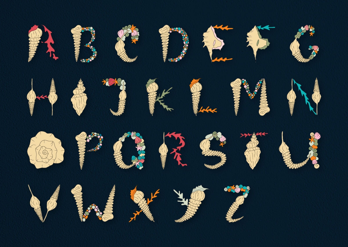
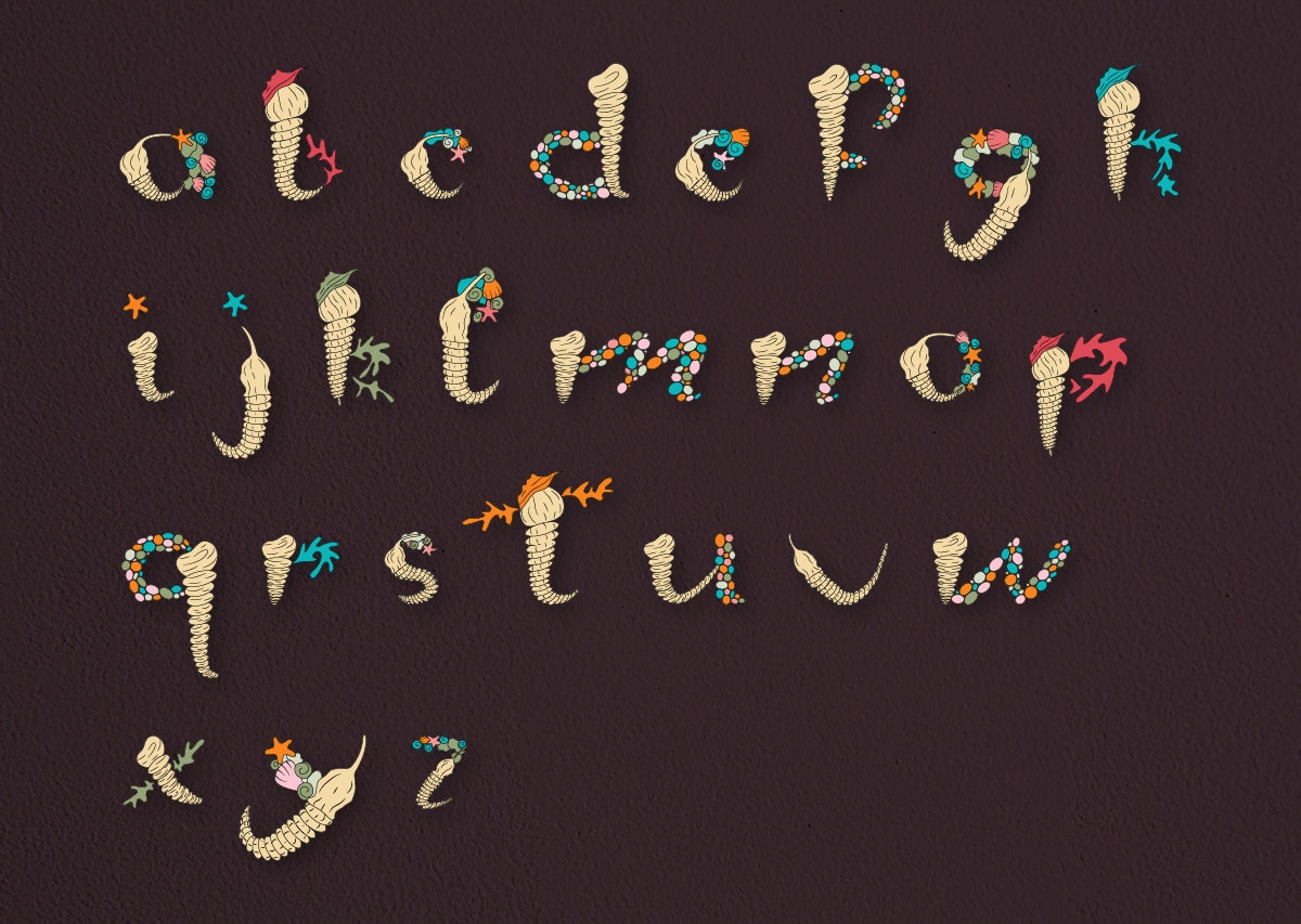
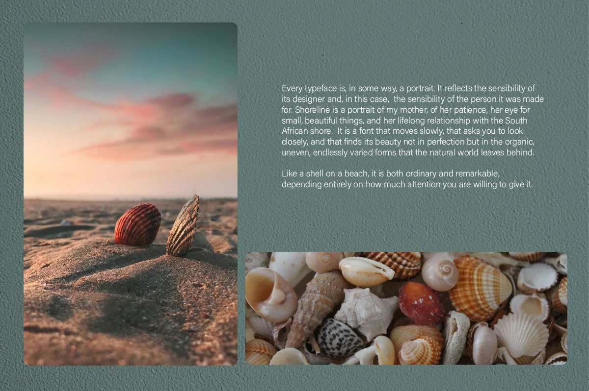
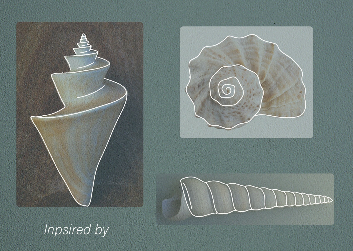
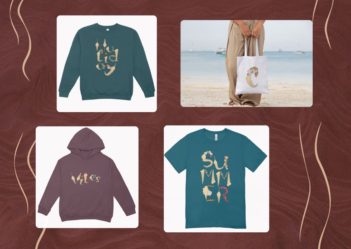
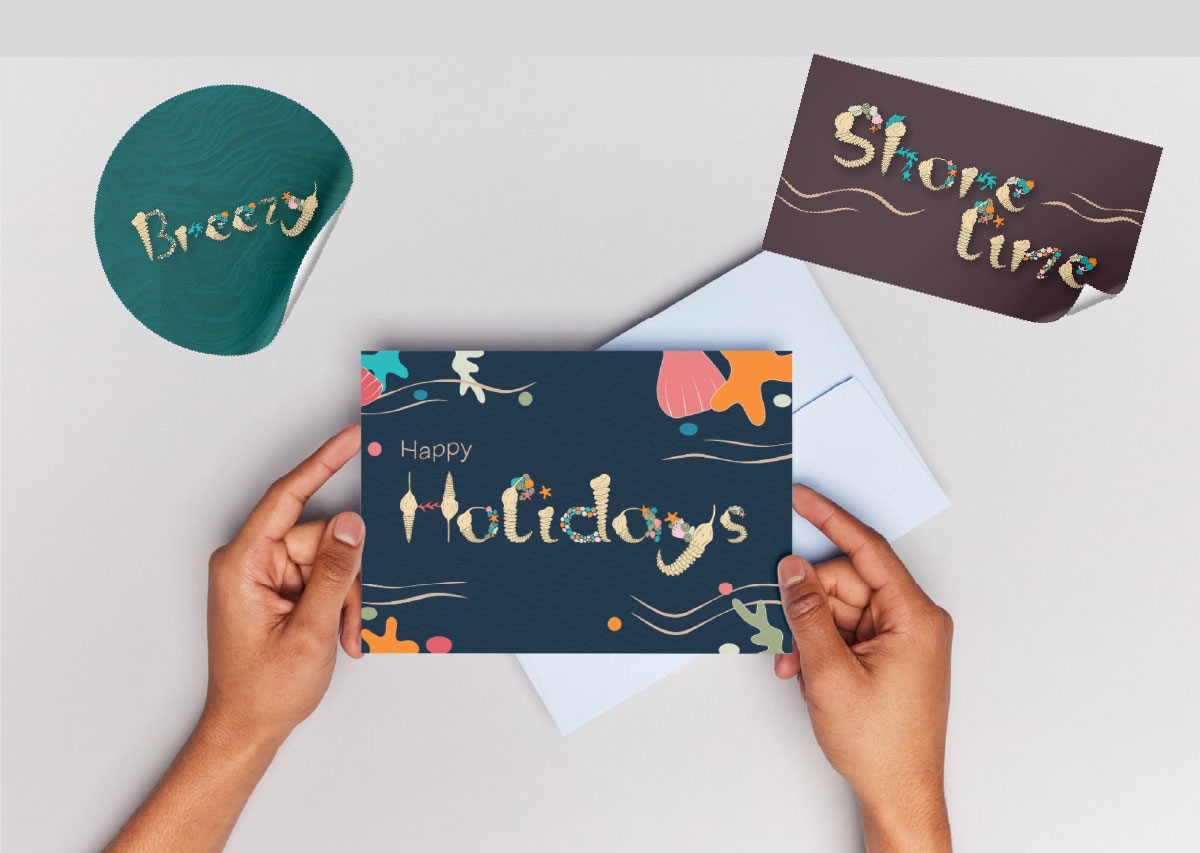
This project required us to design a completely original typeface for someone close to us. A font designed with a specific person in mind, shaped by who they are, what they love, and the world they carry with them. For me, the choice was immediate. My mother has always been drawn to the ocean. It is her way of de-stressing and finding peace within herself. She particularly loves collecting shells and unique rocks. Designing a typeface for her meant designing something that felt like her, unhurried, tactile, and full of quiet detail. Shoreline is a record of what a South African beach actually looks like when you pay close attention to it. Every letterform in Shoreline is constructed from the structural language of shells and coastal sea life. The vertical strokes and stems of each letter are formed from the ribbed, spiralling bodies of auger and turritella shells that have a natural elegance and a strong visual rhythm. It is a typeface designed to be seen large, where the detail of each letter can be appreciated. Its natural home is in contexts that value craft, nature, and handmade warmth.
This project required us to design a completely original typeface for someone close to us. A font designed with a specific person in mind, shaped by who they are, what they love, and the world they carry with them. For me, the choice was immediate. My mother has always been drawn to the ocean. It is her way of de-stressing and finding peace within herself. She particularly loves collecting shells and unique rocks. Designing a typeface for her meant designing something that felt like her, unhurried, tactile, and full of quiet detail. Shoreline is a record of what a South African beach actually looks like when you pay close attention to it. Every letterform in Shoreline is constructed from the structural language of shells and coastal sea life. The vertical strokes and stems of each letter are formed from the ribbed, spiralling bodies of auger and turritella shells that have a natural elegance and a strong visual rhythm. It is a typeface designed to be seen large, where the detail of each letter can be appreciated. Its natural home is in contexts that value craft, nature, and handmade warmth.
Lead Designer(s) Name(s):Waseela Khan