Discovery x Nandos Vitality Chicken Run
Prize(s):
WINNER 2026 Print & Digital / Corporate Identity
Lead Designer(s) Name(s):Tshepo Masilo
Client Name:Discovery Vitality
Photo Credit:Tshepo Masilo
Project Location:Johannesburg
Design Status:Commercialized
Website: View
Project Description:
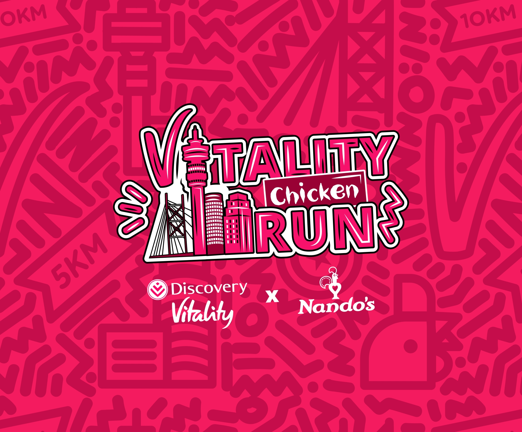
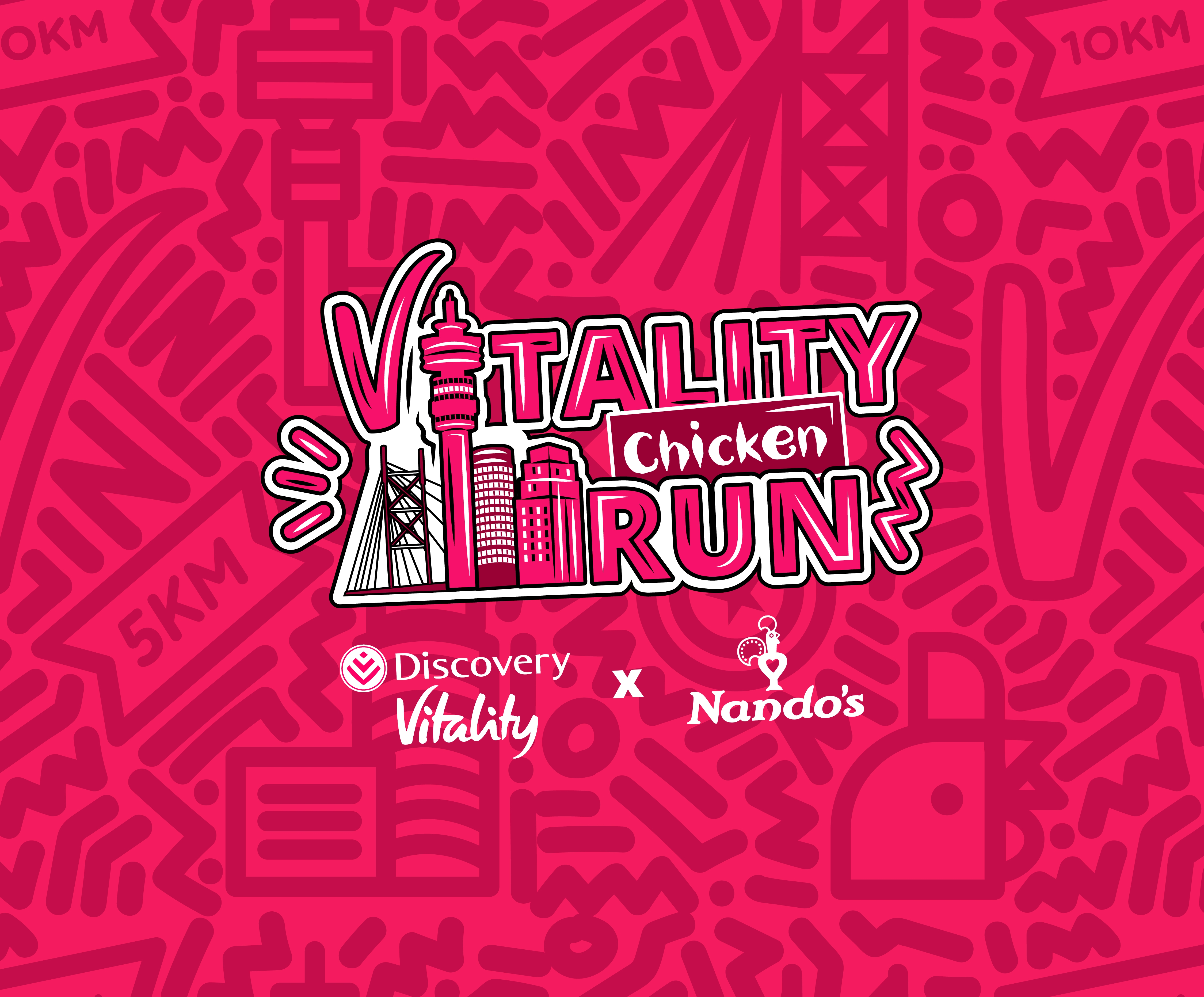
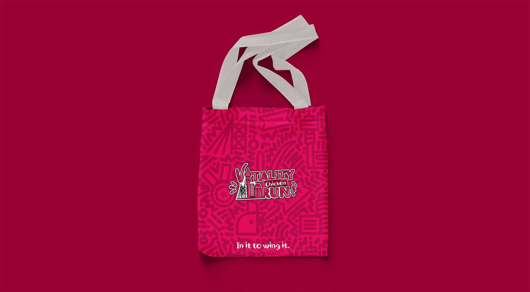
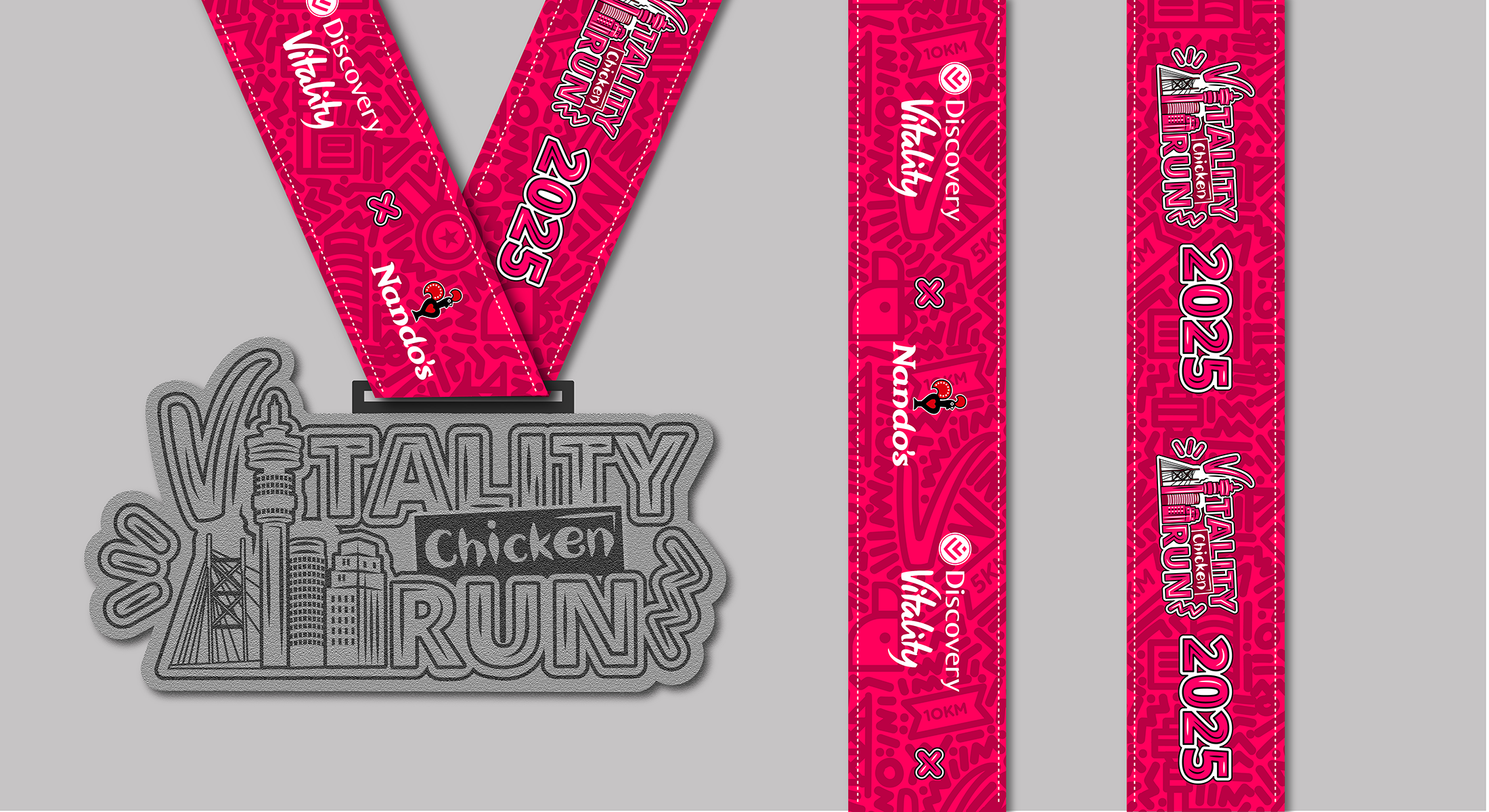
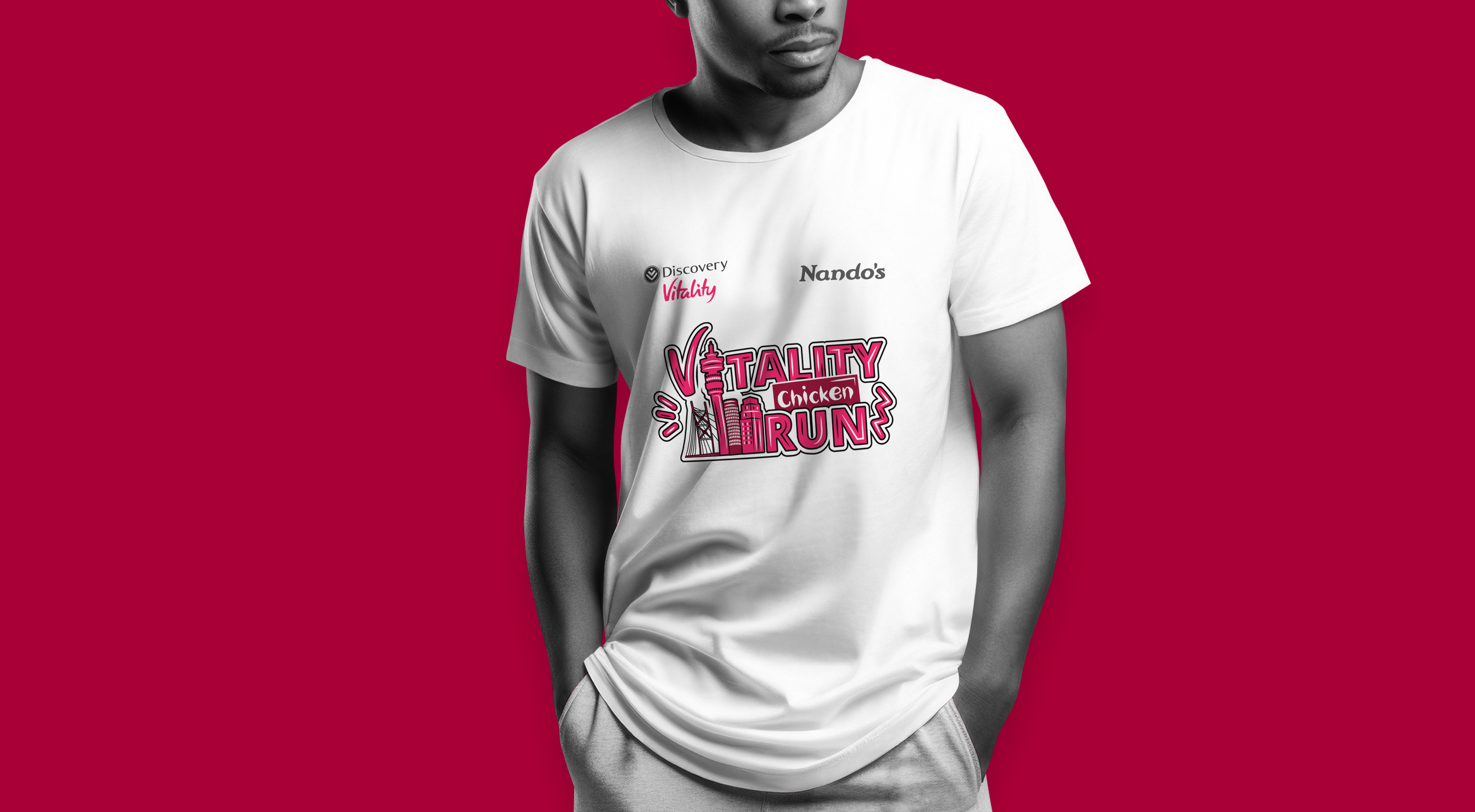
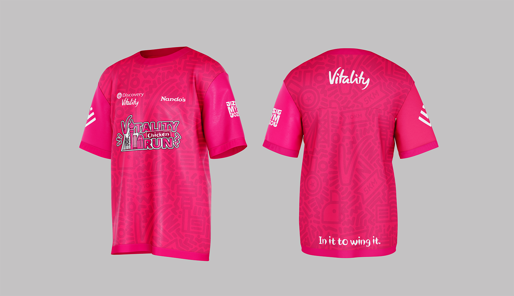
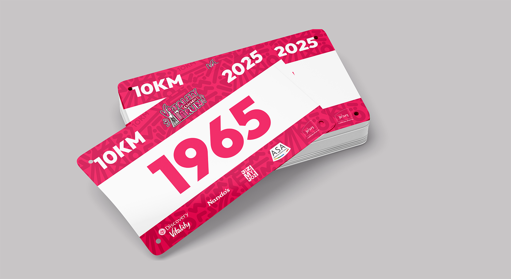
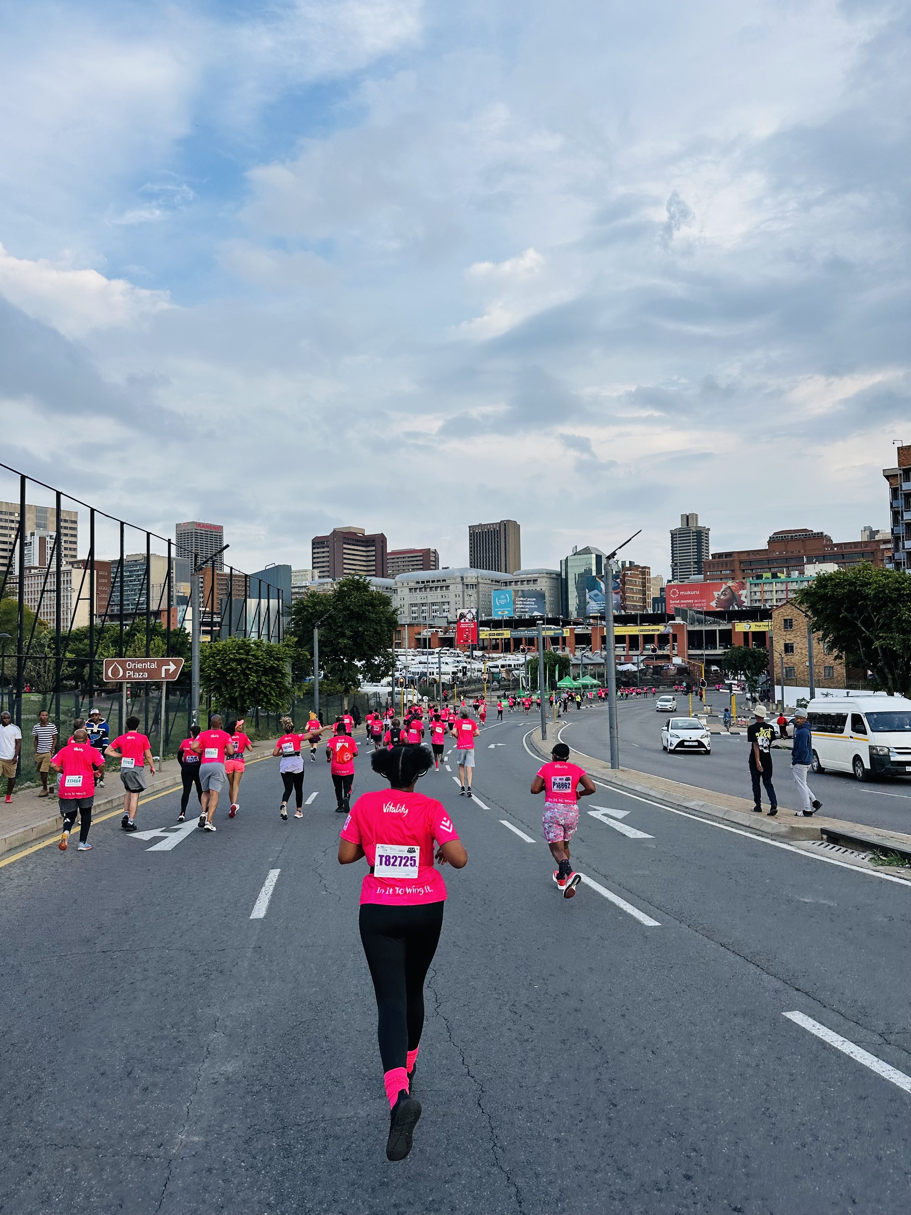
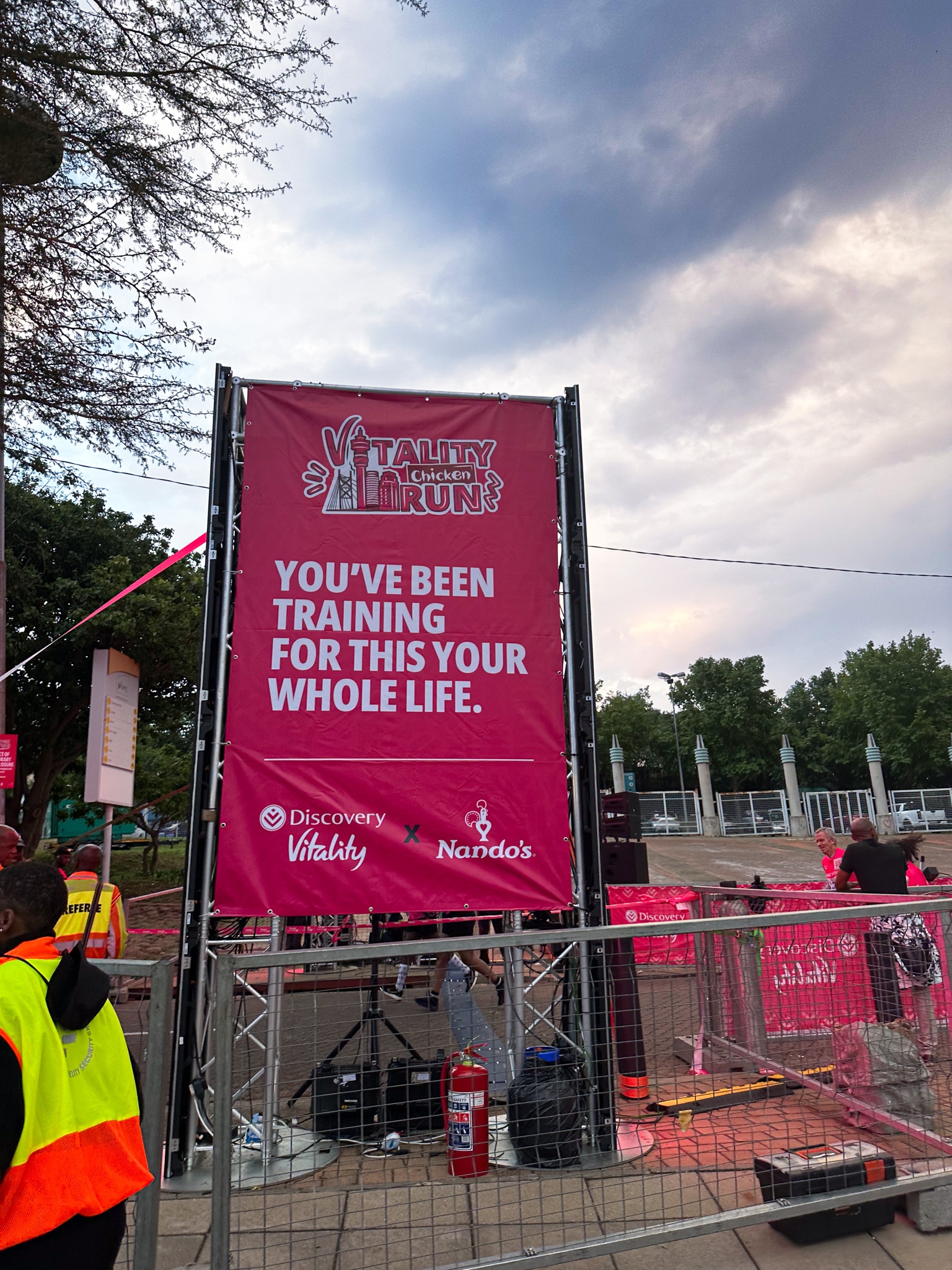
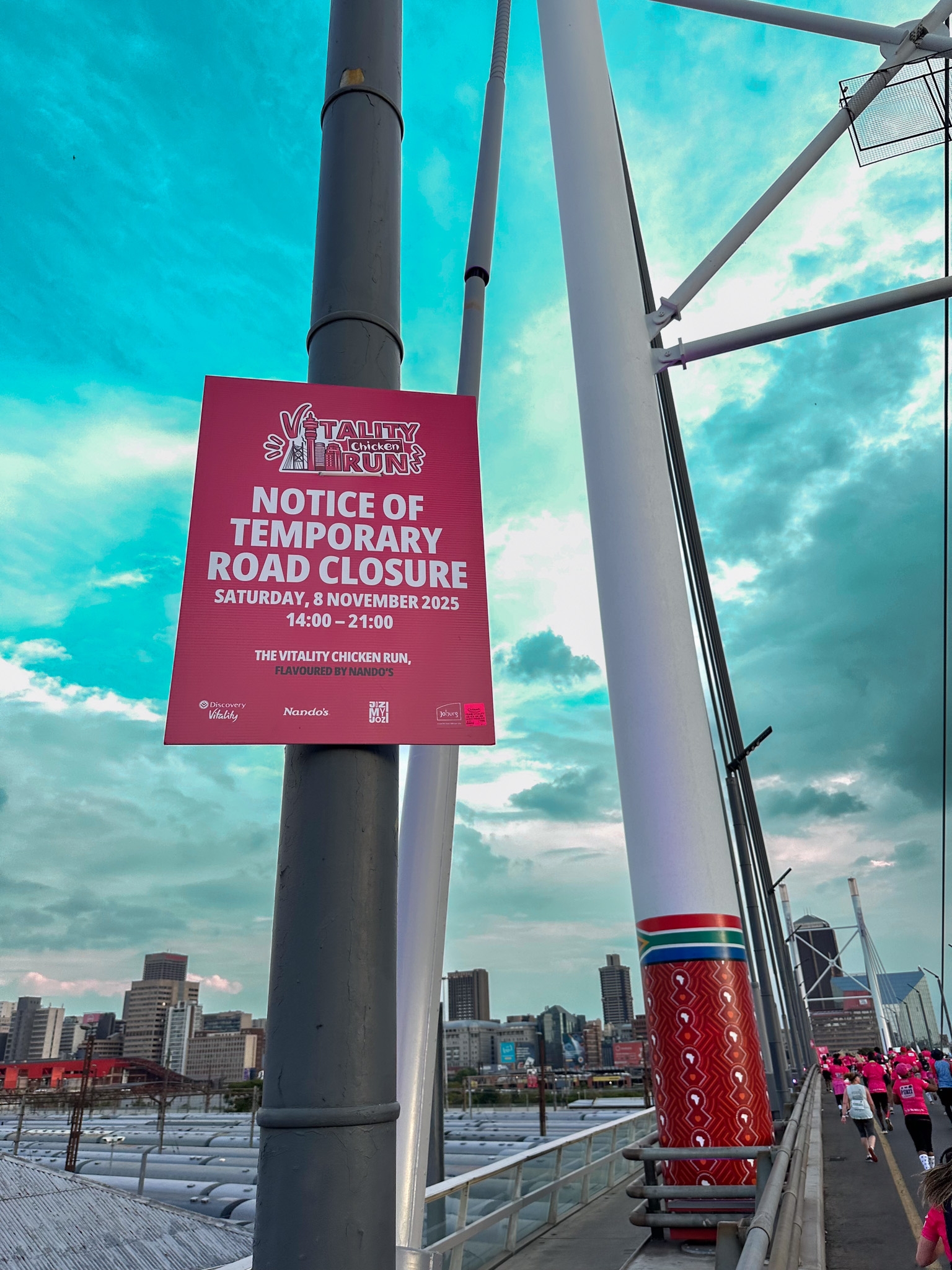
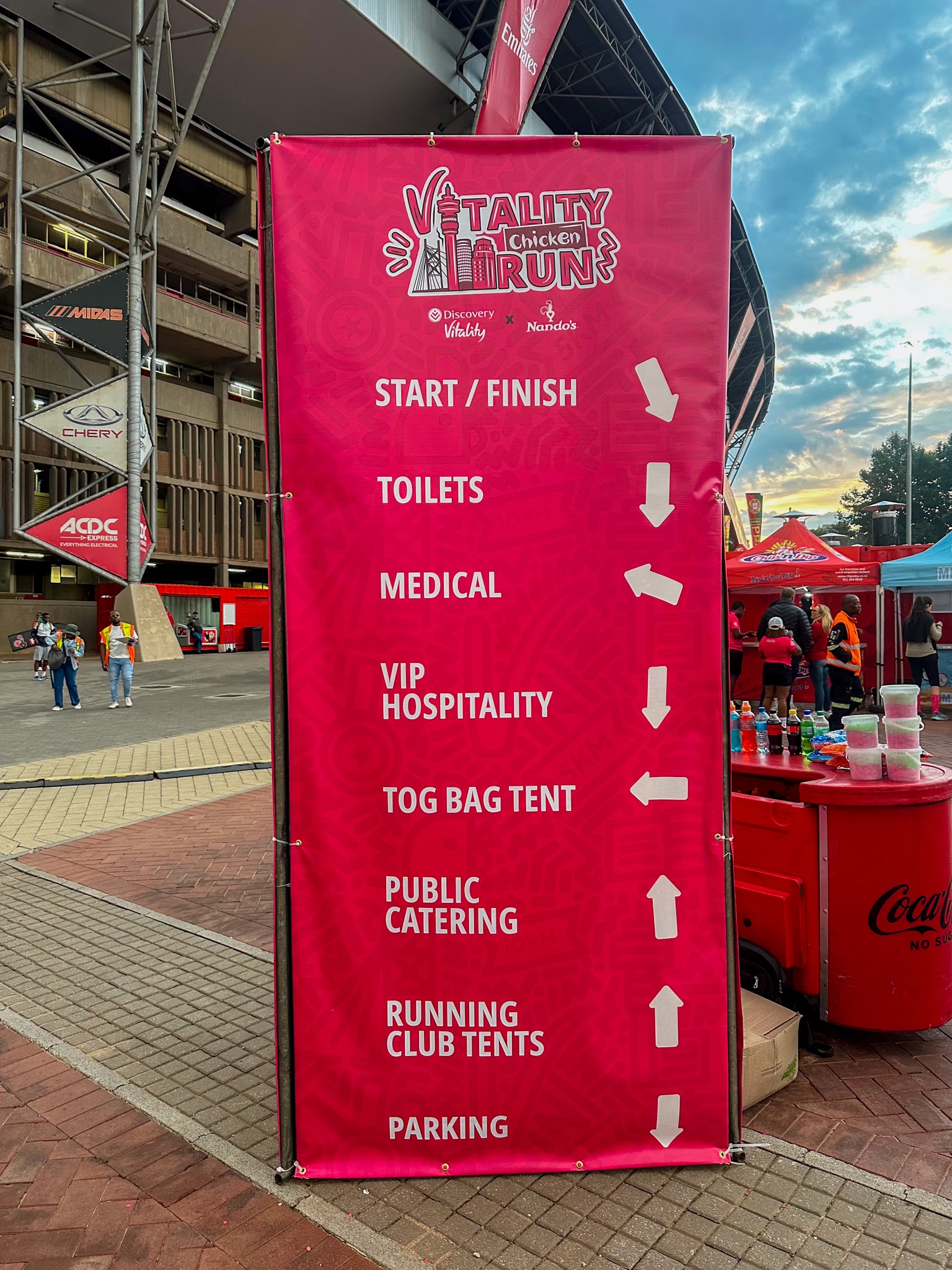
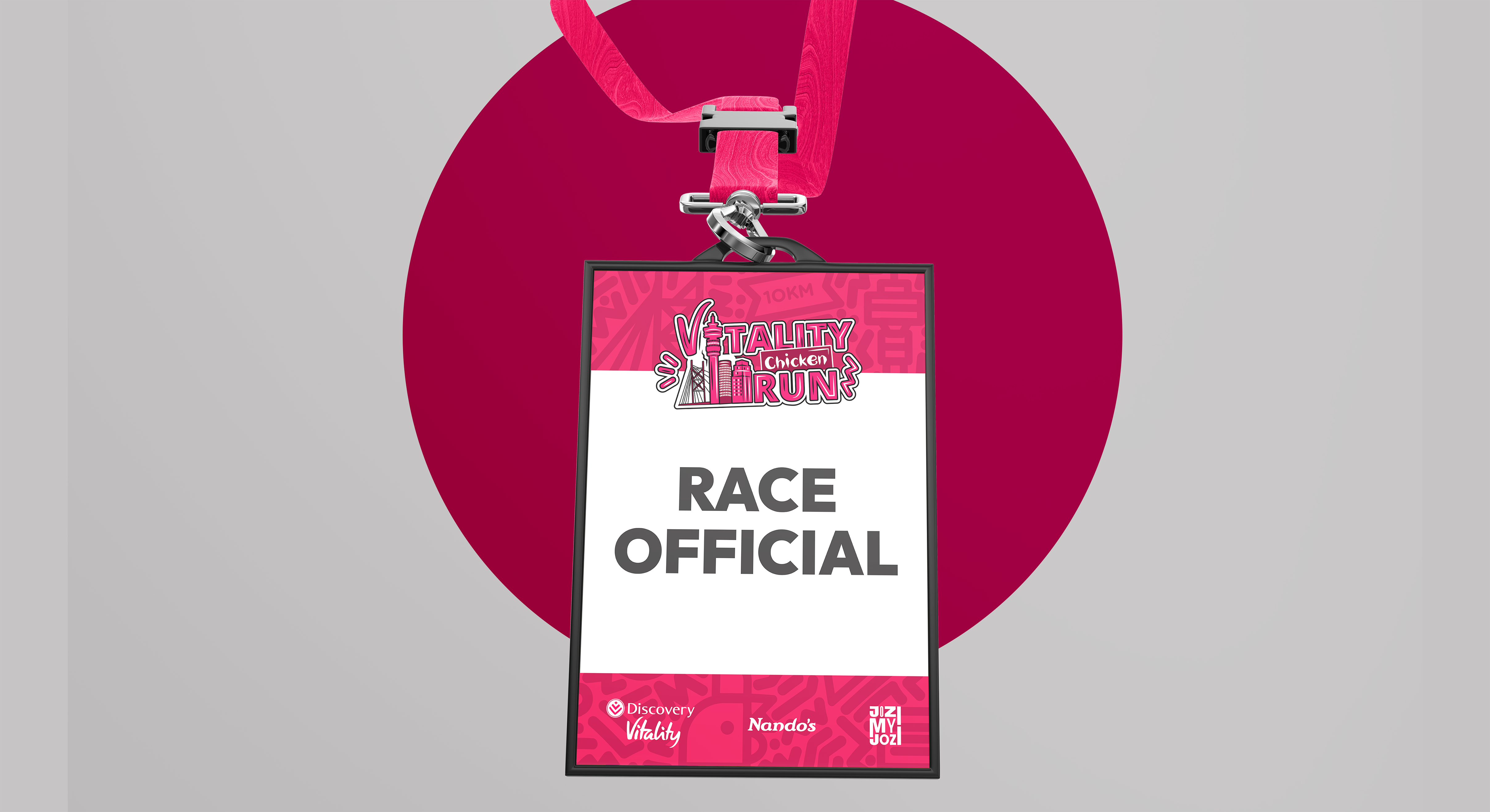
The Discovery Vitality x Nando’s Chicken Run was a corporate identity project created for a Johannesburg night run that brought together two of South Africa’s most recognisable brands. The challenge was to create one event identity that could hold Discovery Vitality’s sense of energy and movement alongside Nando’s humour and heat, while making sure the final result still felt balanced and clearly led by Vitality. Beyond the logo itself, the project was developed as a flexible visual language that could extend across campaign material, event branding, merchandise, medals and a mini expression guide. Rooted in the spirit of Jozi and the event’s playful positioning, the final identity gave the run a bold, local and memorable presence that felt more like a cultural moment than a standard corporate event.
The Discovery Vitality x Nando’s Chicken Run was a corporate identity project created for a Johannesburg night run that brought together two of South Africa’s most recognisable brands. The challenge was to create one event identity that could hold Discovery Vitality’s sense of energy and movement alongside Nando’s humour and heat, while making sure the final result still felt balanced and clearly led by Vitality. Beyond the logo itself, the project was developed as a flexible visual language that could extend across campaign material, event branding, merchandise, medals and a mini expression guide. Rooted in the spirit of Jozi and the event’s playful positioning, the final identity gave the run a bold, local and memorable presence that felt more like a cultural moment than a standard corporate event.
Project Innovation / Specification:
The innovation in this project came from turning a co branded brief into one unified identity rather than a simple sponsorship lockup. The Discovery Vitality V was integrated into the creative language to keep Vitality present and leading, while the word “Chicken” used Nando’s distinctive font style to bring in the brand’s humour and recognisable character. This created a mark that balanced both brands in a clear and intentional way. The identity was also shaped by Johannesburg itself. Instead of creating a generic race logo, the creative drew from the city and the landmarks runners would pass during the event, including Nelson Mandela Bridge and Ponte City. By combining brand balance with local relevance, the final identity became more than a campaign mark. It became a visual expression of the event’s real setting, energy and spirit.
The innovation in this project came from turning a co branded brief into one unified identity rather than a simple sponsorship lockup. The Discovery Vitality V was integrated into the creative language to keep Vitality present and leading, while the word “Chicken” used Nando’s distinctive font style to bring in the brand’s humour and recognisable character. This created a mark that balanced both brands in a clear and intentional way. The identity was also shaped by Johannesburg itself. Instead of creating a generic race logo, the creative drew from the city and the landmarks runners would pass during the event, including Nelson Mandela Bridge and Ponte City. By combining brand balance with local relevance, the final identity became more than a campaign mark. It became a visual expression of the event’s real setting, energy and spirit.
Project Sustainability Approach:
Sustainability in this project was approached through long term thinking rather than materials alone. The identity was developed as a scalable visual system that could be applied consistently across multiple touchpoints, from marketing and merchandise to medals and event branding, helping reduce unnecessary redesign and create lasting value beyond a single use moment. The project also aligned with a wider social purpose through the event’s contribution to JoziMyJozi and its work in revitalising Johannesburg’s inner city, connecting the brand identity to a broader story of participation, place and positive local impact.
Sustainability in this project was approached through long term thinking rather than materials alone. The identity was developed as a scalable visual system that could be applied consistently across multiple touchpoints, from marketing and merchandise to medals and event branding, helping reduce unnecessary redesign and create lasting value beyond a single use moment. The project also aligned with a wider social purpose through the event’s contribution to JoziMyJozi and its work in revitalising Johannesburg’s inner city, connecting the brand identity to a broader story of participation, place and positive local impact.
Local and Regional Impacts of the Project:
Locally, the project gave the event a clear Johannesburg identity by drawing from the city’s landmarks, energy and everyday culture, making the run feel rooted in place and more relatable to the people taking part. This helped turn the branding into more than promotion, creating a stronger emotional link between the event and the city itself. Regionally, the project demonstrated how two major South African brands could be brought together through a culturally relevant and accessible identity system. It showed how corporate event branding can feel local, human and socially connected, while also supporting a wider cause through the event’s link to JoziMyJozi and inner city upliftment
Locally, the project gave the event a clear Johannesburg identity by drawing from the city’s landmarks, energy and everyday culture, making the run feel rooted in place and more relatable to the people taking part. This helped turn the branding into more than promotion, creating a stronger emotional link between the event and the city itself. Regionally, the project demonstrated how two major South African brands could be brought together through a culturally relevant and accessible identity system. It showed how corporate event branding can feel local, human and socially connected, while also supporting a wider cause through the event’s link to JoziMyJozi and inner city upliftment
Lead Designer(s) Name(s):Tshepo Masilo