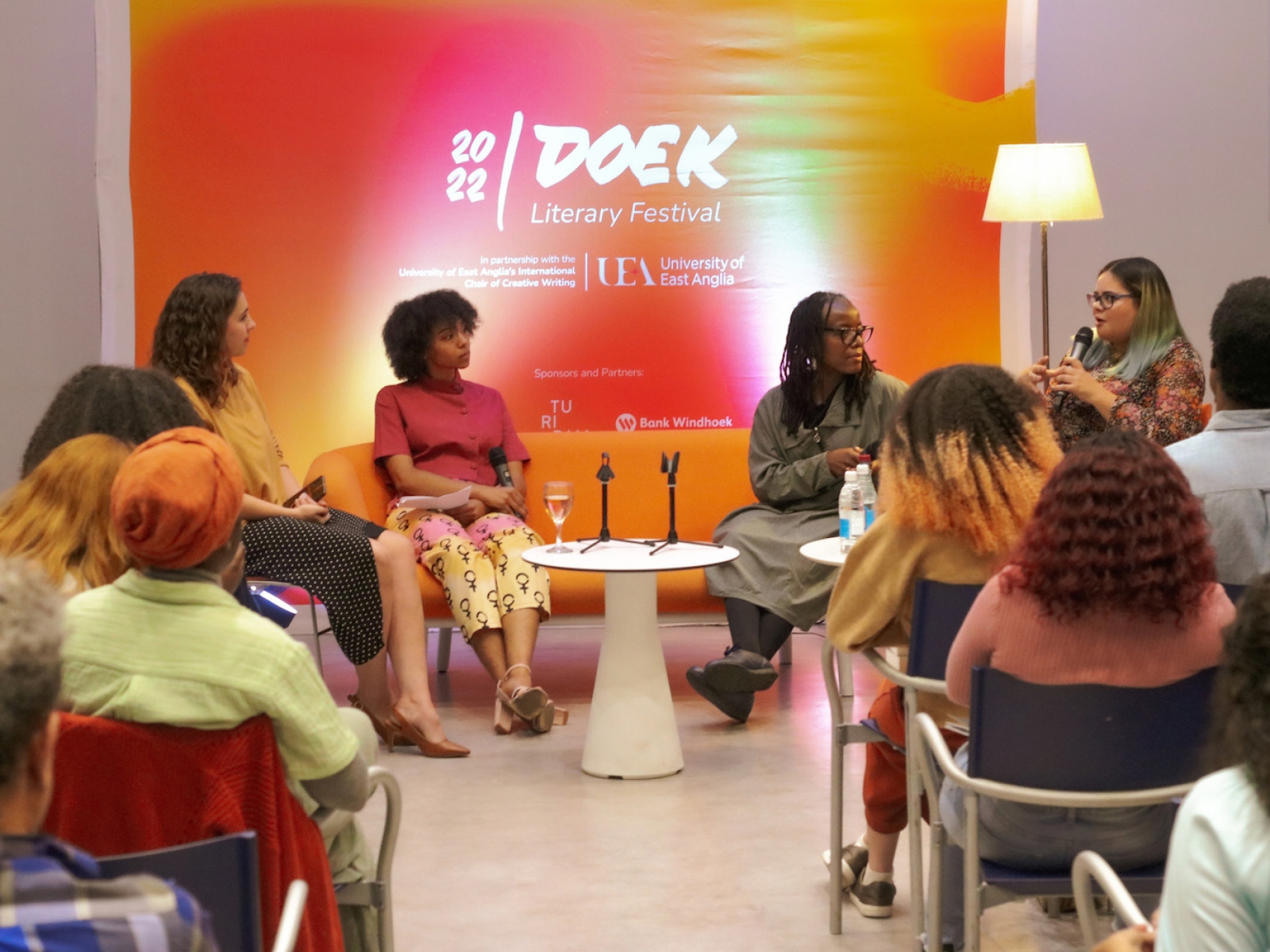

2022 Doek Literary Festival
Prize(s):
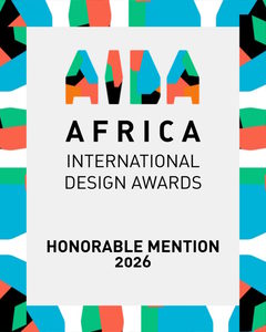
Honorable Mention 2026 Print & Digital / Other Graphics
Company Name:Turipamwe Design Trading
Lead Designer(s) Name(s):Elrico Gawanab, Tanya Stroh
Design Team / Other designer(s):Dudley Minnie, Jean-Claude Tjitamunisa
Other Contributor(s):Hand lettering: Oom Punch
Client Name:Doek Arts Trust, Rémy Ngamije, in partnership with University of East Anglia’s International Chair
Photo Credit:Jean-Claude Tjitamunisa, Elrico Gawanab, Namafu Amutse
Project Location:Windhoek, Namibia
Design Status:Commercialized
Website: View
Project Description:
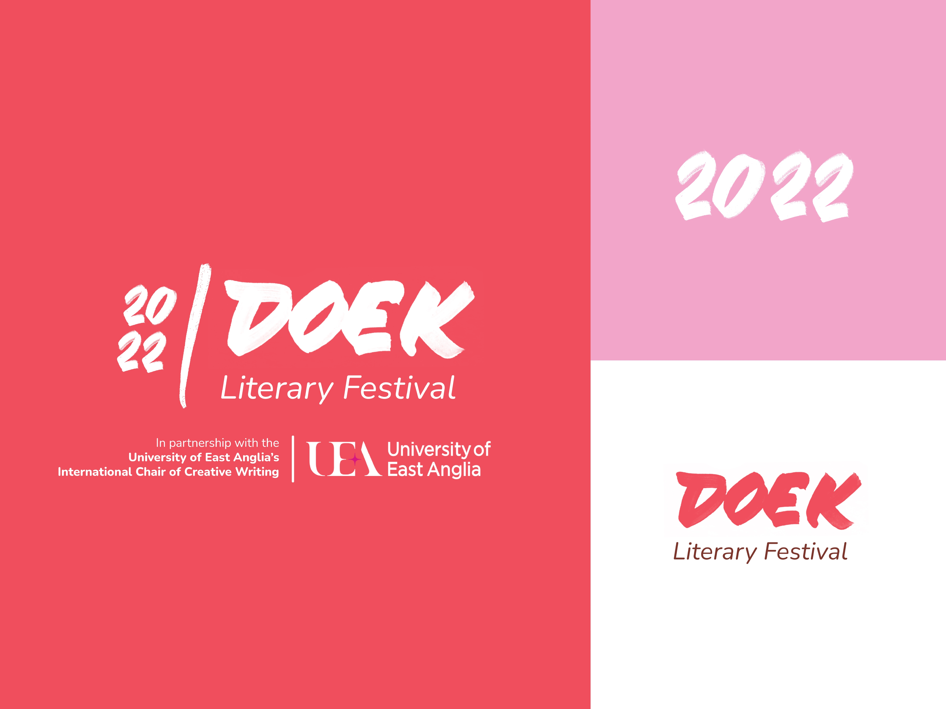
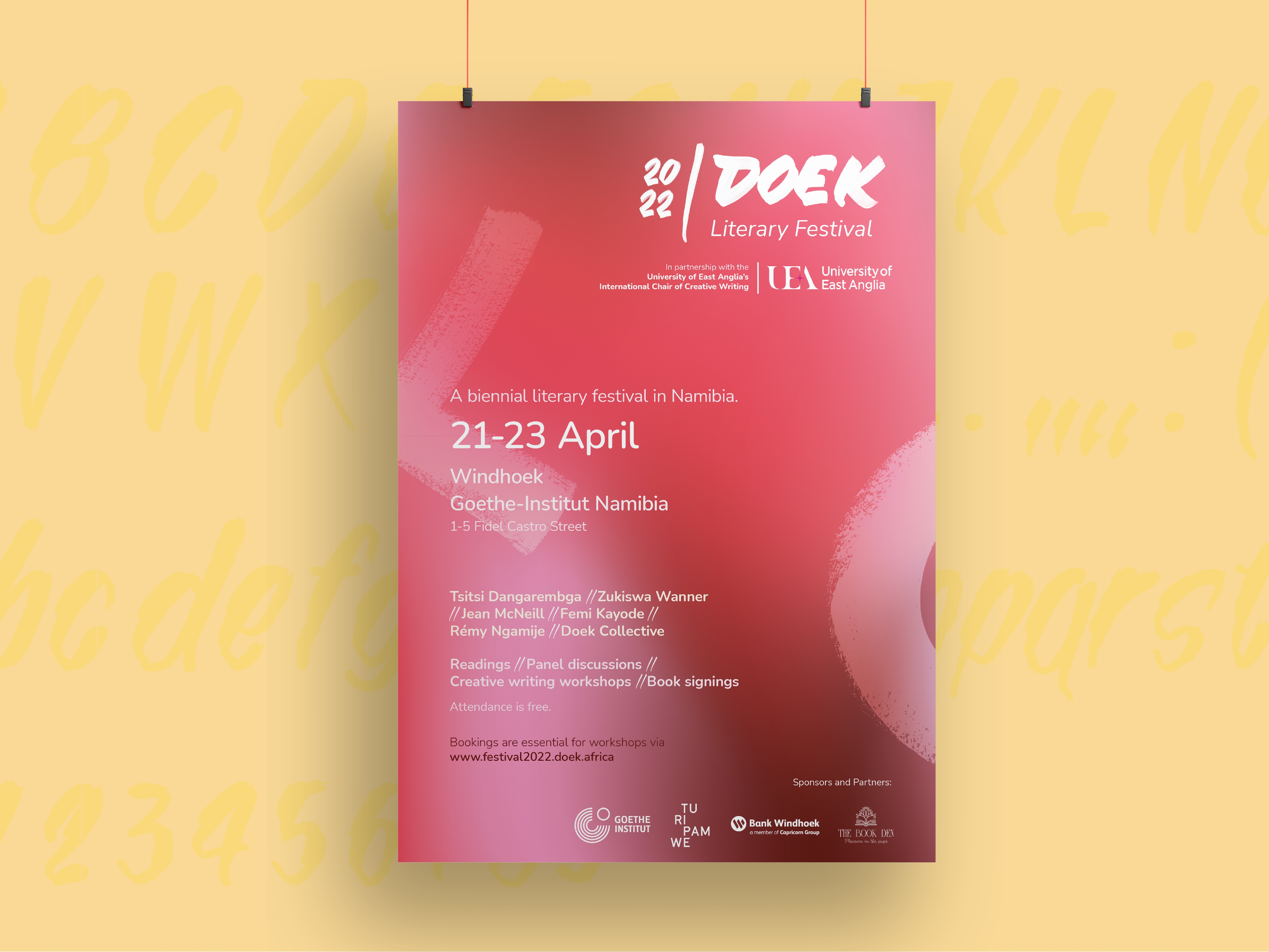
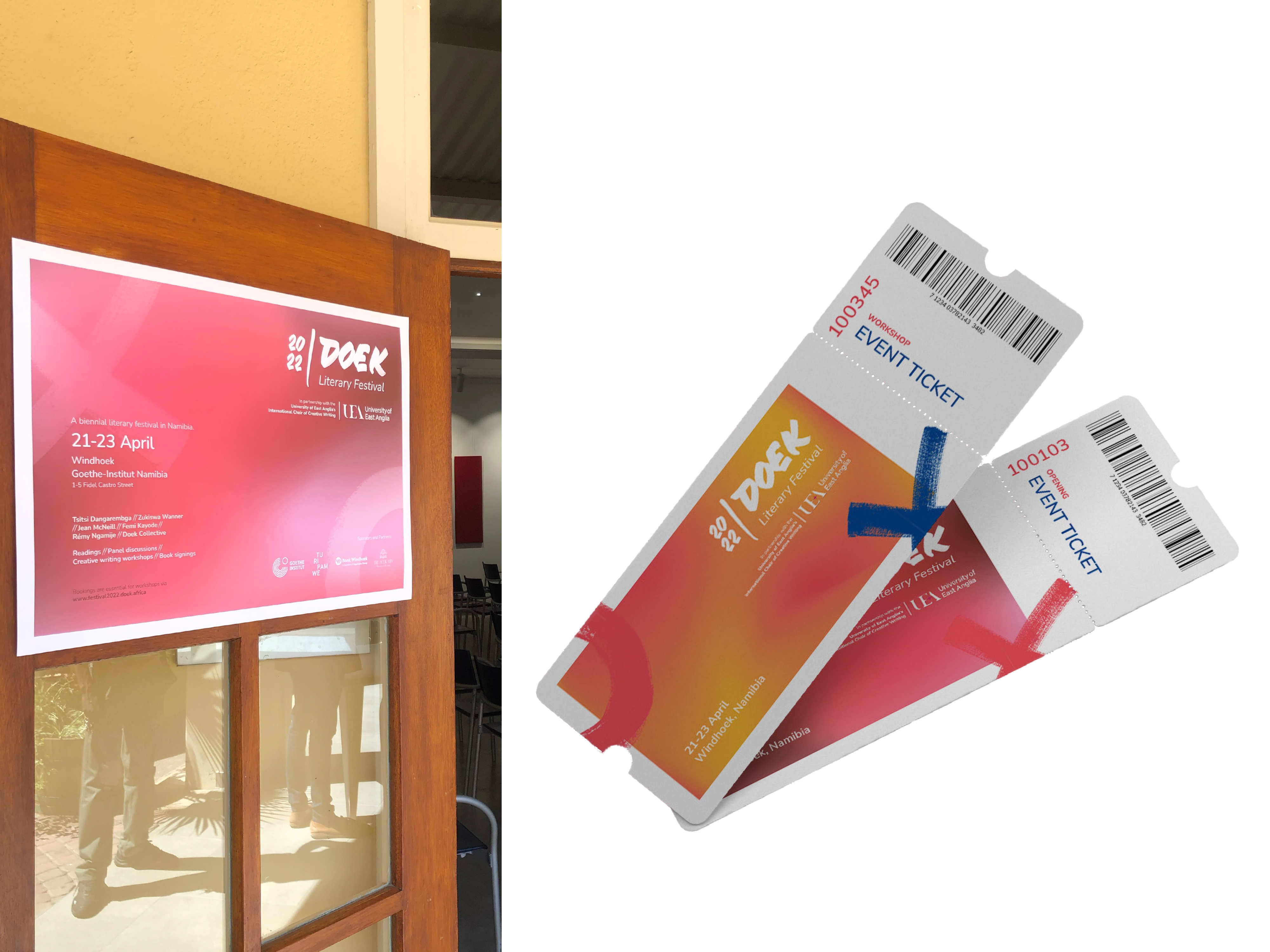
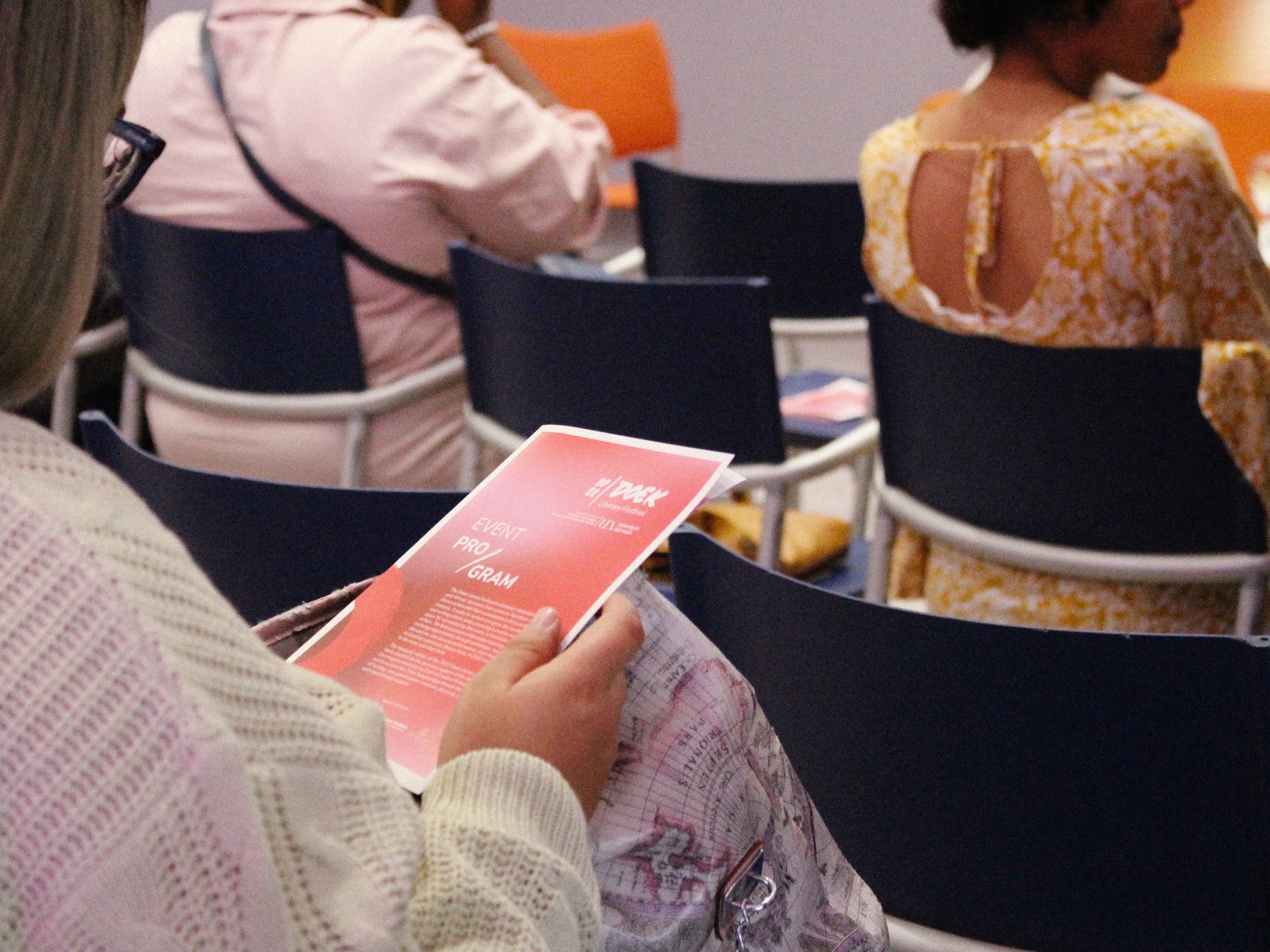
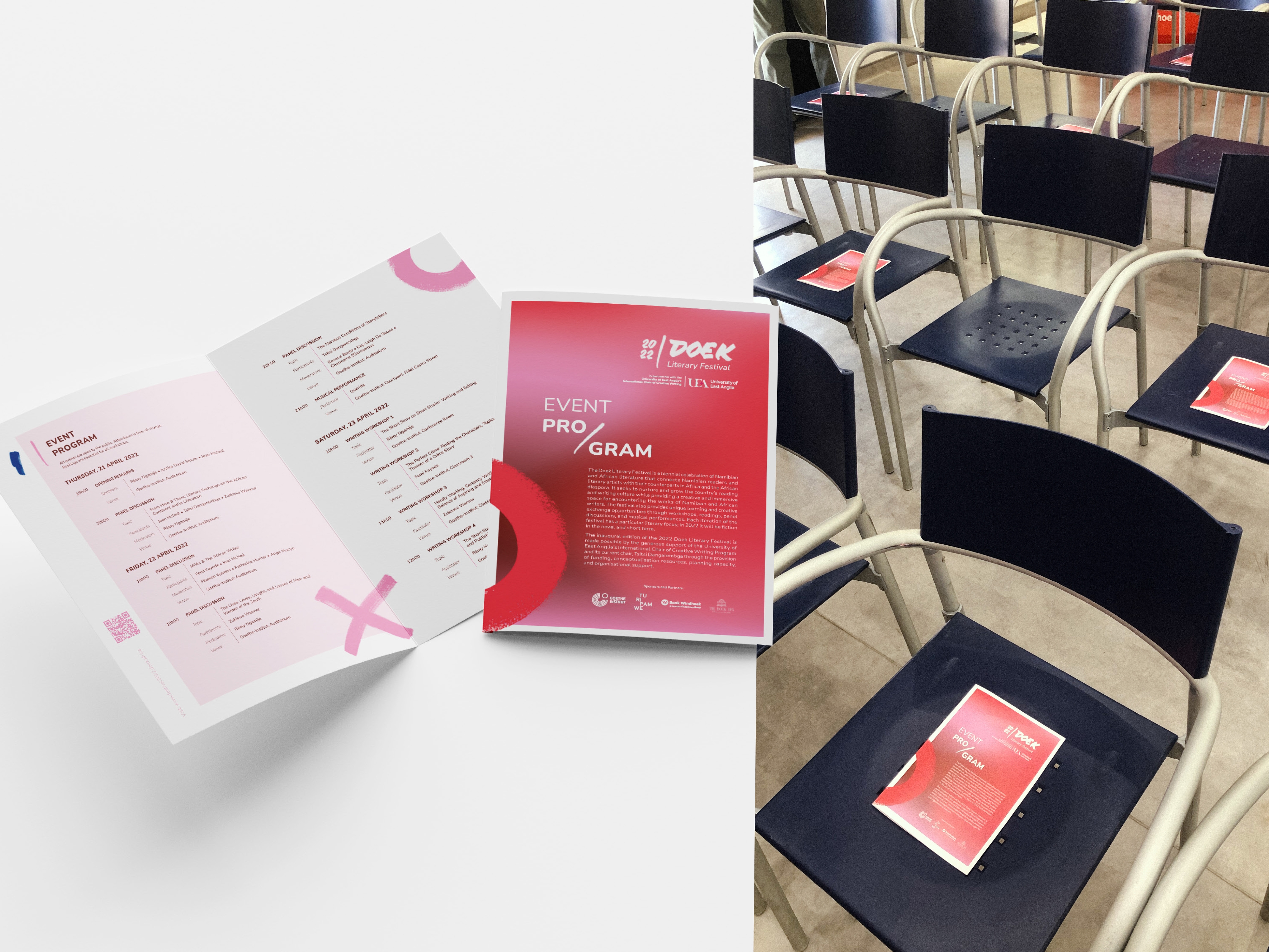
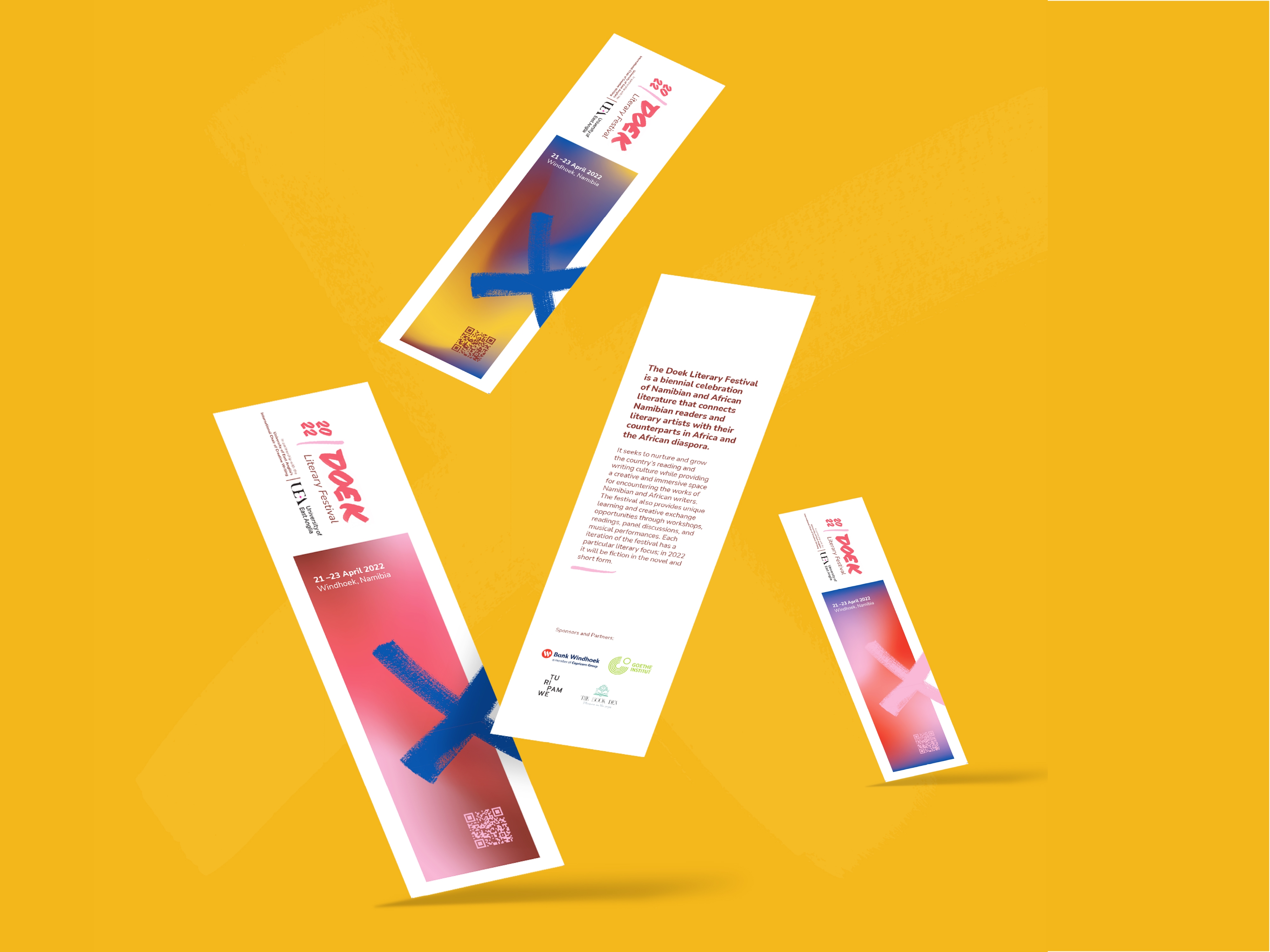
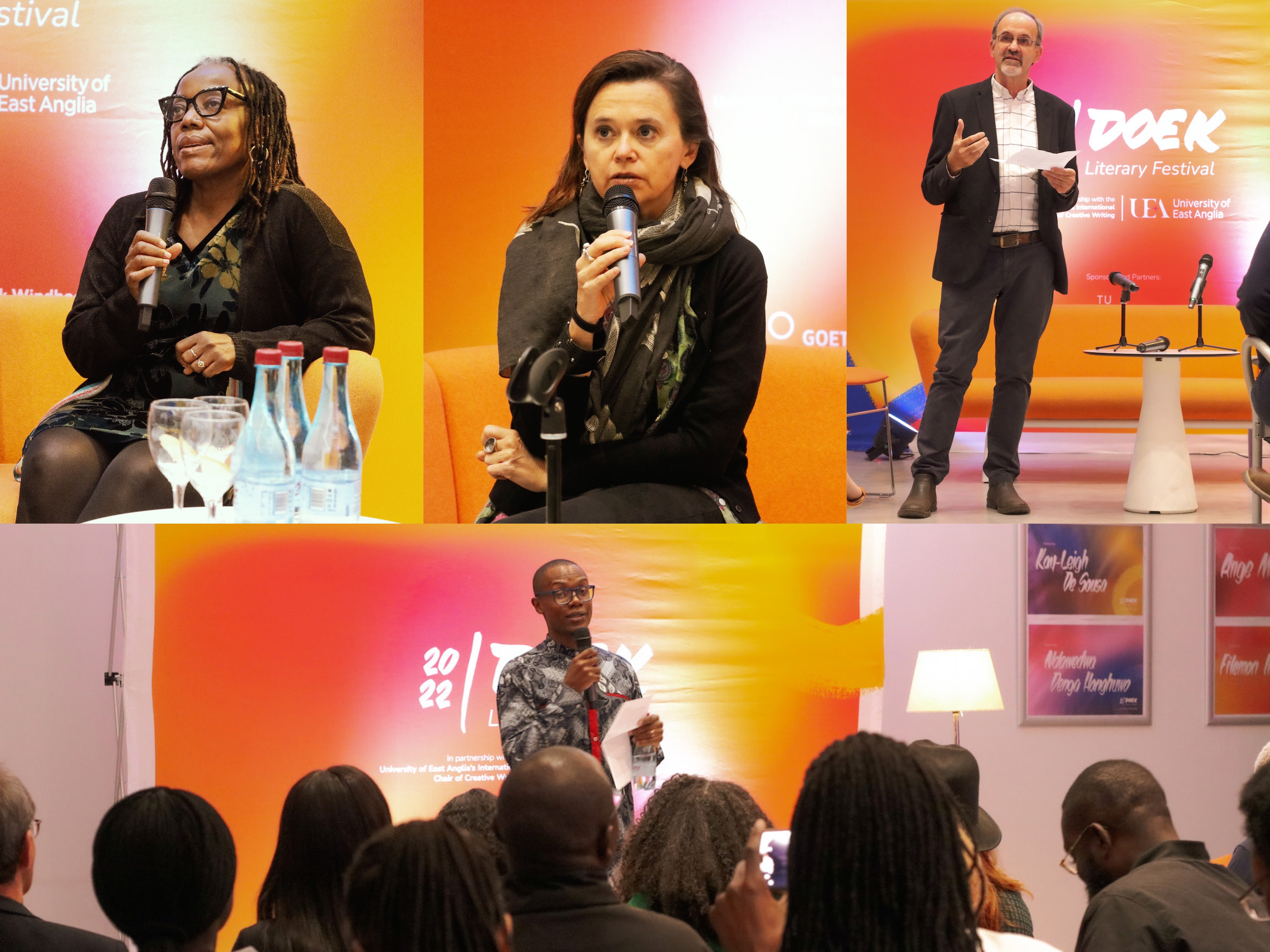
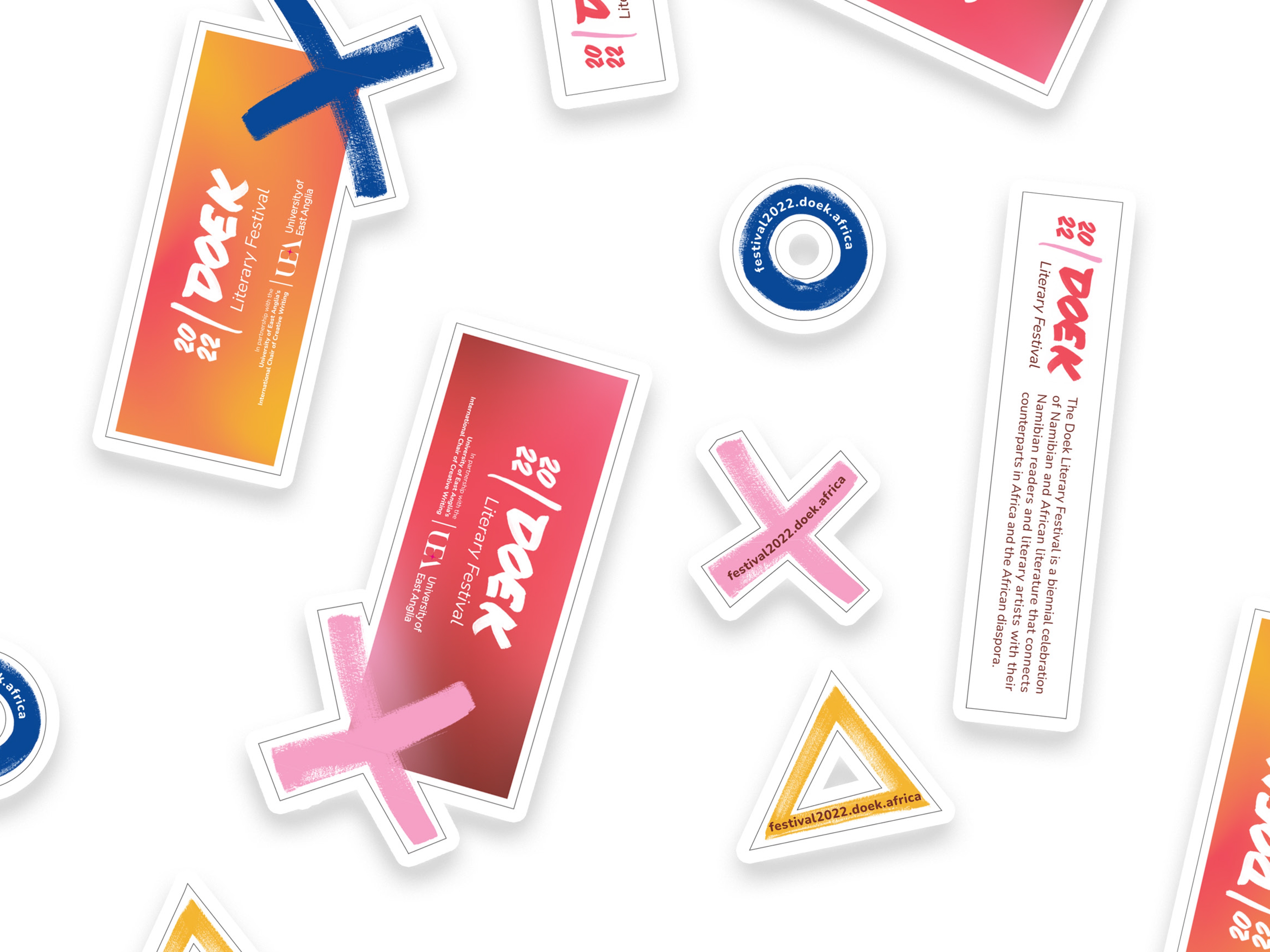
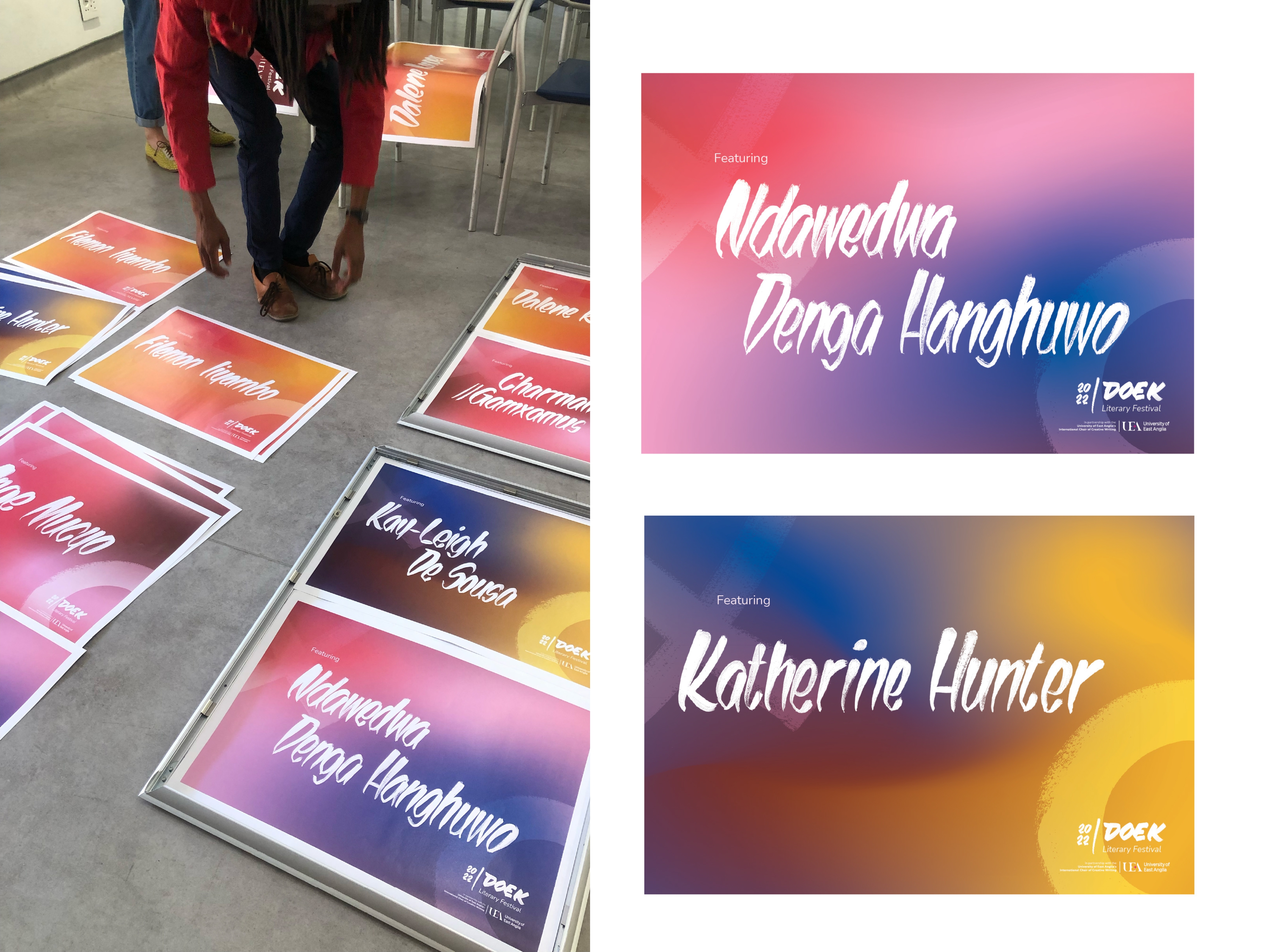
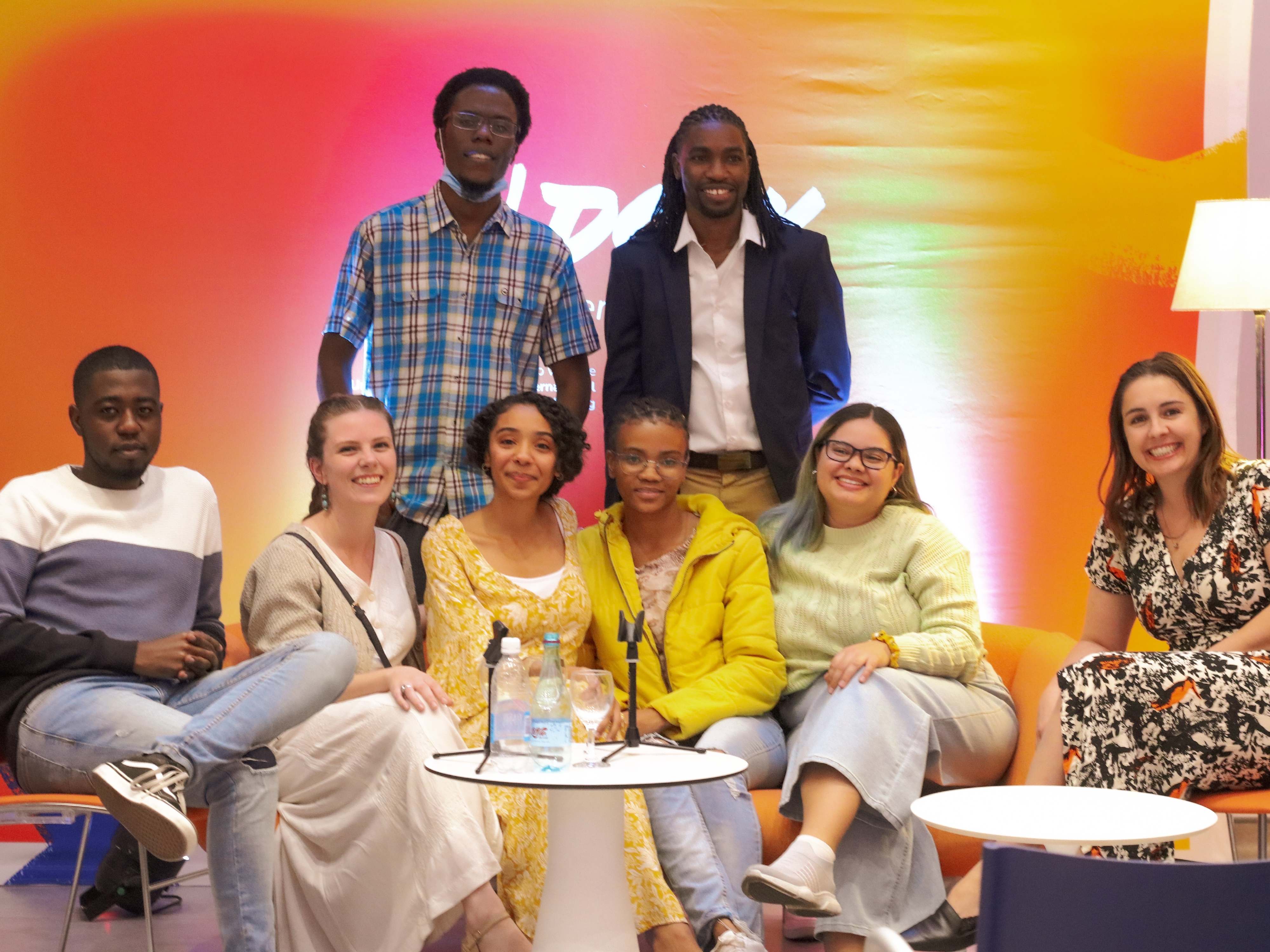
The visual identity for the Doek Literary Festival was designed as an act of cultural assertion. Rooted in Namibia’s evolving literary landscape, the brand responds directly to Doek’s manifesto: to make space, claim voice, and build from within rather than wait for validation. Inspired by local visual culture and vernacular signwriting traditions, the identity embraces hand-crafted typography, tactile illustration, and layered composition. The aesthetic reflects a creative environment shaped by scarcity — where making meaning from very little is not a limitation, but an invitation. Rather than adopting polished, global literary conventions, the design foregrounds locality, texture, and immediacy. It signals that this festival belongs here — in the creative desert — and that storytelling is infrastructure. The system extended across signage posters, bookmarks and stage banners (which became material for the 2024 festivals tote baes), and social media branding, transforming everyday venues into visible sites of literary presence.
The visual identity for the Doek Literary Festival was designed as an act of cultural assertion. Rooted in Namibia’s evolving literary landscape, the brand responds directly to Doek’s manifesto: to make space, claim voice, and build from within rather than wait for validation. Inspired by local visual culture and vernacular signwriting traditions, the identity embraces hand-crafted typography, tactile illustration, and layered composition. The aesthetic reflects a creative environment shaped by scarcity — where making meaning from very little is not a limitation, but an invitation. Rather than adopting polished, global literary conventions, the design foregrounds locality, texture, and immediacy. It signals that this festival belongs here — in the creative desert — and that storytelling is infrastructure. The system extended across signage posters, bookmarks and stage banners (which became material for the 2024 festivals tote baes), and social media branding, transforming everyday venues into visible sites of literary presence.
Project Innovation / Specification:
The innovation lies in building a bold literary brand from local visual language rather than imported aesthetics. Typography was treated as an expressive form, drawing influence from hand-painted signage and everyday lettering practices. Irregularity and human mark-making were preserved to reflect authenticity and ownership. Illustrative elements were developed through analogue-first processes before digital refinement, reinforcing the manifesto’s spirit of making with what is available. Colour, texture, and scale were used deliberately to create a sense of presence in both physical and digital spaces, ensuring the festival could not be overlooked. The visual system was modular and scalable, allowing compositions to shift while retaining recognisability. This flexibility mirrored the festival’s ethos: open, adaptive, and collectively built. The identity does not decorate literature; it declares it.
The innovation lies in building a bold literary brand from local visual language rather than imported aesthetics. Typography was treated as an expressive form, drawing influence from hand-painted signage and everyday lettering practices. Irregularity and human mark-making were preserved to reflect authenticity and ownership. Illustrative elements were developed through analogue-first processes before digital refinement, reinforcing the manifesto’s spirit of making with what is available. Colour, texture, and scale were used deliberately to create a sense of presence in both physical and digital spaces, ensuring the festival could not be overlooked. The visual system was modular and scalable, allowing compositions to shift while retaining recognisability. This flexibility mirrored the festival’s ethos: open, adaptive, and collectively built. The identity does not decorate literature; it declares it.
Project Sustainability Approach:
Sustainability was embedded through systems thinking and long-term authorship. The brand was designed as an evolving framework that can grow across future editions without requiring reinvention. Handcrafted typographic and illustrative elements were digitised and archived for reuse, ensuring continuity while minimising production waste. The identity was adaptable across print, social media, merchandise, and environmental graphics, reducing the need to create new assets each year. In a context often described as a Namibian “creative desert,” sustainability is a matter of cultural survival. The design supports a literary ecosystem that builds its own visibility and momentum from within — strengthening continuity, recognition, and resilience over time.
Sustainability was embedded through systems thinking and long-term authorship. The brand was designed as an evolving framework that can grow across future editions without requiring reinvention. Handcrafted typographic and illustrative elements were digitised and archived for reuse, ensuring continuity while minimising production waste. The identity was adaptable across print, social media, merchandise, and environmental graphics, reducing the need to create new assets each year. In a context often described as a Namibian “creative desert,” sustainability is a matter of cultural survival. The design supports a literary ecosystem that builds its own visibility and momentum from within — strengthening continuity, recognition, and resilience over time.
Local and Regional Impacts of the Project:
Locally, the branding gave the festival a clear cultural identity, reinforcing Doek as a self-authored literary movement rooted in Namibian contexts. It helped the event gain visibility among readers, writers, and cultural institutions as a serious platform for literary exchange. Regionally and internationally, the identity supported Doek’s growing profile in the broader African publishing landscape. The festival has been highlighted in global discussions on African literature, including coverage by The New York Times for its significance in literary culture, and is noted in UNESCO’s 2025 analysis of the African book industry as part of a dynamic ecosystem of literary events that strengthen continental publishing infrastructure.
Locally, the branding gave the festival a clear cultural identity, reinforcing Doek as a self-authored literary movement rooted in Namibian contexts. It helped the event gain visibility among readers, writers, and cultural institutions as a serious platform for literary exchange. Regionally and internationally, the identity supported Doek’s growing profile in the broader African publishing landscape. The festival has been highlighted in global discussions on African literature, including coverage by The New York Times for its significance in literary culture, and is noted in UNESCO’s 2025 analysis of the African book industry as part of a dynamic ecosystem of literary events that strengthen continental publishing infrastructure.
Company Name:Turipamwe Design Trading
Lead Designer(s) Name(s):Elrico Gawanab, Tanya Stroh
Profile Description:
Turipamwe is a Namibia-based design practice working across communication design, spatial storytelling, and co-creation. Rooted in African contexts, the studio approaches design as a vehicle for understanding, dialogue, and impact. Its work spans cultural, civic, and social sectors, combining research, visual systems, and facilitation to translate complex ideas into clear, human-centred outcomes. Turipamwe is particularly interested in design that is authored from within context and responsive to local realities, while remaining legible and relevant on international platforms.
Turipamwe is a Namibia-based design practice working across communication design, spatial storytelling, and co-creation. Rooted in African contexts, the studio approaches design as a vehicle for understanding, dialogue, and impact. Its work spans cultural, civic, and social sectors, combining research, visual systems, and facilitation to translate complex ideas into clear, human-centred outcomes. Turipamwe is particularly interested in design that is authored from within context and responsive to local realities, while remaining legible and relevant on international platforms.
Environmental Practices:
Environmental responsibility is approached through thoughtful, context-sensitive choices rather than prescriptive frameworks. Where possible, projects prioritise durable materials, modular design, and reuse to extend the life of outputs beyond single-use applications. Indigenous knowledge systems and local ways of making inform decisions around materiality, scale, and production. Sustainability is understood as cultural and environmental continuity — designing work that is adaptable, respectful of resources, and able to exist meaningfully across time, place, and use.
Environmental responsibility is approached through thoughtful, context-sensitive choices rather than prescriptive frameworks. Where possible, projects prioritise durable materials, modular design, and reuse to extend the life of outputs beyond single-use applications. Indigenous knowledge systems and local ways of making inform decisions around materiality, scale, and production. Sustainability is understood as cultural and environmental continuity — designing work that is adaptable, respectful of resources, and able to exist meaningfully across time, place, and use.
Previous Awards Won:
Shortlisted The Eiger Foundation African Photobook of the Year Awards, 2022 Hentie Burger, Namibia Unique Awards Won Close Film Festival 2023, Best Poster Design
Shortlisted The Eiger Foundation African Photobook of the Year Awards, 2022 Hentie Burger, Namibia Unique Awards Won Close Film Festival 2023, Best Poster Design