
Ntozabantu: The shape of words
Prize(s):
WINNER 2026 Multimedia Design / Multimedia Animation
School / University Name:Greenside Design Center
Lead Designer(s) Name(s):Marwa Elhaissouki
Professor Name(s):Evan Reyneke, Lindi Maritz
Project Location:Johannesburg, South Africa
Design Status:Prototype
Website: View
Video URL:View
Project Description:
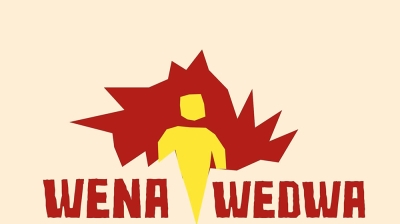
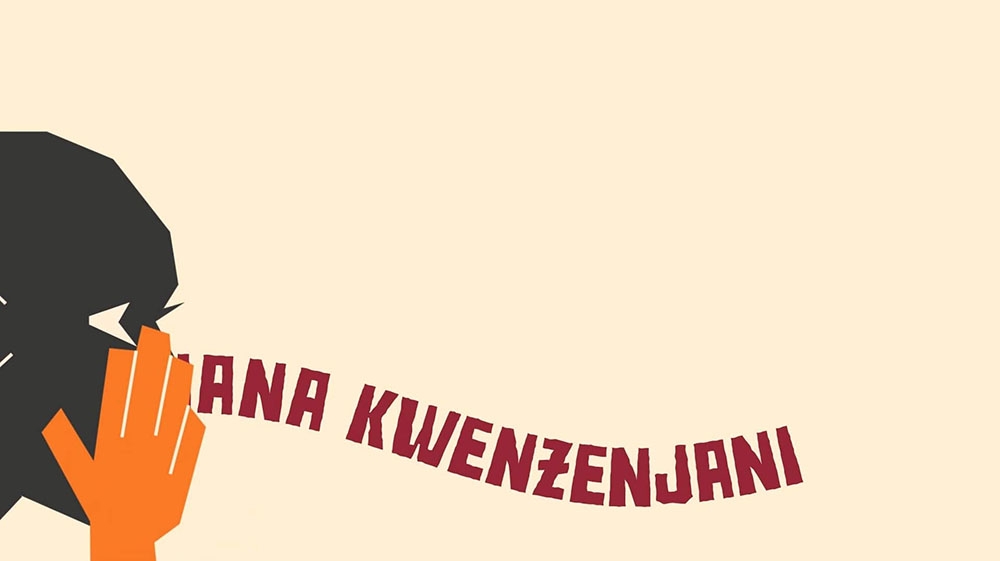
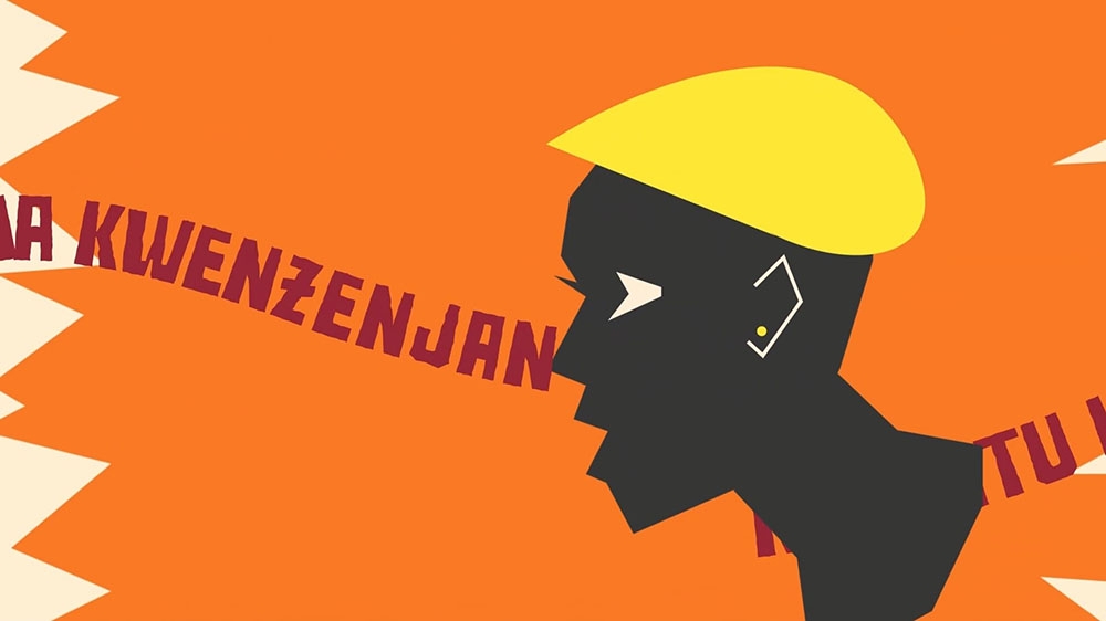
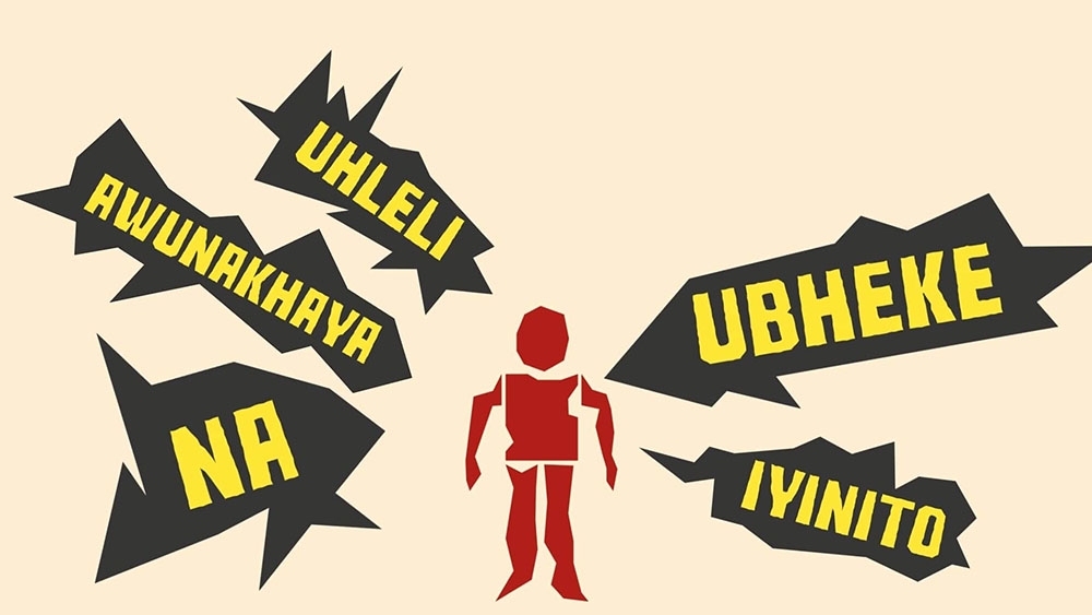
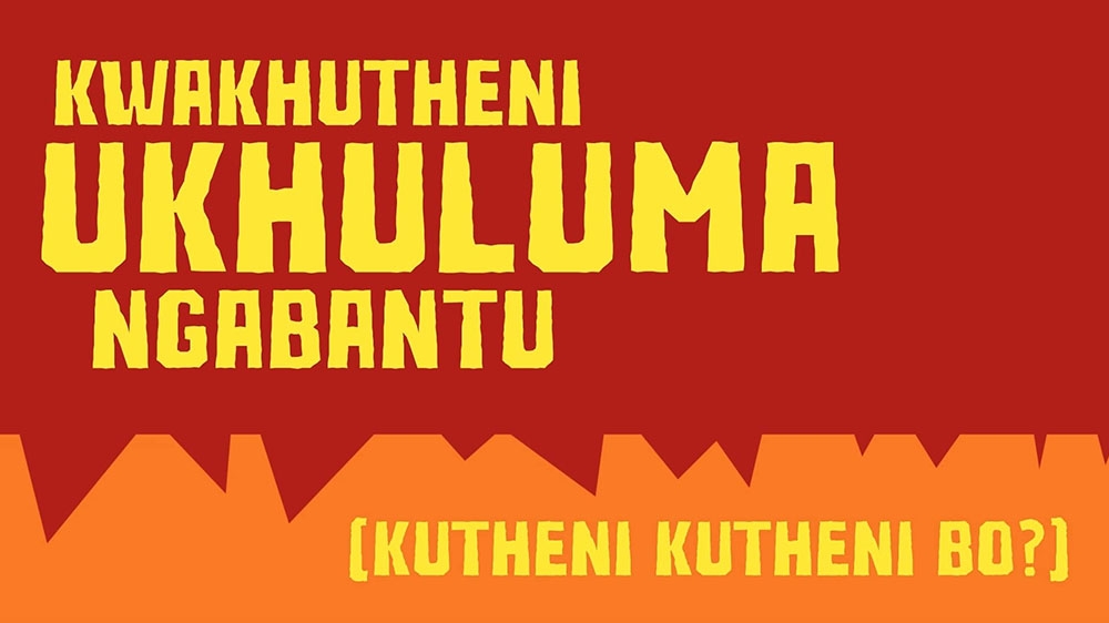
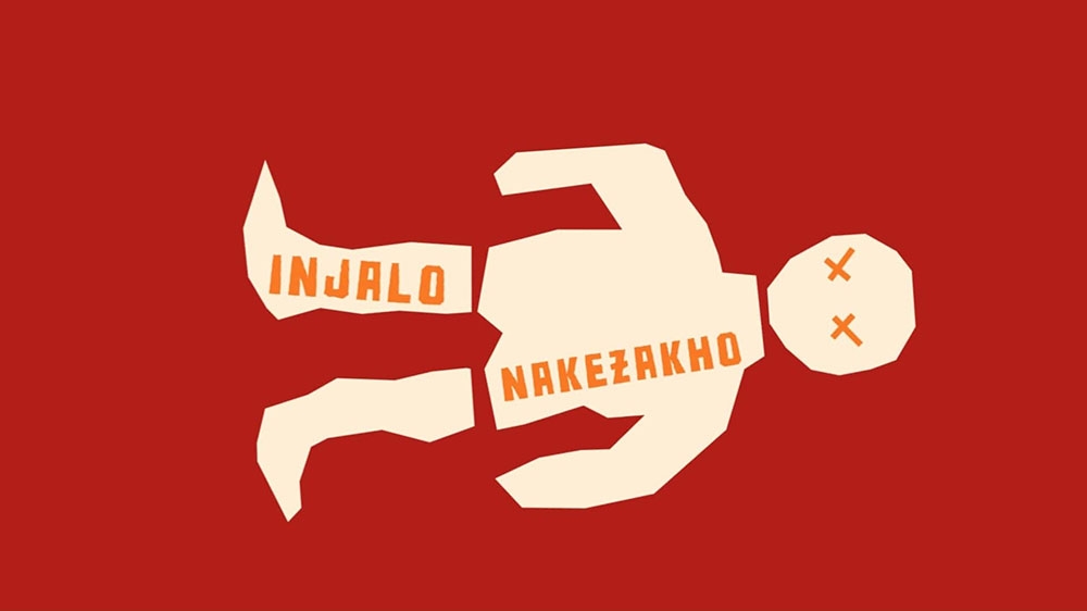
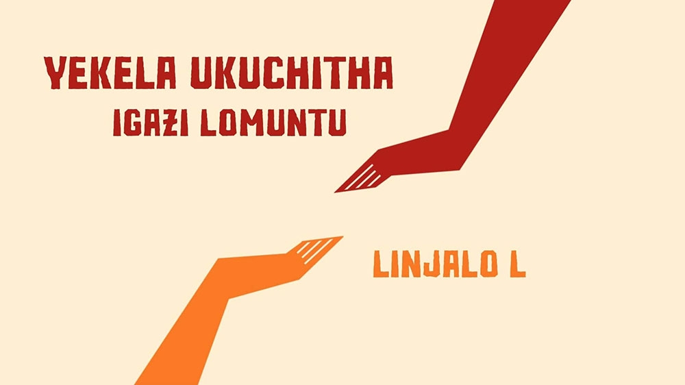
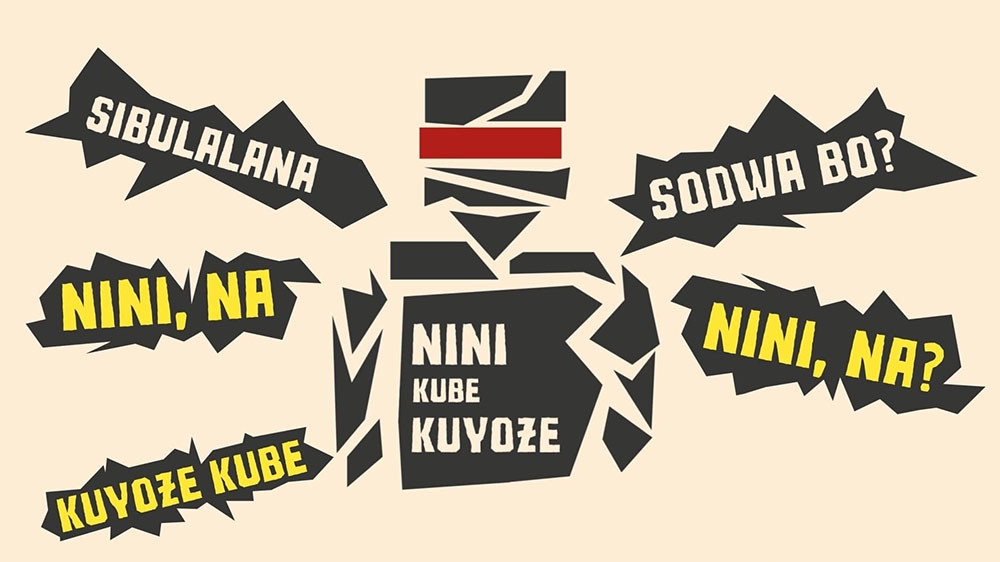
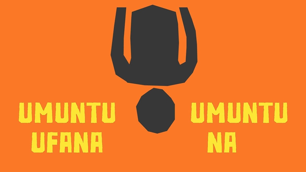
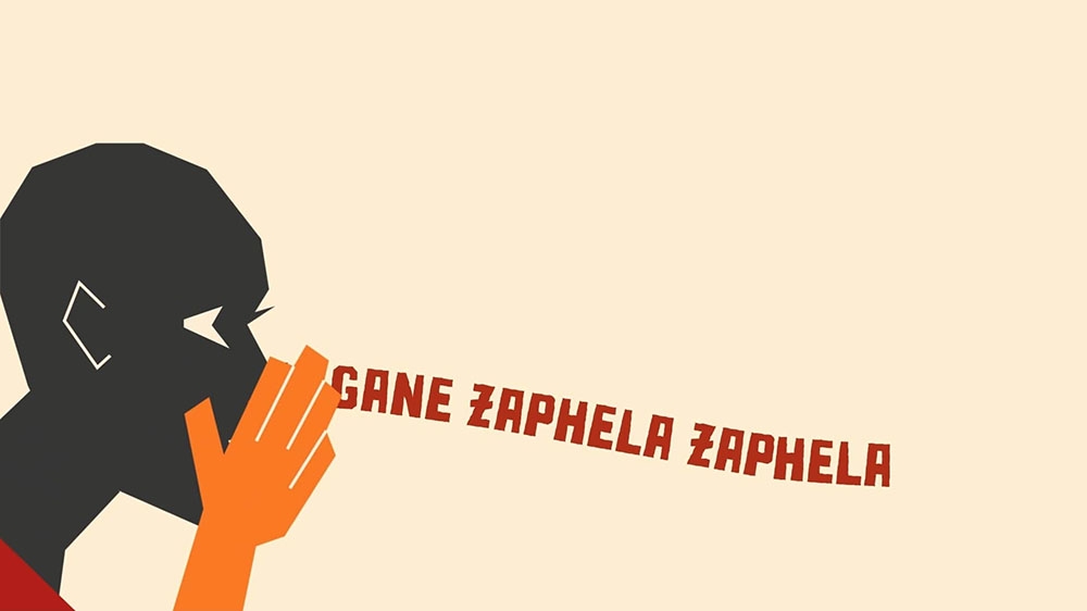
This project explores the emotive potential of lyric music videos as a cost-effective alternative to traditional formats, using kinetic typography and static imagery to communicate narrative depth. Inspired by Lebo Mathosa’s Ntozabantu, the video addresses themes of compassion versus harm, asking viewers to reflect on the impact of words. Titled The Shape of Words, the concept visualizes hurtful language through sharp, angular forms, contrasted with rounded shapes that symbolize safety and kindness. A warm palette of red, orange, and yellow reinforces the emotional intensity of the song, balancing themes of pain with hope for empathy. By combining motion principles, typographic rhythm, and visual metaphor, the video creates a dynamic literary landscape that immerses audiences in the song’s message while avoiding genre clichés. The result is a visually coherent, culturally resonant piece that bridges sound and imagery to foster deeper emotional engagement.
This project explores the emotive potential of lyric music videos as a cost-effective alternative to traditional formats, using kinetic typography and static imagery to communicate narrative depth. Inspired by Lebo Mathosa’s Ntozabantu, the video addresses themes of compassion versus harm, asking viewers to reflect on the impact of words. Titled The Shape of Words, the concept visualizes hurtful language through sharp, angular forms, contrasted with rounded shapes that symbolize safety and kindness. A warm palette of red, orange, and yellow reinforces the emotional intensity of the song, balancing themes of pain with hope for empathy. By combining motion principles, typographic rhythm, and visual metaphor, the video creates a dynamic literary landscape that immerses audiences in the song’s message while avoiding genre clichés. The result is a visually coherent, culturally resonant piece that bridges sound and imagery to foster deeper emotional engagement.
Project Innovation / Specification:
The innovation lies in abstracting the meaning of words into visual form, asking “What do hurtful words look like?” rather than depicting gossip or violence literally. This approach leverages shape psychology, associating jagged, angular forms with danger and rounded shapes with safety, to create a visceral connection between visual language and emotional experience. The design draws inspiration from Saul Bass, integrating bold, minimal forms with kinetic typography to achieve clarity and impact. Repetition of assets across frames establishes rhythm and pattern recognition, enhancing memorability and reinforcing the song’s message. Technically, the project employs Ruina One Black typeface for its strong presence, animated with principles of motion design to synchronize with the song’s rhythm. The video is optimized for digital platforms such as YouTube and TikTok, ensuring accessibility and relevance to contemporary audiences. This synthesis of metaphor, typography, and motion creates a distinctive communication design solution that is both innovative and culturally grounded.
The innovation lies in abstracting the meaning of words into visual form, asking “What do hurtful words look like?” rather than depicting gossip or violence literally. This approach leverages shape psychology, associating jagged, angular forms with danger and rounded shapes with safety, to create a visceral connection between visual language and emotional experience. The design draws inspiration from Saul Bass, integrating bold, minimal forms with kinetic typography to achieve clarity and impact. Repetition of assets across frames establishes rhythm and pattern recognition, enhancing memorability and reinforcing the song’s message. Technically, the project employs Ruina One Black typeface for its strong presence, animated with principles of motion design to synchronize with the song’s rhythm. The video is optimized for digital platforms such as YouTube and TikTok, ensuring accessibility and relevance to contemporary audiences. This synthesis of metaphor, typography, and motion creates a distinctive communication design solution that is both innovative and culturally grounded.
Project Sustainability Approach:
Sustainability in this project extends beyond resource-conscious production into the preservation and celebration of indigenous language. By centering Ntozabantu, a song in a native Bantu language, the video resists the dominance of colonized English and affirms the cultural richness of South African linguistic heritage. This choice ensures that the work contributes to linguistic sustainability, keeping local languages visible and relevant in contemporary digital media. The lyric video format itself is resource-efficient, requiring minimal equipment and relying on kinetic typography and static imagery rather than costly motion footage. Reuse of assets reduces production demands while reinforcing thematic coherence. Socially, the project sustains community values by promoting empathy and compassion, countering harmful narratives with messages of kindness. By combining low-impact design methods with a commitment to indigenous language, the project demonstrates how communication design can be both environmentally efficient and culturally regenerative
Sustainability in this project extends beyond resource-conscious production into the preservation and celebration of indigenous language. By centering Ntozabantu, a song in a native Bantu language, the video resists the dominance of colonized English and affirms the cultural richness of South African linguistic heritage. This choice ensures that the work contributes to linguistic sustainability, keeping local languages visible and relevant in contemporary digital media. The lyric video format itself is resource-efficient, requiring minimal equipment and relying on kinetic typography and static imagery rather than costly motion footage. Reuse of assets reduces production demands while reinforcing thematic coherence. Socially, the project sustains community values by promoting empathy and compassion, countering harmful narratives with messages of kindness. By combining low-impact design methods with a commitment to indigenous language, the project demonstrates how communication design can be both environmentally efficient and culturally regenerative
Local and Regional Impacts of the Project:
The project strengthens local identity by elevating a South African song in its original Bantu language, ensuring that indigenous voices are heard and celebrated in digital spaces often dominated by English. This linguistic emphasis fosters pride, accessibility, and cultural continuity, encouraging younger audiences to engage with and value their heritage. Regionally, the video contributes to the visibility of African languages in global communication design, challenging stereotypes and broadening representation. Its cost-effective approach empowers artists and designers working with limited resources, while its message of compassion resonates across communities, sparking dialogue about the power of words to either divide or unite. By amplifying indigenous language through design.
The project strengthens local identity by elevating a South African song in its original Bantu language, ensuring that indigenous voices are heard and celebrated in digital spaces often dominated by English. This linguistic emphasis fosters pride, accessibility, and cultural continuity, encouraging younger audiences to engage with and value their heritage. Regionally, the video contributes to the visibility of African languages in global communication design, challenging stereotypes and broadening representation. Its cost-effective approach empowers artists and designers working with limited resources, while its message of compassion resonates across communities, sparking dialogue about the power of words to either divide or unite. By amplifying indigenous language through design.