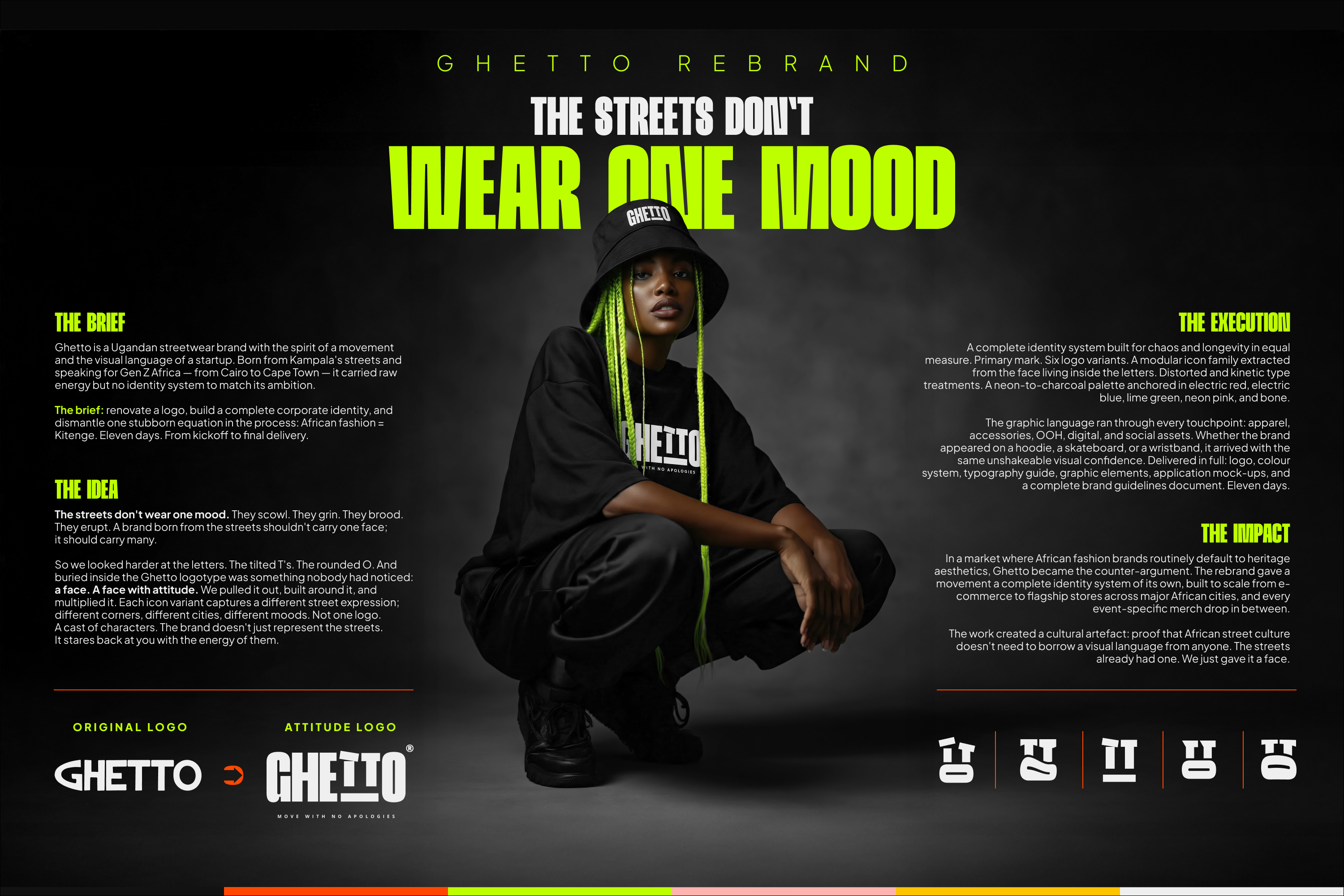
The Streets Don't Wear One Mood
Prize(s):
WINNER 2026 Print & Digital / Logo, Trademark and Symbol Design | Honorable Mention 2026 Multimedia Design / Brand Identity
Company Name:The Quollective Africa
Lead Designer(s) Name(s):Kennedy Thiongo
Design Team / Other designer(s):John Gaitho, Andrew Nyaga
Other Contributor(s):Leila Terry Shikuku
Client Name:Swangz Avenue
Project Location:Kampala, Uganda
Design Status:Commercialized
Website: View
Project Description:
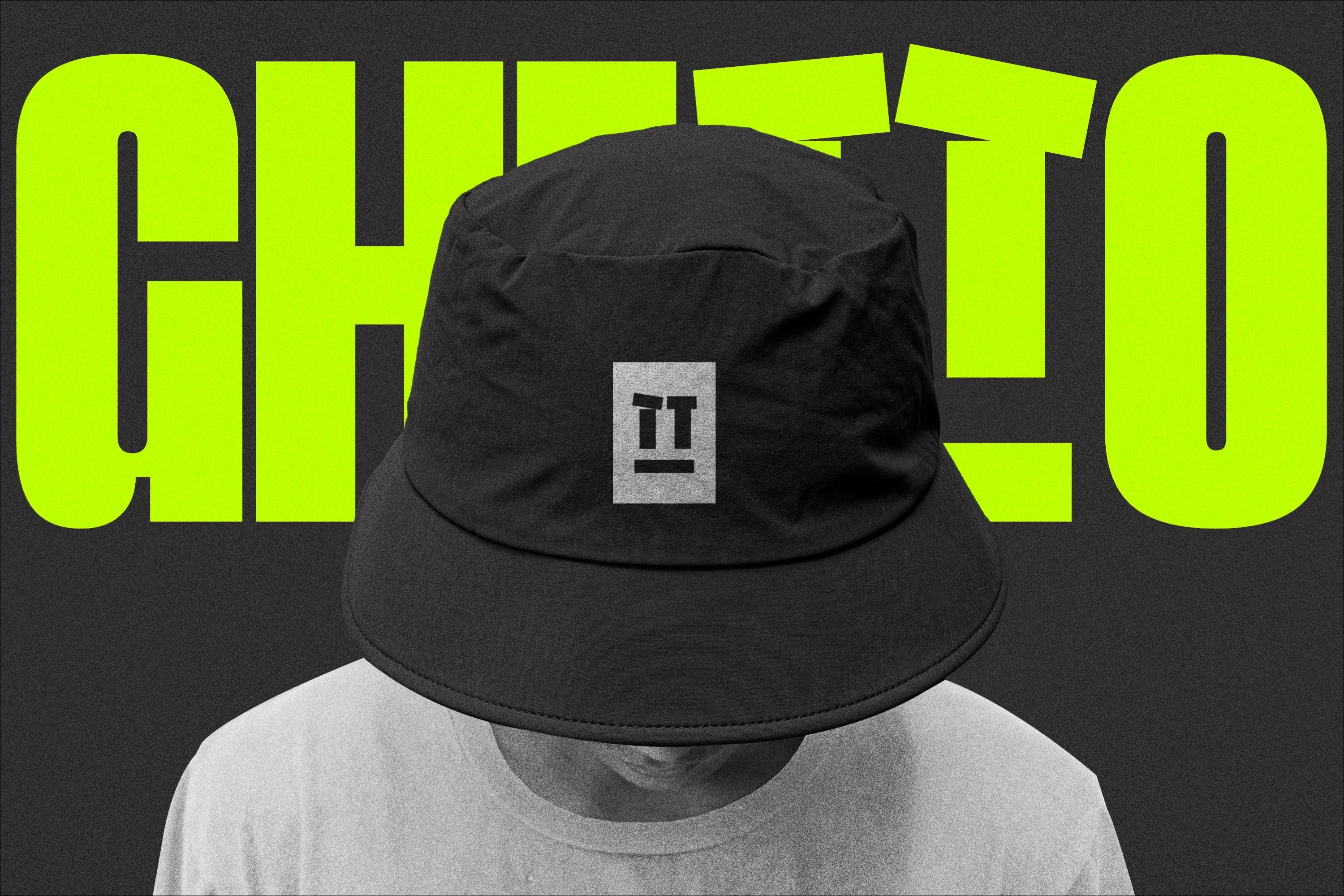
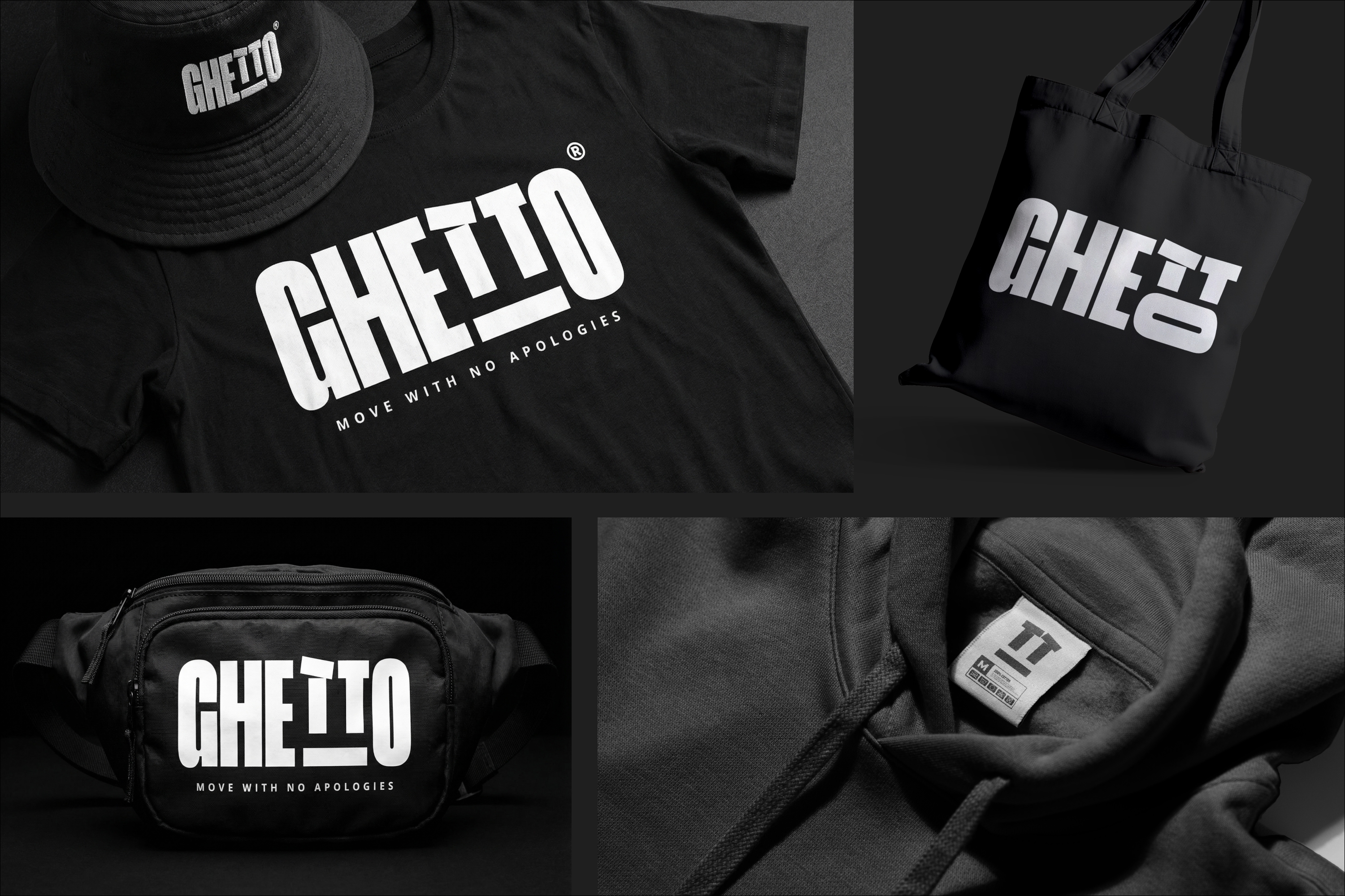
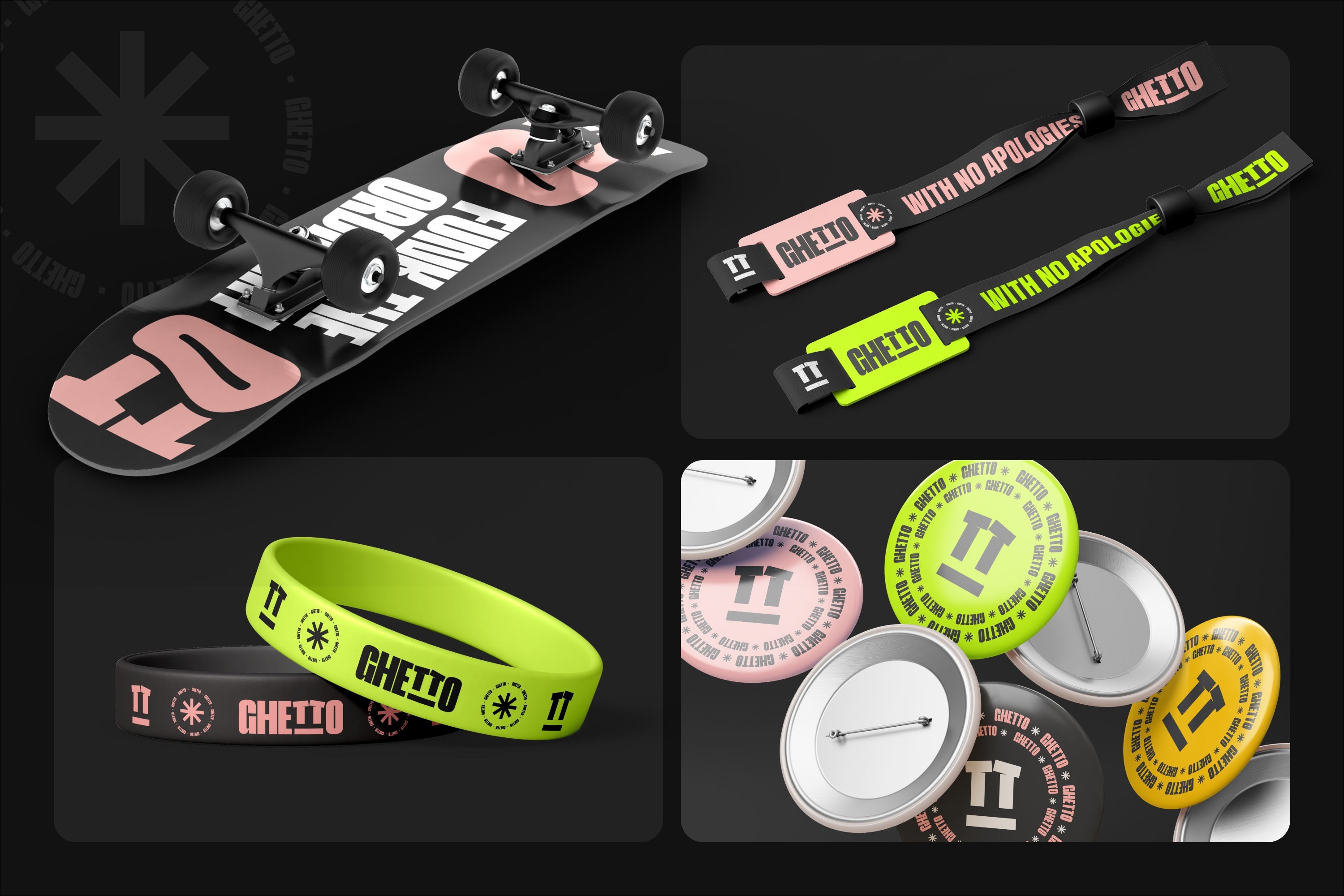
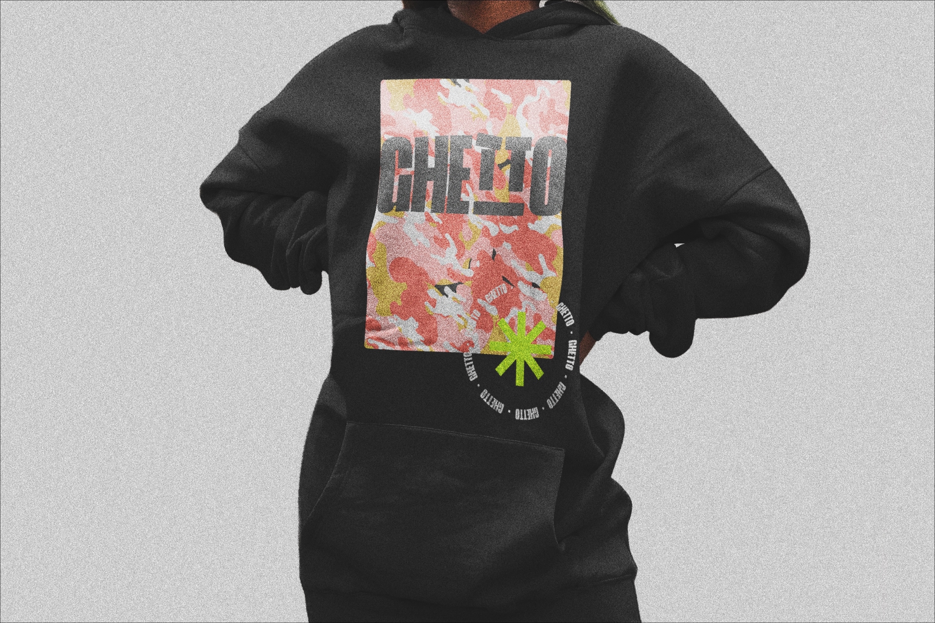
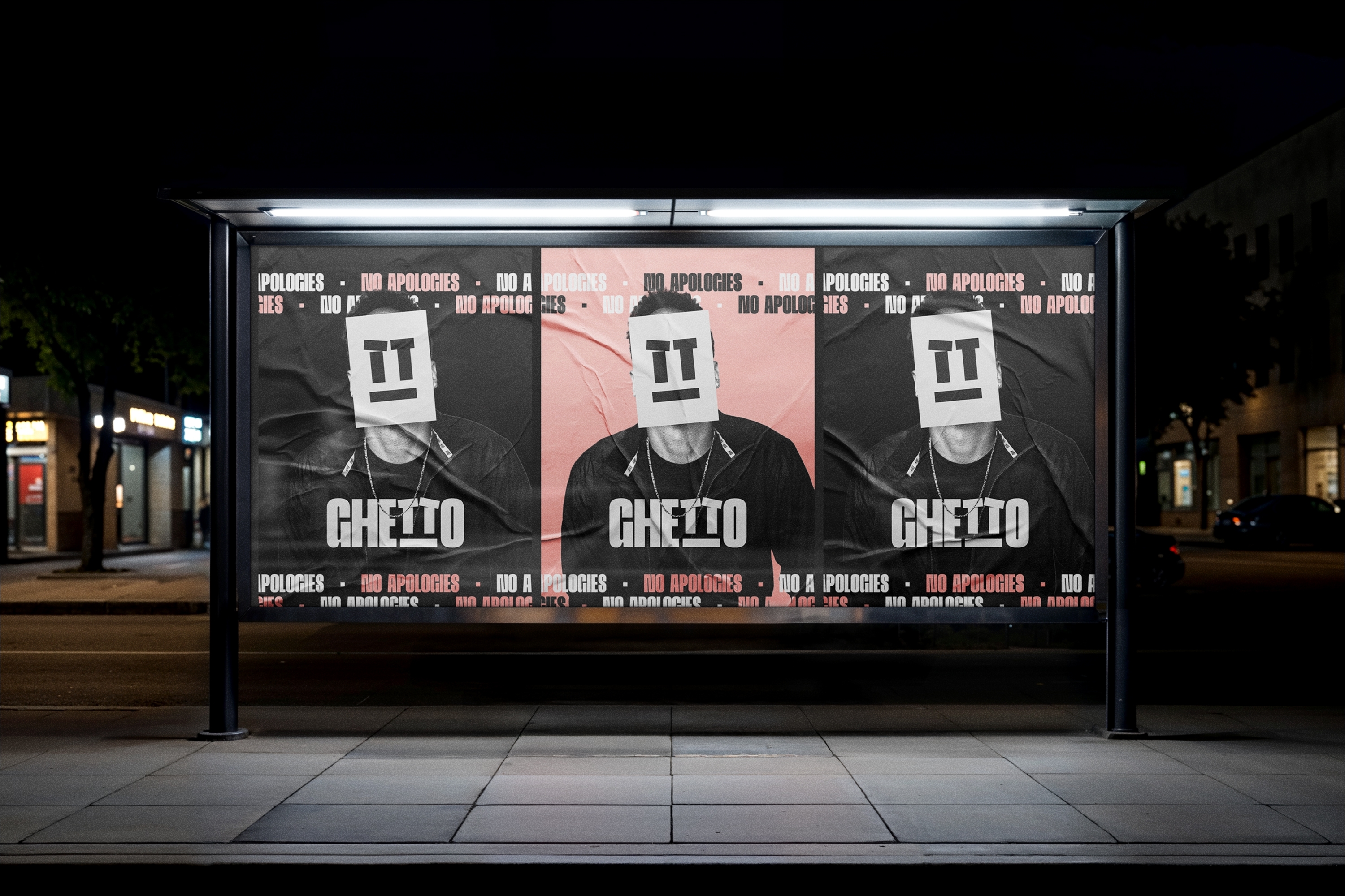
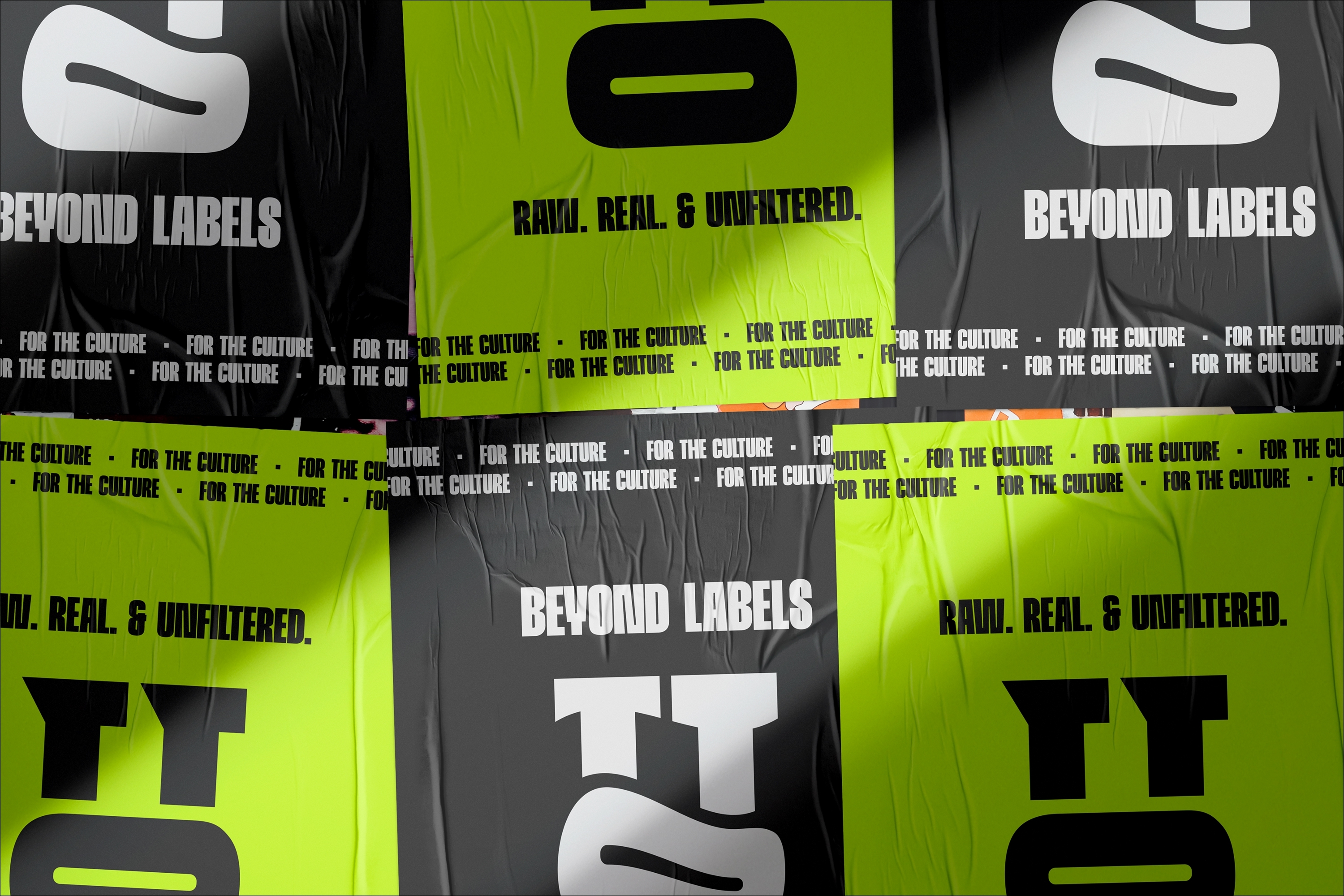
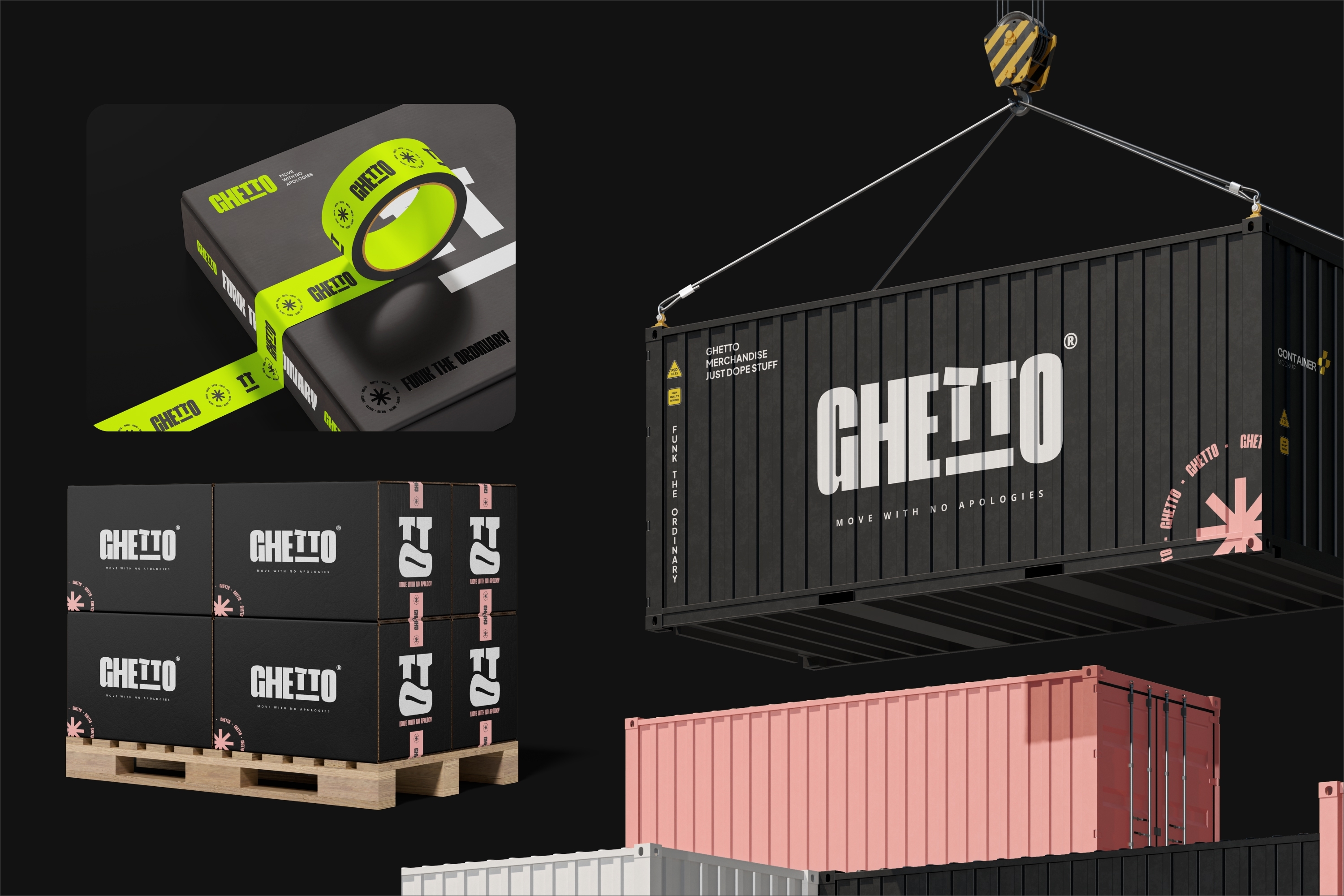
We are a Ugandan streetwear brand with the energy of a movement. Born on the streets of Kampala, speaking for Gen Z Africa from Cairo to Cape Town. But for all that raw creative power, it had no identity system worthy of the noise it was making. The brief: renovate the logo, build a complete corporate identity, and dismantle one stubborn equation in the process. African fashion is not Kitenge. Eleven days. Kickoff to final delivery. The answer lived inside the letters. The tilted T's. Forming a face with attitude. We pulled it out, built around it, and multiplied it. Each character became a different street expression. A cast of characters. The brand didn't just represent the streets. It stared back at you with the energy of them. The result: a brand identity system built for chaos and longevity. Primary mark, six logo variants, a modular icon family, distorted and kinetic type treatments, and a neon-to-charcoal palette anchored in electric red, lime green, neon pink, and Yellow.
We are a Ugandan streetwear brand with the energy of a movement. Born on the streets of Kampala, speaking for Gen Z Africa from Cairo to Cape Town. But for all that raw creative power, it had no identity system worthy of the noise it was making. The brief: renovate the logo, build a complete corporate identity, and dismantle one stubborn equation in the process. African fashion is not Kitenge. Eleven days. Kickoff to final delivery. The answer lived inside the letters. The tilted T's. Forming a face with attitude. We pulled it out, built around it, and multiplied it. Each character became a different street expression. A cast of characters. The brand didn't just represent the streets. It stared back at you with the energy of them. The result: a brand identity system built for chaos and longevity. Primary mark, six logo variants, a modular icon family, distorted and kinetic type treatments, and a neon-to-charcoal palette anchored in electric red, lime green, neon pink, and Yellow.
Project Innovation / Specification:
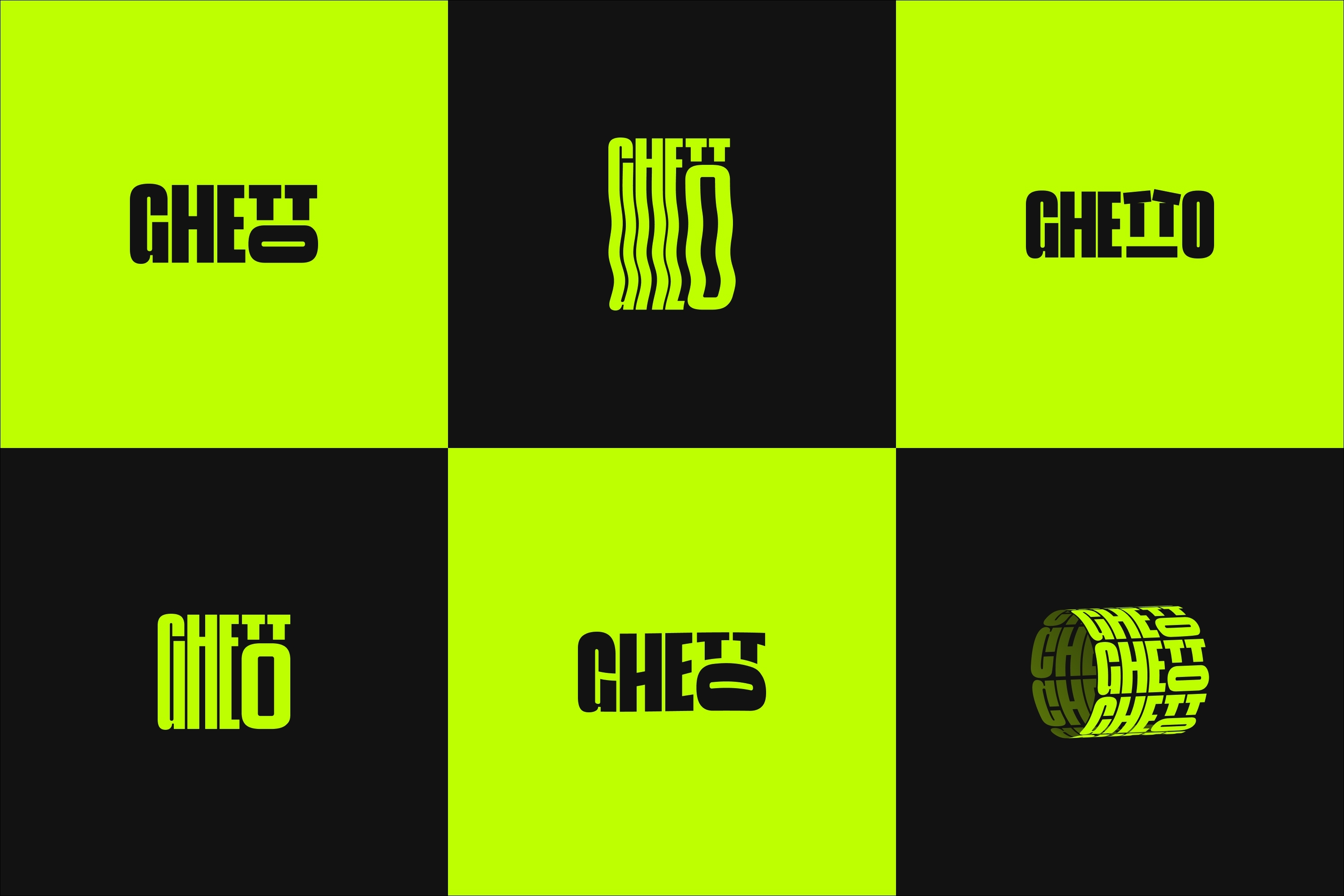
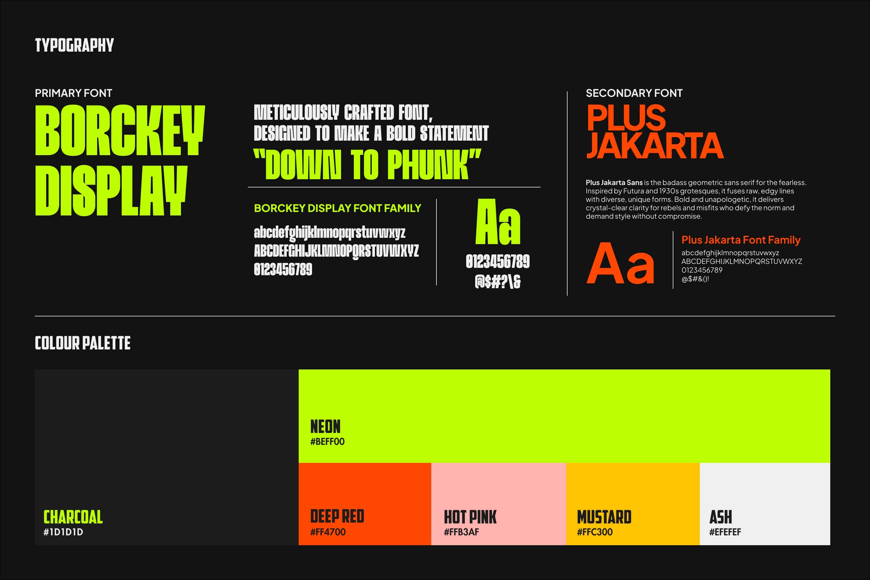
The identity was not designed. It was discovered. The logotype already contained a face. Two tilted T's as eyes. An underline as a mouth. From that single insight, a complete modular icon family was built: six expressions, six moods, one visual system. Each icon operates at any scale without losing its connection to the primary mark. Typography ran on two axes: Borckey Display for raw weight, Plus Jakarta Sans for legibility. Both pushed through distortion to express movement. The colour system rejected what African fashion typically reaches for. It pulled instead from the neon vocabulary of Kampala's streets: electric red, electric blue, lime green, neon pink, bone. Six logo variants. One primary mark. One standalone icon. One complete guidelines document. Everything the brand needs to scale.
The identity was not designed. It was discovered. The logotype already contained a face. Two tilted T's as eyes. An underline as a mouth. From that single insight, a complete modular icon family was built: six expressions, six moods, one visual system. Each icon operates at any scale without losing its connection to the primary mark. Typography ran on two axes: Borckey Display for raw weight, Plus Jakarta Sans for legibility. Both pushed through distortion to express movement. The colour system rejected what African fashion typically reaches for. It pulled instead from the neon vocabulary of Kampala's streets: electric red, electric blue, lime green, neon pink, bone. Six logo variants. One primary mark. One standalone icon. One complete guidelines document. Everything the brand needs to scale.
Project Sustainability Approach:
Two kinds of sustainability: cultural and commercial. Culturally, African streetwear has borrowed its design language from outside the continent for too long. This system drew entirely from within. Every decision rooted in the visual energy of Kampala's streets. Commercially, the architecture was built to last. Six logo variants adapt across every application without losing coherence. The icon family grows as the brand grows. The guidelines document means future collaborators execute consistently without returning to the source. No single-use assets. No printed materials in the creative process. Delivered entirely digitally from concept to completion.
Two kinds of sustainability: cultural and commercial. Culturally, African streetwear has borrowed its design language from outside the continent for too long. This system drew entirely from within. Every decision rooted in the visual energy of Kampala's streets. Commercially, the architecture was built to last. Six logo variants adapt across every application without losing coherence. The icon family grows as the brand grows. The guidelines document means future collaborators execute consistently without returning to the source. No single-use assets. No printed materials in the creative process. Delivered entirely digitally from concept to completion.
Local and Regional Impacts of the Project:
African fashion brands default to heritage. This project refused to. We now owns a visual identity built entirely from within African street culture. It proves that a brand speaking for Gen Z Africa, from Kampala to Lagos to Nairobi, needs no outside permission to compete globally. A complete brand identity system. Eleven days. That benchmark matters for every independent African creative business that comes after. African street culture always had its own visual language. We just gave it a face.
African fashion brands default to heritage. This project refused to. We now owns a visual identity built entirely from within African street culture. It proves that a brand speaking for Gen Z Africa, from Kampala to Lagos to Nairobi, needs no outside permission to compete globally. A complete brand identity system. Eleven days. That benchmark matters for every independent African creative business that comes after. African street culture always had its own visual language. We just gave it a face.