Bean There Coffee Packaging
Prize(s):
Honorable Mention 2026 Packaging Design / Food & Beverage packaging
Company Name:Fandam Studio
Lead Designer(s) Name(s):Dustin Slabber
Client Name:Bean There
Project Location:Johannesburg
Design Status:Commercialized
Website: View
Project Description:
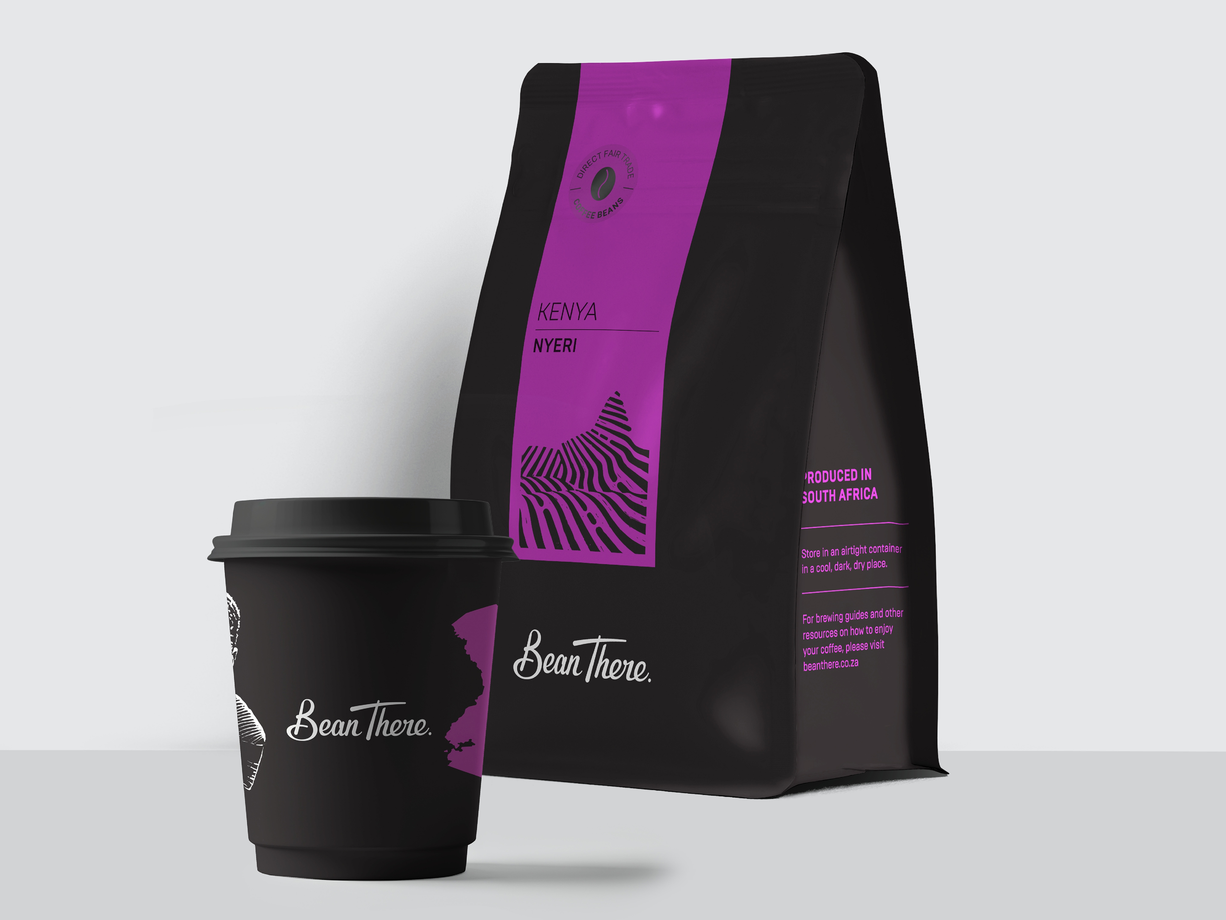
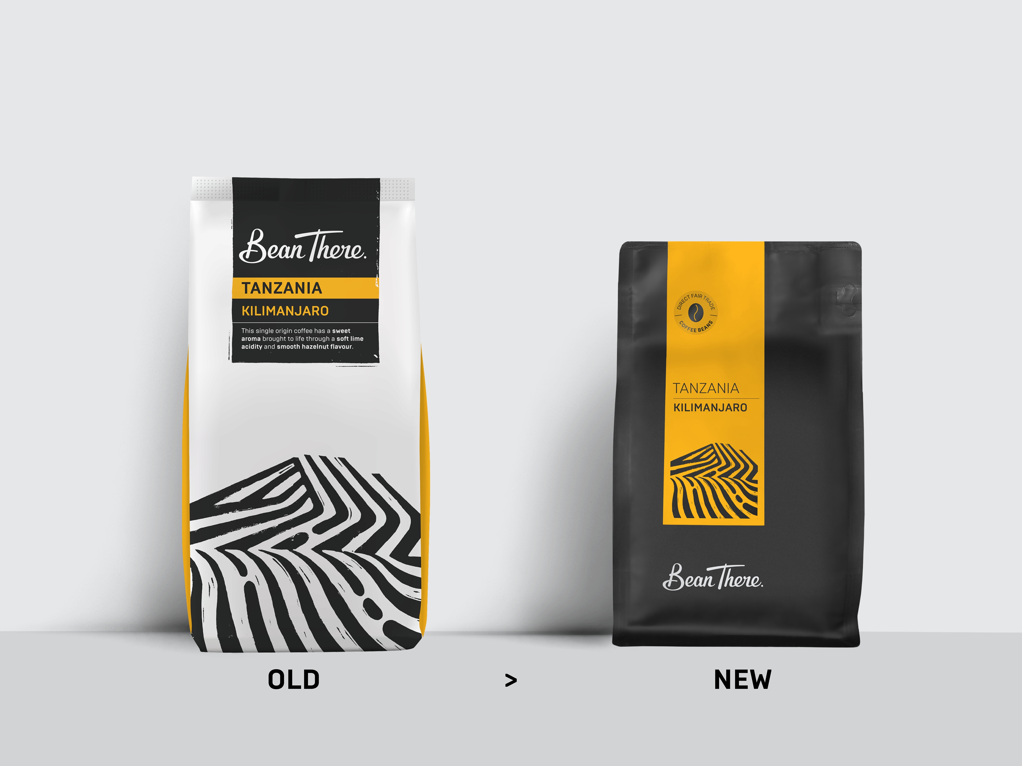
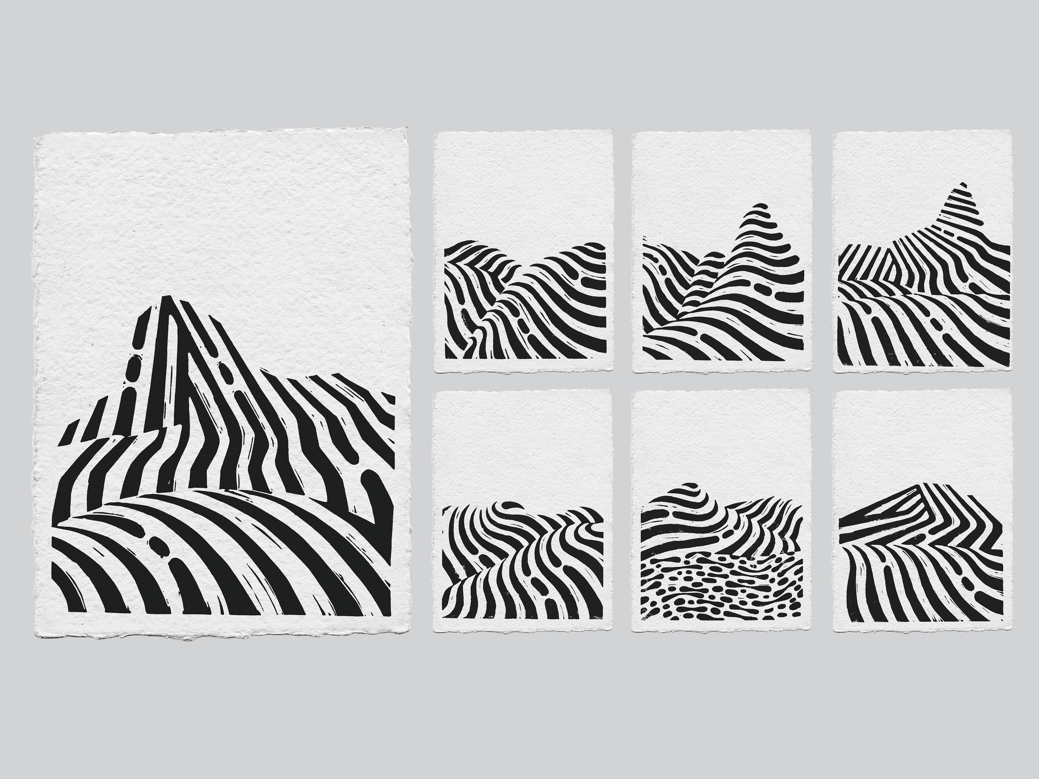
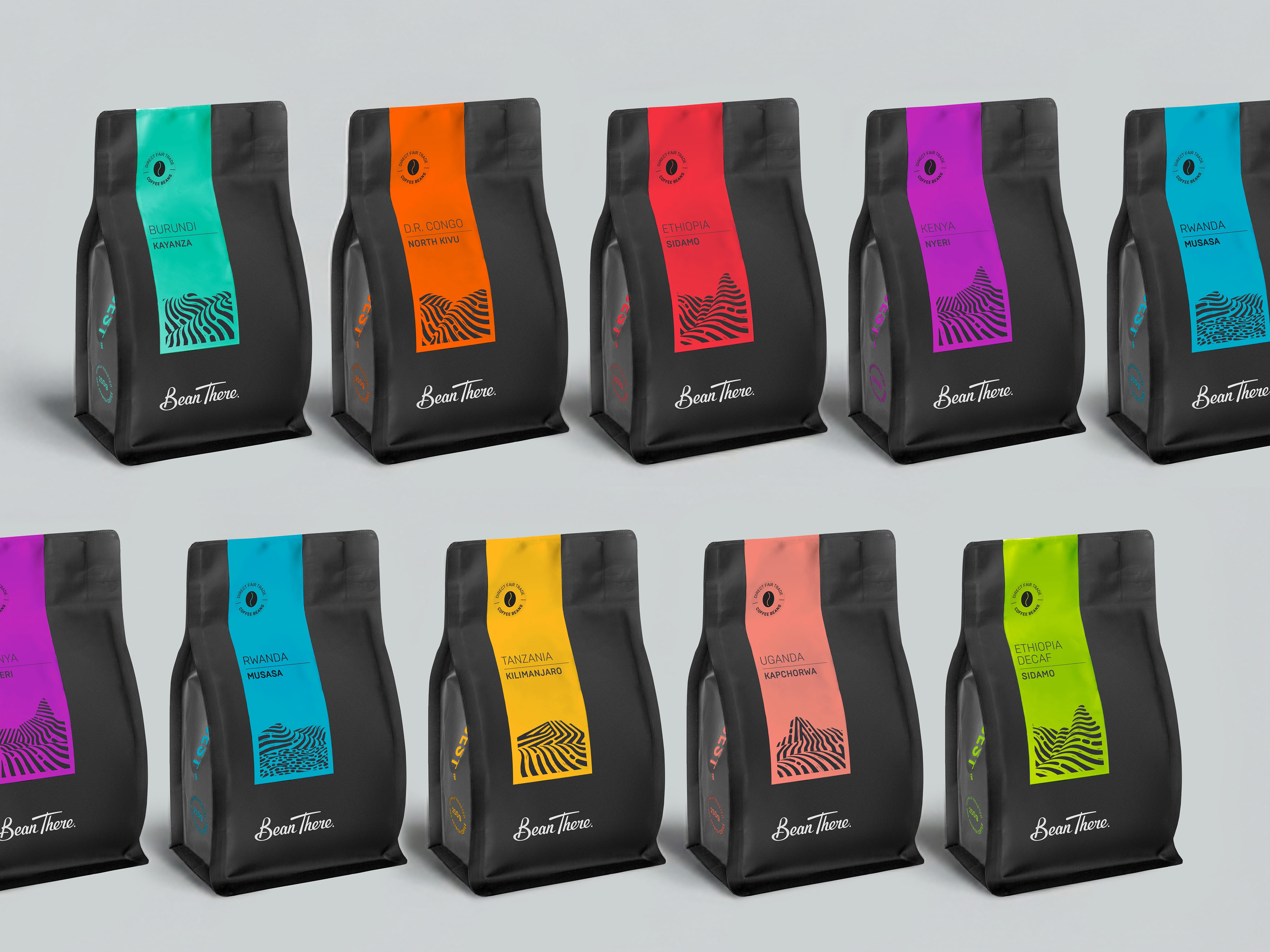
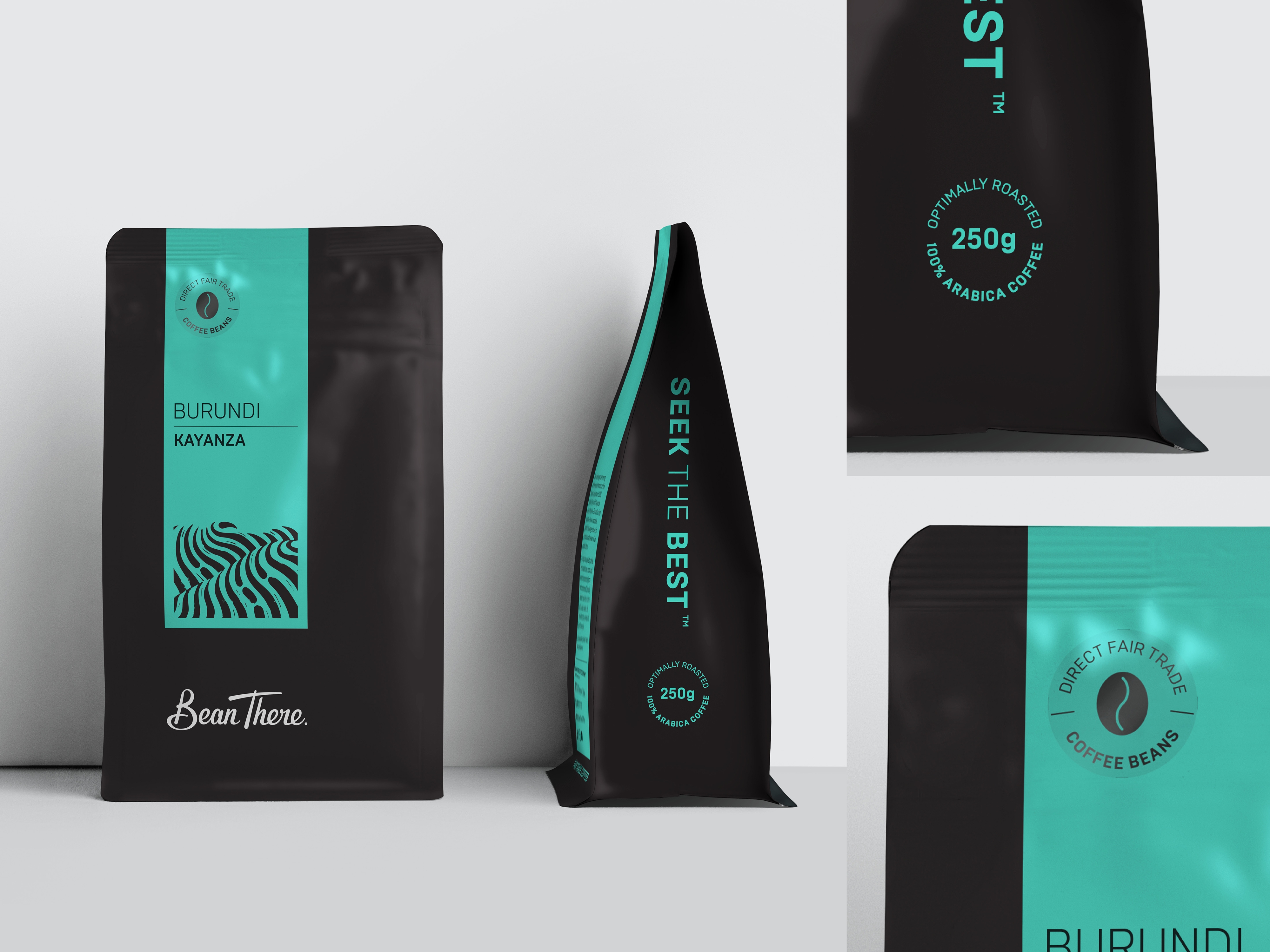
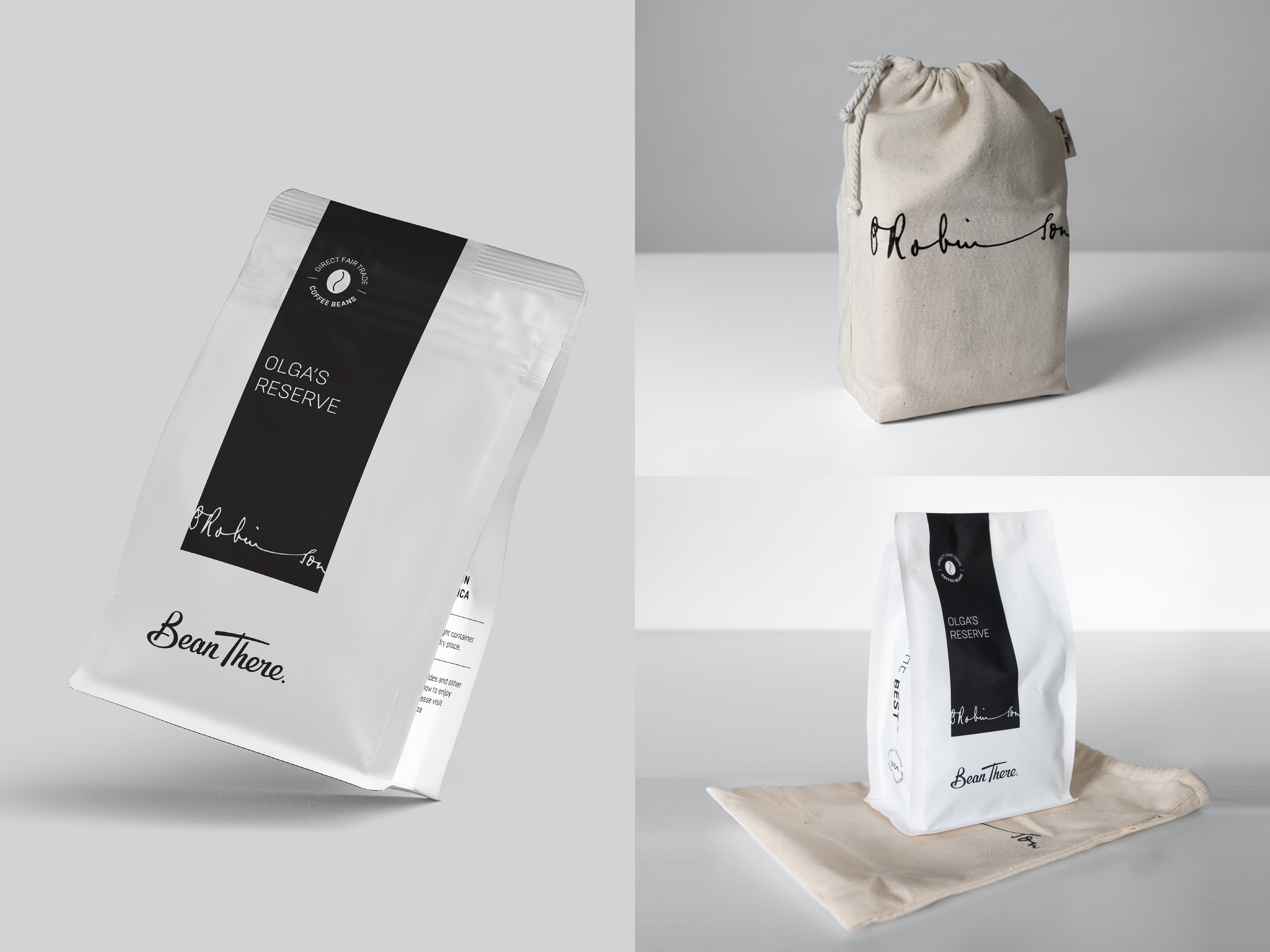
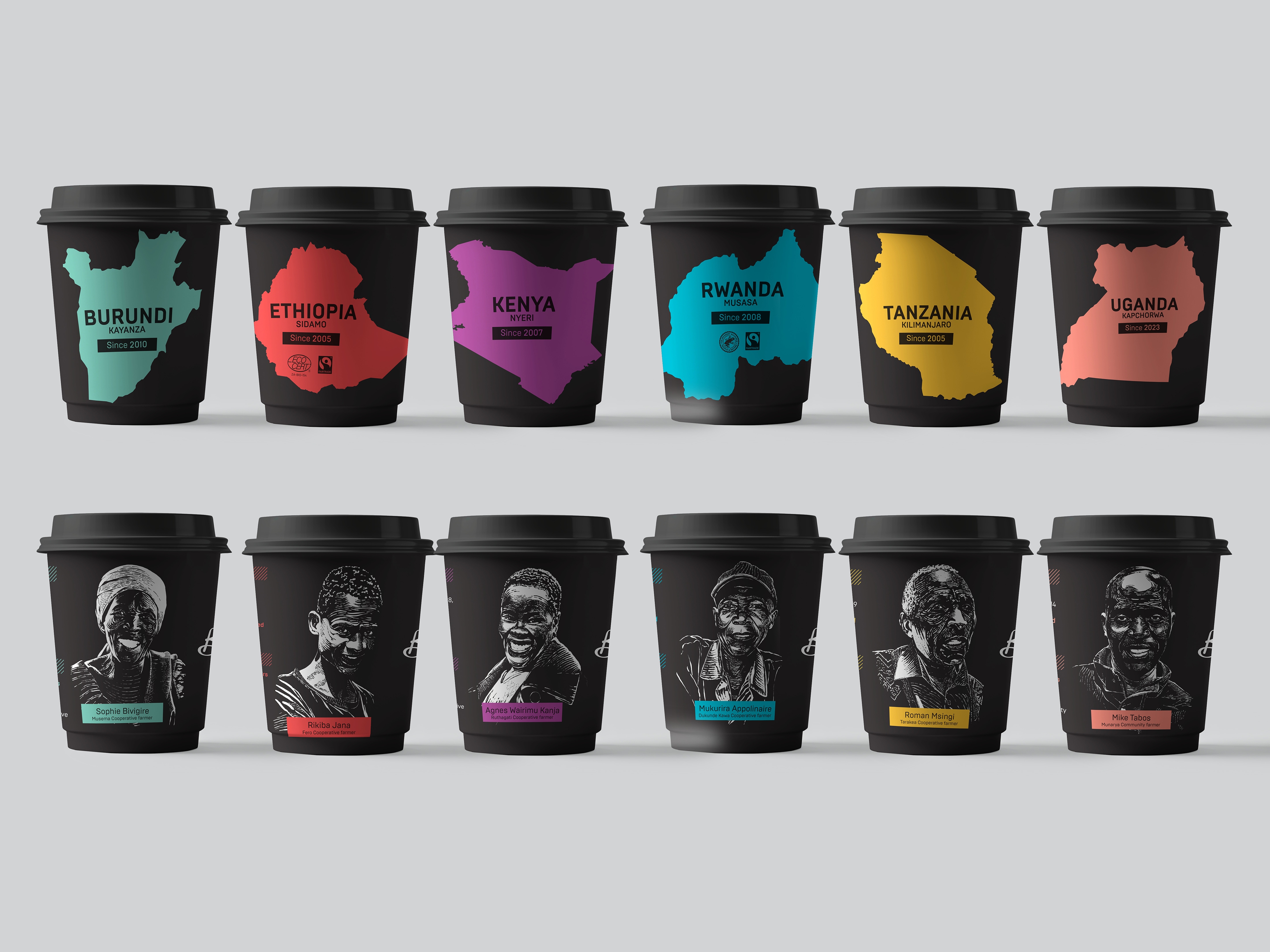
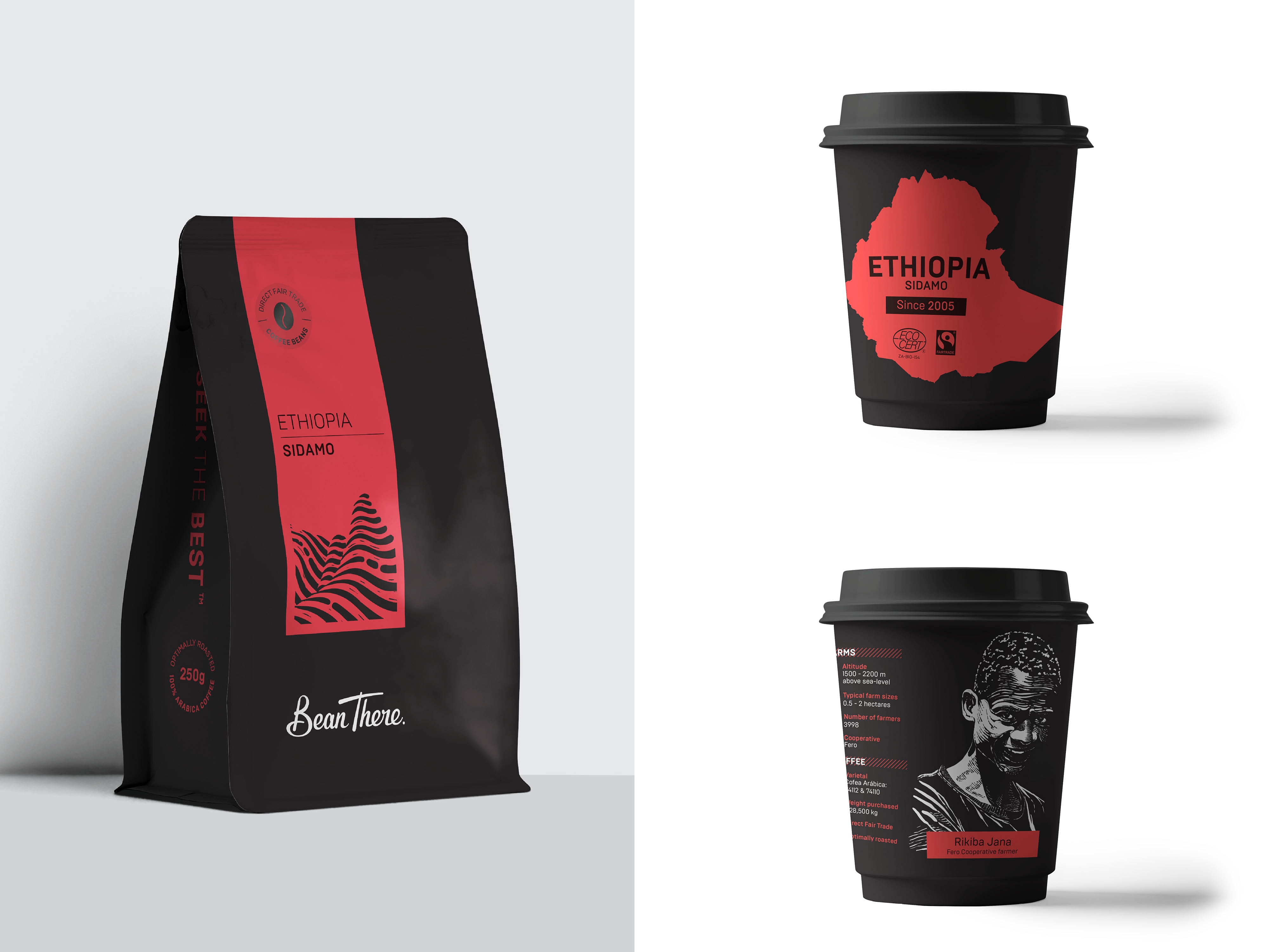
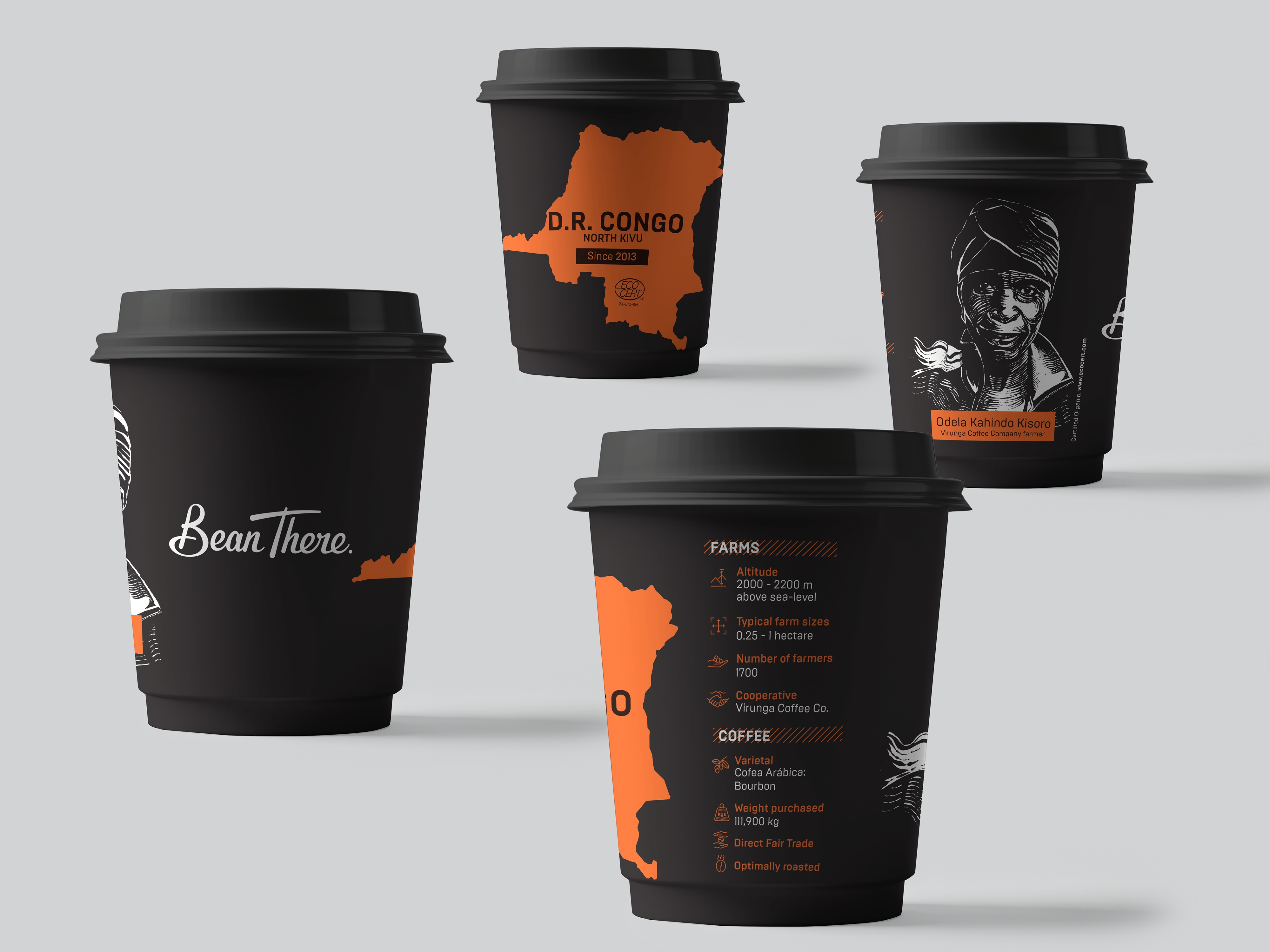
This project reimagines the packaging system for a pioneering and now maturing African coffee brand built on direct, transparent relationships with growers. Initiated alongside a transition to recycled packaging materials and Bean There's twentieth anniversary, the redesign became an opportunity to evolve a six-year-old range in response to a shifting market context. Where the previous system prioritised bold retail visibility, the new direction responds to growth within premium hospitality environments. The design moves towards a quieter, more refined expression — one that communicates craft, provenance and quality with greater subtlety. At its core is a shift from descriptive packaging to storytelling. Each coffee is anchored in its place of origin through a minimalist colour band and a series of hand-crafted linocut landscapes, capturing the distinct terrain of each region. The system extends across retail packs, limited editions and in-store coffee cups, creating a unified experience from shelf to café. On cups, the narrative becomes more personal, featuring grower portraits alongside key origin data — closing the distance between customer and farmer.
This project reimagines the packaging system for a pioneering and now maturing African coffee brand built on direct, transparent relationships with growers. Initiated alongside a transition to recycled packaging materials and Bean There's twentieth anniversary, the redesign became an opportunity to evolve a six-year-old range in response to a shifting market context. Where the previous system prioritised bold retail visibility, the new direction responds to growth within premium hospitality environments. The design moves towards a quieter, more refined expression — one that communicates craft, provenance and quality with greater subtlety. At its core is a shift from descriptive packaging to storytelling. Each coffee is anchored in its place of origin through a minimalist colour band and a series of hand-crafted linocut landscapes, capturing the distinct terrain of each region. The system extends across retail packs, limited editions and in-store coffee cups, creating a unified experience from shelf to café. On cups, the narrative becomes more personal, featuring grower portraits alongside key origin data — closing the distance between customer and farmer.
Project Innovation / Specification:
The innovation lies in developing a flexible packaging system that supports both material change and a strategic repositioning of the brand. A simplified structural device — the vertical colour band — provides consistency across all formats while allowing for quieter, more premium expression. It carries origin information, a distilled landscape motif and certification marks, ensuring clarity without relying on bold, high-contrast retail cues. The introduction of linocut landscapes brings a crafted, human quality to the system. Each composition is derived from the topography of a specific coffee-growing region, forming a modular visual language. The tactility and imperfection of the medium reinforce the brand’s artisanal positioning. On 100% compostable cups, the system adapts to feature people rather than place. High-contrast grower portraits are combined with concise data visualisations, translating origin information into an accessible, people-centred narrative. The design also accommodates the constraints and opportunities of recycled packaging substrates, ensuring legibility, consistency and colour performance across all materials.
The innovation lies in developing a flexible packaging system that supports both material change and a strategic repositioning of the brand. A simplified structural device — the vertical colour band — provides consistency across all formats while allowing for quieter, more premium expression. It carries origin information, a distilled landscape motif and certification marks, ensuring clarity without relying on bold, high-contrast retail cues. The introduction of linocut landscapes brings a crafted, human quality to the system. Each composition is derived from the topography of a specific coffee-growing region, forming a modular visual language. The tactility and imperfection of the medium reinforce the brand’s artisanal positioning. On 100% compostable cups, the system adapts to feature people rather than place. High-contrast grower portraits are combined with concise data visualisations, translating origin information into an accessible, people-centred narrative. The design also accommodates the constraints and opportunities of recycled packaging substrates, ensuring legibility, consistency and colour performance across all materials.
Project Sustainability Approach:
The redesign is grounded in a practical and integrated approach to sustainability, beginning with the transition to recycled and recyclable packaging materials. This shift informed both the aesthetic and structural decisions of the system. By simplifying the design into a single, adaptable framework, the need for multiple formats and complex print processes is reduced. A restrained palette — matte black paired with a single colour per origin — allows for efficient ink use while maintaining clear differentiation. The move is towards a quieter, more enduring aesthetic. By avoiding overtly trend-driven design and finishes, the system is intended to remain relevant over time, reducing the frequency of redesign cycles and associated material waste. On-pack communication is carefully prioritised, ensuring that information is clear and purposeful, improving usability. On single-use takeaway cups, the design maximises their communication potential — using them to share grower stories and origin data, reinforcing the value of the product and encouraging more considered consumption. And, naturally, the cups are 100% compostable.
The redesign is grounded in a practical and integrated approach to sustainability, beginning with the transition to recycled and recyclable packaging materials. This shift informed both the aesthetic and structural decisions of the system. By simplifying the design into a single, adaptable framework, the need for multiple formats and complex print processes is reduced. A restrained palette — matte black paired with a single colour per origin — allows for efficient ink use while maintaining clear differentiation. The move is towards a quieter, more enduring aesthetic. By avoiding overtly trend-driven design and finishes, the system is intended to remain relevant over time, reducing the frequency of redesign cycles and associated material waste. On-pack communication is carefully prioritised, ensuring that information is clear and purposeful, improving usability. On single-use takeaway cups, the design maximises their communication potential — using them to share grower stories and origin data, reinforcing the value of the product and encouraging more considered consumption. And, naturally, the cups are 100% compostable.
Local and Regional Impacts of the Project:
The project reinforces the value chain of African coffee by placing origin, landscape and growers at the centre of the brand experience. By enabling the product to sit confidently within premium hospitality environments, it supports better market access and fairer value distribution for small-scale, largely manual producers. This investment in growers and their communities contributes to a more resilient supply chain — and ultimately to a higher quality product. By naming origins and foregrounding farmers, the design builds a clearer connection between producer and customer, adding emotional value alongside product quality. Regionally, it demonstrates how African brands can elevate both perception and real value without losing authenticity — a win for growers and consumers alike.
The project reinforces the value chain of African coffee by placing origin, landscape and growers at the centre of the brand experience. By enabling the product to sit confidently within premium hospitality environments, it supports better market access and fairer value distribution for small-scale, largely manual producers. This investment in growers and their communities contributes to a more resilient supply chain — and ultimately to a higher quality product. By naming origins and foregrounding farmers, the design builds a clearer connection between producer and customer, adding emotional value alongside product quality. Regionally, it demonstrates how African brands can elevate both perception and real value without losing authenticity — a win for growers and consumers alike.