

4HEADS BRANDING AND PACKAGING
Prize(s):
WINNER 2026 Multimedia Design / Brand Identity | Packaging Design / Food & Beverage packaging
Lead Designer(s) Name(s):Maxwell Dewunmi
Client Name:Bottle King Nigeria
Photo Credit:Adinda Deboer, Chelsea Craig
Project Location:Nigeria
Design Status:Commercialized
Video URL:View
Project Description:
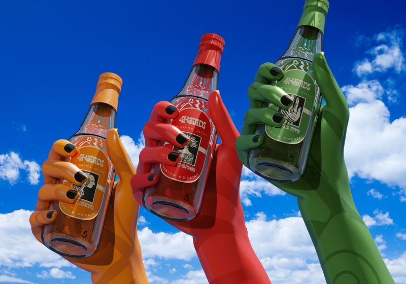
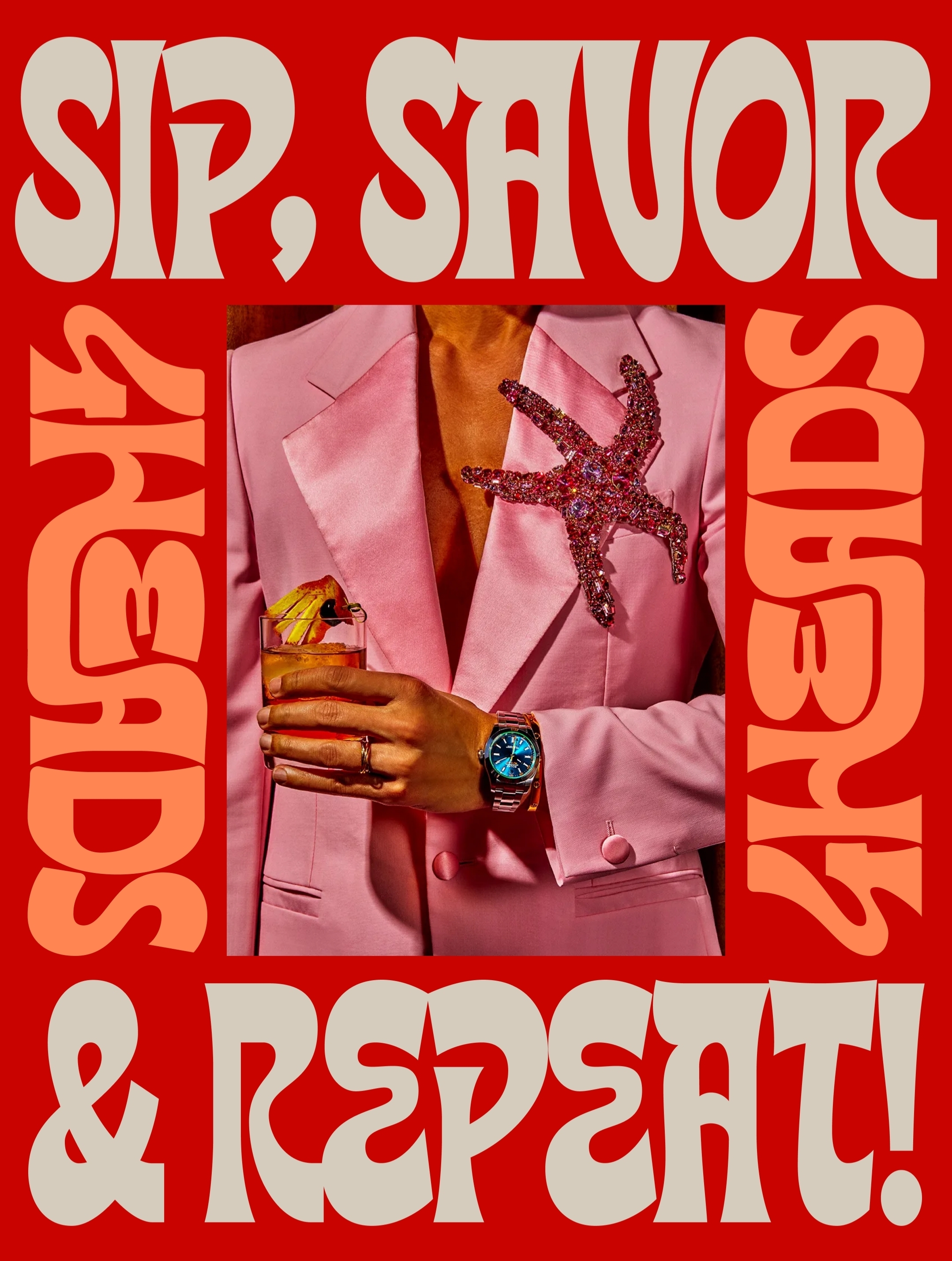
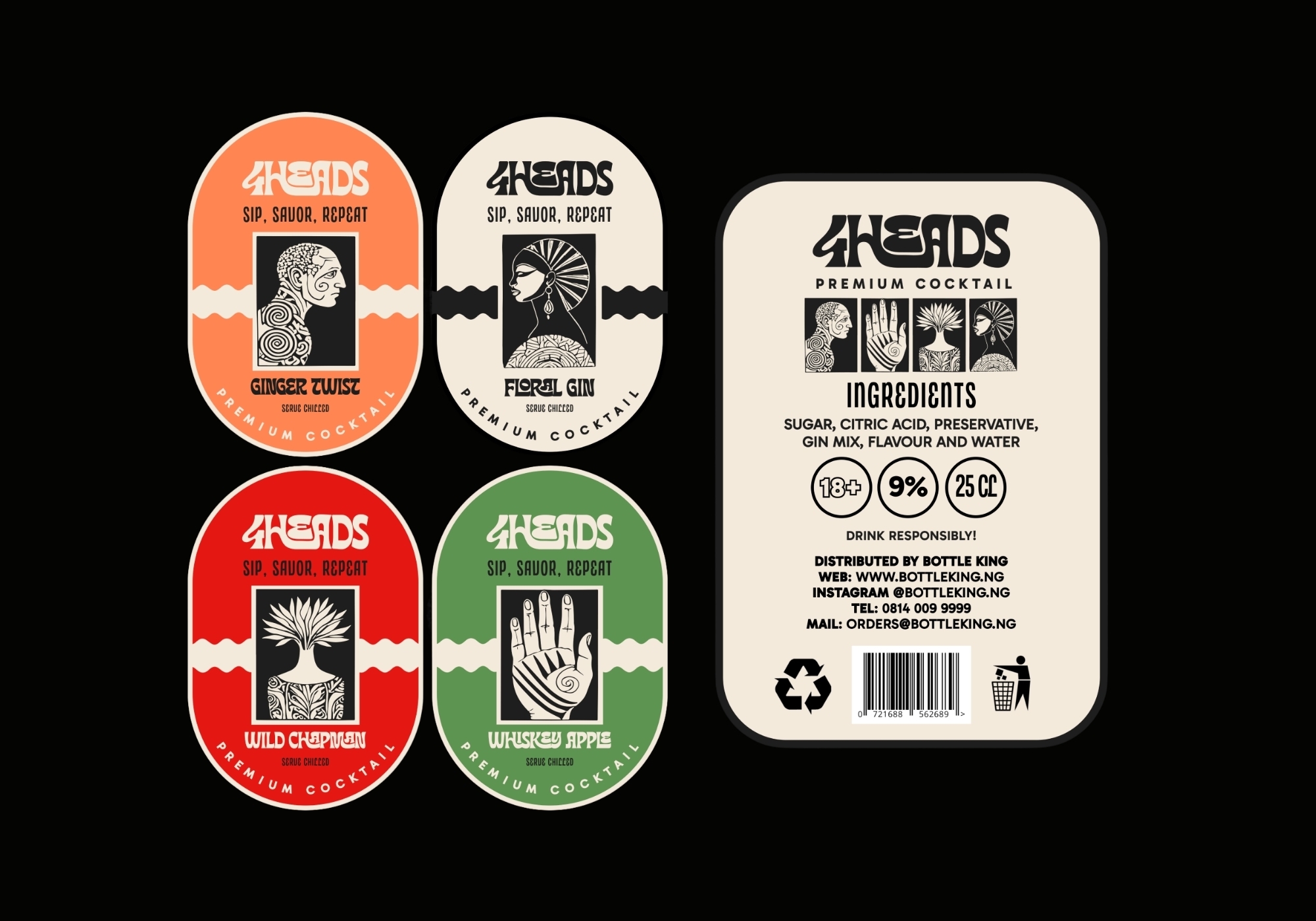
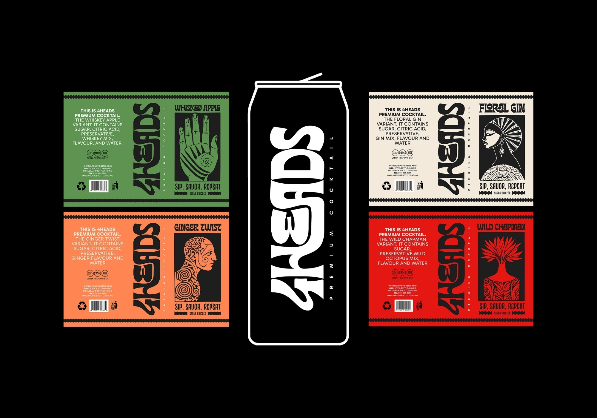
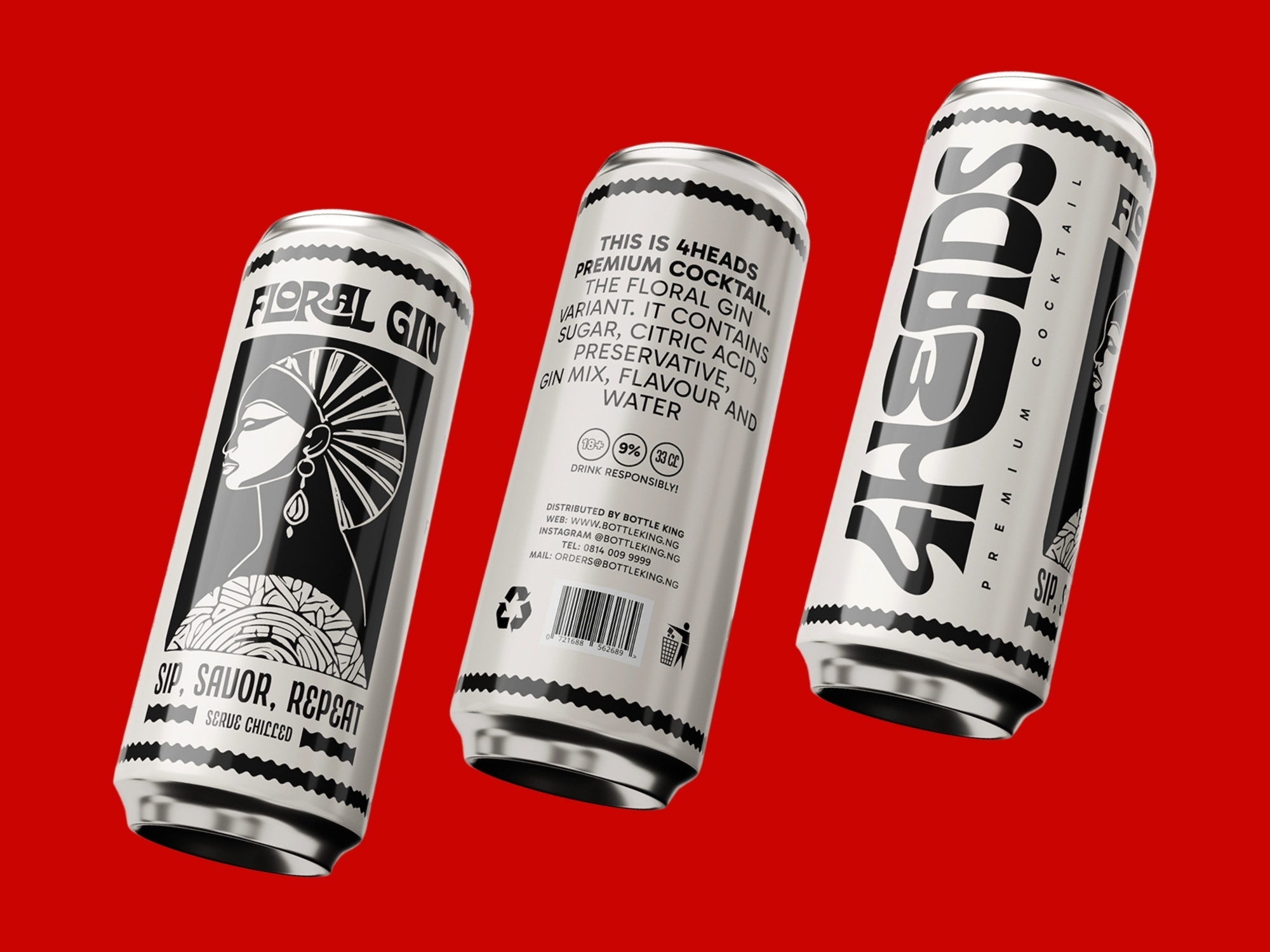
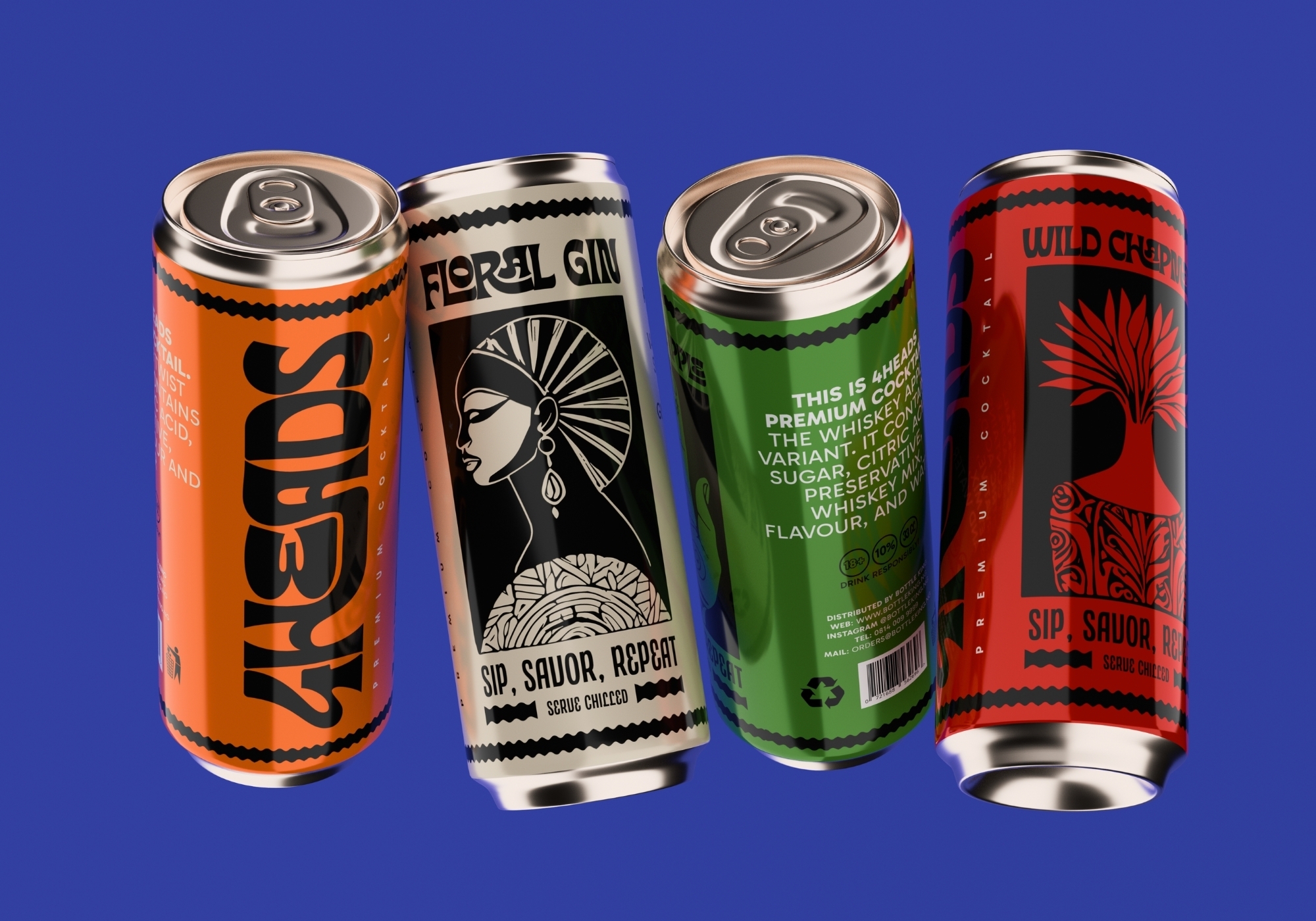
4HEADS needed a bold, premium visual identity that could easily be replicated from brand design all the way to a physical product experience. The challenge was to create a brand system that stands-out and can easily be recognised on a beverage shelf. In creating a design system for the brand, I had to factor in the following constraints: 1. The feel of the brand should communicate a very bold and premium feel mixed with a mature sense of playfulness. 2. A brand design that works across digital and physical experiences of the product. 3. Come up with production aware solutions, considering availabilty of materials and sustainability of the Packaging solutions. 4. Packaging should be easy to wrap and the different variants of the beverage should have their distinct look and feel.
4HEADS needed a bold, premium visual identity that could easily be replicated from brand design all the way to a physical product experience. The challenge was to create a brand system that stands-out and can easily be recognised on a beverage shelf. In creating a design system for the brand, I had to factor in the following constraints: 1. The feel of the brand should communicate a very bold and premium feel mixed with a mature sense of playfulness. 2. A brand design that works across digital and physical experiences of the product. 3. Come up with production aware solutions, considering availabilty of materials and sustainability of the Packaging solutions. 4. Packaging should be easy to wrap and the different variants of the beverage should have their distinct look and feel.
Project Innovation / Specification:
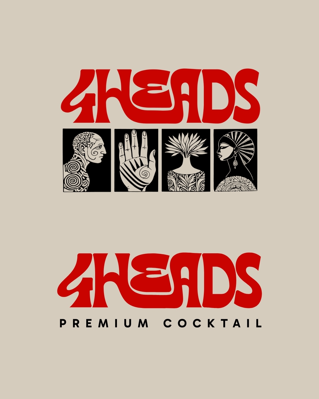
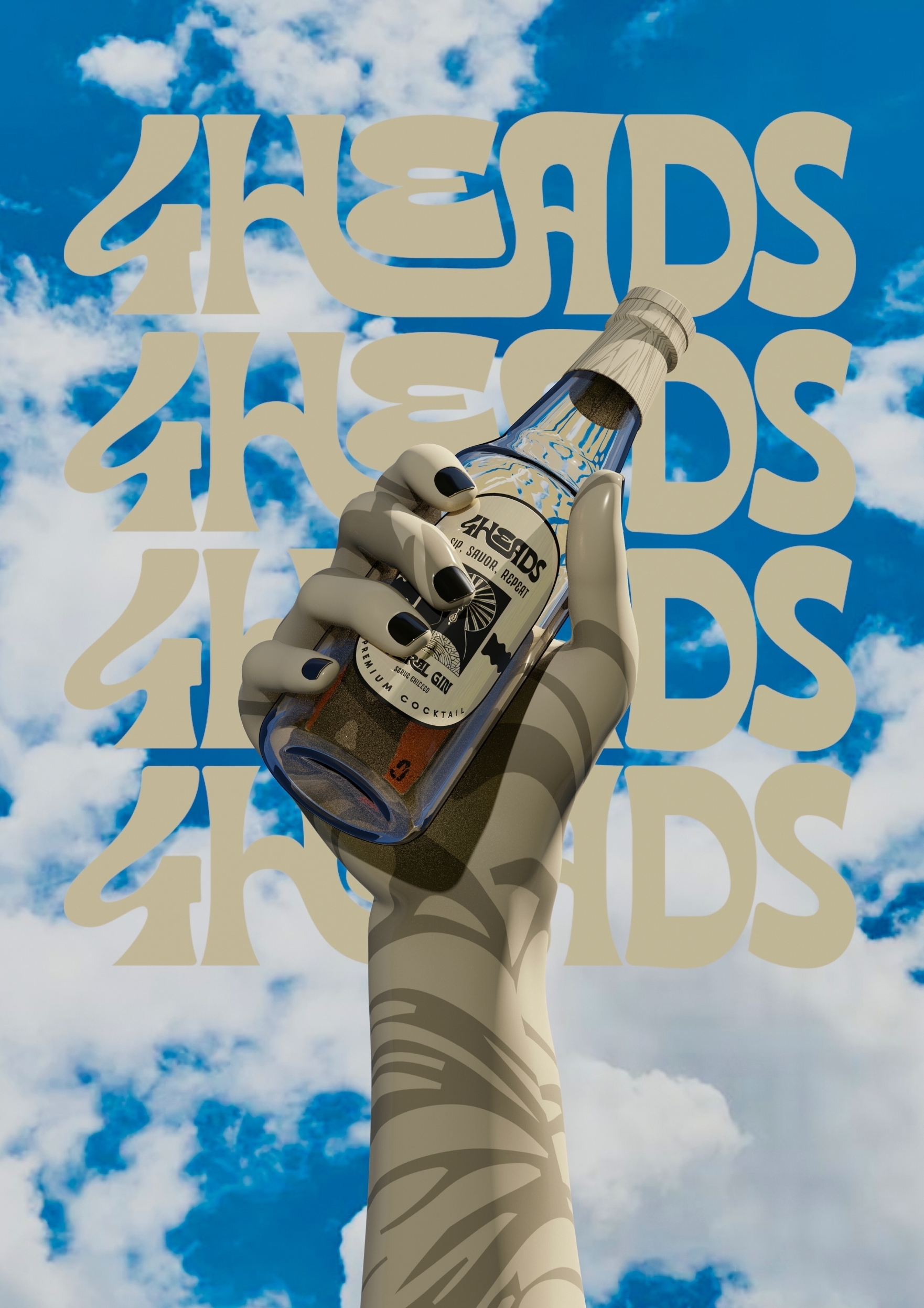
Design strategy: Keeping in mind that I had to design for two realities (the digital and shelf experience), my approach was to build a simple and scalable system that works well across both experiences by using the strategies outlined below: 1. Hierarchy structure in the design to make sure the design reads from brand, to product, to variant suggestion and then supporting information. 2. Bold Typographic based design to account for hierarchy, scalability of design and memorability of the product. 3. Modular design that allows for reusable graphic components and layout rules that stay consistent across formats 4. Final 3D Visualisation to further demonstrate the validity, visual appeal and how the design wraps beautifully around a can/bottle. Solution/Creative Execution: 1. Bold wordmark logo along with a clear typography system for supporting information. 2. Creation of 4 icons to depict and differentiate the personalities of the different flavours/variants. 3. High-contrast compositions to improve distance legibility and stand-out factor 4. Clear front-face priority for brand recognition. 5. Visual consistency with the identity system so the can feels like a natural extension.
Design strategy: Keeping in mind that I had to design for two realities (the digital and shelf experience), my approach was to build a simple and scalable system that works well across both experiences by using the strategies outlined below: 1. Hierarchy structure in the design to make sure the design reads from brand, to product, to variant suggestion and then supporting information. 2. Bold Typographic based design to account for hierarchy, scalability of design and memorability of the product. 3. Modular design that allows for reusable graphic components and layout rules that stay consistent across formats 4. Final 3D Visualisation to further demonstrate the validity, visual appeal and how the design wraps beautifully around a can/bottle. Solution/Creative Execution: 1. Bold wordmark logo along with a clear typography system for supporting information. 2. Creation of 4 icons to depict and differentiate the personalities of the different flavours/variants. 3. High-contrast compositions to improve distance legibility and stand-out factor 4. Clear front-face priority for brand recognition. 5. Visual consistency with the identity system so the can feels like a natural extension.
Project Sustainability Approach:
Environmentally, the extensive 3D visualization helped reduce physical proofing/prototyping and material waste early. The identity is built to be timeless, durable and scalable. This will reduce the need for frequent redesign cycles that often lead to disposal of packaging assets and printed materials.
Environmentally, the extensive 3D visualization helped reduce physical proofing/prototyping and material waste early. The identity is built to be timeless, durable and scalable. This will reduce the need for frequent redesign cycles that often lead to disposal of packaging assets and printed materials.
Local and Regional Impacts of the Project:
The final system delivered a product with a unique visual feel that stands-out easily in a digital experience of the brand and can compete with its strong shelf presence. The solutions were designed to be scalable to enable fast rollout of materials for campaigns with out loosing the bold personality and consistency of the brand.
The final system delivered a product with a unique visual feel that stands-out easily in a digital experience of the brand and can compete with its strong shelf presence. The solutions were designed to be scalable to enable fast rollout of materials for campaigns with out loosing the bold personality and consistency of the brand.
Profile Description:
Maxwell Dewunmi is a Creative Designer and Artist with a growing body of work spanning 3D design, 3D art and illustration, graphic design, brand design, and animation. He has collaborated with several local and international brands, helping them connect more meaningfully with their audiences through eye-catching, functional, and thoughtful design. His work has earned notable recognition, including wins at the Cannes Awards 2023 in the PR Lions category and the IAB South Africa Bookmark Awards 2023.
Maxwell Dewunmi is a Creative Designer and Artist with a growing body of work spanning 3D design, 3D art and illustration, graphic design, brand design, and animation. He has collaborated with several local and international brands, helping them connect more meaningfully with their audiences through eye-catching, functional, and thoughtful design. His work has earned notable recognition, including wins at the Cannes Awards 2023 in the PR Lions category and the IAB South Africa Bookmark Awards 2023.